
Use cases · Jira dashboards
Say-do ratio on a Jira dashboard: planned vs. actual per sprint
The say-do ratio is the simplest delivery metric there is: what the team committed to at the start of the sprint, against what it actually delivered by the end. Jira computes both halves — the Velocity chart is exactly this, per sprint — but keeps them on the board's reports page, as bars, with no ratio, no target and no way to put them next to the rest of a dashboard. Here is how to show the ratio on a Jira dashboard, and the one definition question to settle first.
Short answer. Jira Cloud has no say-do gadget; the Velocity chart (commitment vs.
completed per sprint) lives on the board, and the Sprint Health gadget shows one sprint's status bar.
Two ways to put the ratio on a dashboard: the Sprint Health Monitor
gadget, which computes done ÷ originally planned with mid-sprint additions excluded and drawn
separately, a goal line, and pass/fail for closed sprints; or a
Plugio Suite sprint dashboard, where the ratio is a Number widget formula
({Delivered} / {Committed} * 100) with a previous-sprint badge, next to a burnup with
the committed line and per-person progress bars.
What "committed" means — settle this first
Every say-do number depends on one choice: does work added after the sprint started count as commitment?
- Strict reading. Committed = the sprint's contents at the moment it was started. Issues added later are tracked separately as scope change; issues removed drop out of the base. This is what the Velocity chart's Commitment bar means, and what most teams mean by "say".
- Live reading. Committed = everything in the sprint right now. Simpler, always current, and it quietly rewards a team that adds small tickets it has already finished.
The Sprint Health Monitor gadget uses the strict reading (it reads the issue change history). A Plugio Suite sprint dashboard uses the live reading (it reads the sprint as it is now). Both are explained below; pick the one whose definition your retrospective actually uses.
What Jira shows natively
- Velocity chart (board → Reports) — two bars per sprint, Commitment and Completed, in the board's estimation statistic, for the last sprints. This is a say-do chart. It only lives on that board's reports page, shows no percentage, and cannot be placed on a dashboard or compared across boards.
- Sprint Report — for one sprint, the lists of completed, not completed, removed and added issues, with totals. The raw material for the ratio, as a report page.
- Sprint Health gadget — the active sprint's issues by status category as a bar, with time elapsed and a scope-change figure. One board, the active sprint only, fixed layout.
- Sprint Burndown gadget — the board's burndown embedded in the dashboard. A chart, not a number, and again one board.
Where these stop: no single percentage on a dashboard, no threshold colouring, no side-by-side of several teams, and no history of the ratio outside the Velocity chart's bars.
Which Plugio gadget?
| If you want… | Use | Why |
|---|---|---|
| The strict ratio on a native dashboard — done ÷ committed at sprint start, added scope shown apart, a goal, pass/fail on closed sprints, several boards side by side | Sprint Health Monitor & Progress Bar (setup A) | Built for exactly this reading: it separates mid-sprint additions using the issue change history, and its comparison layout puts up to four boards in one gadget. |
| The ratio as one tile of a full sprint dashboard — with a burnup, per-person progress, a pivot and whatever else the review needs, all on one sprint switcher | Plugio Suite (sprint mode) (setup B) | A Number formula gives the percentage with a previous-sprint badge; the Line widget's "total scope line" draws committed vs. completed; every widget follows the sprint chip. |
| Just "how far is the sprint" as a bar or gauge, without the commitment question | Gauge Chart, Progress Bars & Counters | Covered in Show sprint progress on a Jira dashboard. |
Setup A — the strict ratio with Sprint Health Monitor
- Add the gadget (Add gadget → "Sprint Health Monitor & Progress Bar") and open Configure.
- Pick the board. The gadget always opens on the board's active sprint, so it rolls over by itself when a new sprint starts; a dropdown on the gadget lets any viewer flip to a closed sprint to read its result.
- Choose the metric: issue count, story points or a numeric field. Story points should match the board's estimation statistic so the ratio agrees with the Velocity chart.
- Set the goal — the dashed line at your target completion, 80 % by default. On a closed sprint it is the pass/fail bar.
- Read it. The fill is done ÷ originally planned. Issues created or moved into the sprint after it started are excluded from the planned base and drawn as hatched segments — in the state colour when done, grey and packed at the far end when still open — so the main percentage keeps answering "how much of what we committed is finished". The stats block prints the ratio, the counts and +N % scope added mid-sprint.
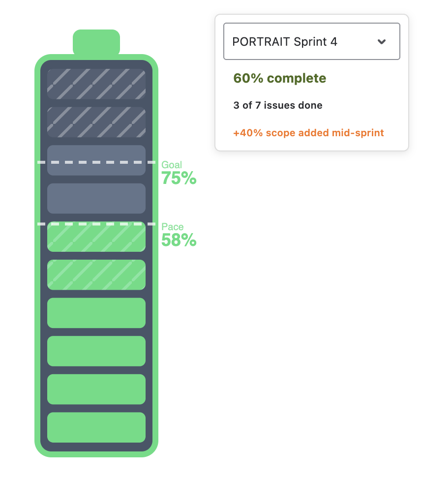
Colour follows pace, not the ratio alone: green at or near the elapsed-time line, yellow more than ten points behind it, red when the sprint is more than half over and well behind — or, for a closed sprint, when it missed the goal.
Several teams on one dashboard
Switch the gadget to the Comparison layout and add up to four boards, all on Current sprint. Each battery shows its own sprint, ratio and state, so a delivery lead sees four teams' say-do at a glance.
Setup B — the ratio on a Suite sprint dashboard
Use this when the say-do number is one of several things the sprint review looks at. A Suite dashboard in sprint mode binds every widget to one sprint — the active one by default — and viewers flip to past sprints with the sprint chip.
- Create the dashboard in Plugio Suite, choose the Sprint scope and pick the board. Leave the selection on Active sprint.
- Add a Number widget with three value rows:
Committed Sum of Story Points Delivered Sum of Story Points where statusCategory = Done Say-do {Delivered} / {Committed} * 100 ← the displayed rowGive the formula row a "%" suffix, turn on Compare to previous period — on a sprint dashboard the baseline is the previous sprint — and add colour bands, e.g. below 70 red, 70–90 yellow, 90 and above green.
- Prefer a dial? A Gauge with value Sum of Story Points where statusCategory = Done and a Dynamic target with an empty condition shows the same ratio as "% of target", with the bands on the arc.
- Add the burnup. A Line widget with X axis Resolved, bucketed by day, Cumulative on and Show total scope line on: the curve is completed points, the dashed line is the sprint's total — committed vs. completed, over the sprint's dates.
- Say-do per person. A Progress Bar widget, value Sum of Story Points where statusCategory = Done, grouped by Assignee, target Ratio in group: one bar per person, each filled to their own delivered ÷ assigned.
- Save and share, or place the dashboard on a native Jira dashboard through the Plugio Suite Dashboard gadget.
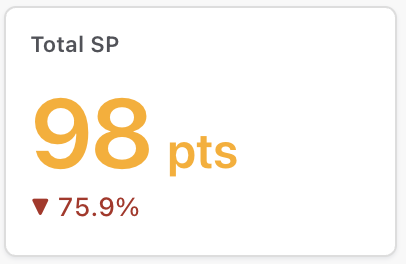
The honest caveat: Suite reads the sprint as it is now. An issue added mid-sprint is part of Committed; an issue removed is gone from both sides. That is the live reading. If your retrospective insists on commitment at sprint start, put the Sprint Health Monitor gadget on the same dashboard for the strict figure — the two numbers together are often the more useful pair, because their gap is the scope change.
Team-managed projects
Team-managed projects estimate in Story point estimate, not Story points. Use that field in every value row; for a dashboard over mixed boards, add one row per field and sum them in the formula.
Variations
History across sprints
Sprint Health Monitor's comparison layout also takes one board four times, on Current, Previous, 2 sprints ago and 3 sprints ago: four batteries, four strict say-do results side by side, rolling forward on their own. For a longer history the native Velocity chart remains the right tool. Suite shows one sprint at a time — the sprint chip flips to any past sprint — and does not draw a multi-sprint trend line of the ratio.
By issue count or time instead of points
Teams that don't estimate can run every setup above on issue count. Sprint Health Monitor takes any numeric field as its metric; in Suite, replace Sum of Story Points with Count or with Sum of Original estimate.
Planned vs. actual for a release or a quarter
The same Number formula works on a date-scoped Suite dashboard: scope the dashboard to a fix version or a JQL, set the time window to the quarter, and the formula compares delivered against planned points with the previous quarter in the badge. Without a sprint there is no "committed at start", so this is always the live reading.
Velocity chart vs. Sprint Health Monitor vs. Suite
| Velocity chart (native) | Sprint Health Monitor | Plugio Suite (sprint mode) | |
|---|---|---|---|
| Where | Board reports page | Native Jira dashboard gadget | Full-page dashboard or native gadget |
| Commitment | At sprint start | At sprint start; additions shown apart | Sprint contents now |
| Output | Two bars per sprint, no ratio | Percentage, goal line, pace, colour state | Percentage with previous-sprint badge, gauge, burnup, per-person bars |
| Several boards | No | Up to four in one gadget | One board per dashboard; several gadgets on a native dashboard |
| Past sprints | Last sprints as bars | Dropdown to any closed sprint; last four sprints side by side in comparison layout | Sprint chip flips to any past sprint |
| Cost | Included | Free on the Marketplace | Free on the Marketplace |
Put the ratio on your own dashboard. Plugio Suite is free on the Atlassian Marketplace; the documentation covers sprint mode, formulas and the burnup line, and there is a live demo with sample data.
Want the strict commitment reading as a single gadget? Sprint Health Monitor & Progress Bar — also free.
Frequently asked questions
What is a say-do ratio?
Delivered ÷ committed for a sprint — the share of what the team said it would finish that it actually finished. 90 % and above is usually read as a reliable team; consistently low values point at over-commitment or mid-sprint churn rather than at slow work.
Does Jira have a say-do ratio chart?
The Velocity chart on a board's Reports page is one: Commitment vs. Completed per sprint. It shows bars, not a percentage, and cannot be placed on a dashboard. There is no native gadget with the ratio.
Does work added mid-sprint count as committed?
Depends on the tool. Sprint Health Monitor excludes it from the planned base and shows it separately, using the issue change history. A Plugio Suite sprint dashboard counts the sprint as it is now. The gap between the two figures is the scope change.
Can I compare several teams' say-do on one dashboard?
Yes. Sprint Health Monitor's comparison layout shows up to four boards in one gadget; with Suite, place one gadget per board on a native Jira dashboard.
Can I see the ratio for a past sprint?
Both apps let you pick a closed sprint. Sprint Health Monitor then shows pass or fail against the goal, and its comparison layout can line up the last four sprints of one board; Suite's sprint chip flips every widget on the dashboard to that sprint.
Do sub-task story points count?
Sprint Health Monitor sums the metric over the sprint's issues as Jira reports them. In Suite, the sum covers every issue in the sprint, sub-tasks included when they carry the field; use a where condition such as issuetype not in subTaskIssueTypes() on the value rows to exclude them.