
Use cases · Jira dashboards
KPI counters and big numbers on a Jira dashboard
Open bugs, overdue tickets, issues created and resolved this week, story points in the backlog, average cycle time: the numbers a team looks at every morning. Jira's dashboard can list the issues behind each one, but it has no gadget that just shows the number, large, with a target or a trend. Here is how to build that row of KPI tiles — and which gadget fits which kind of KPI.
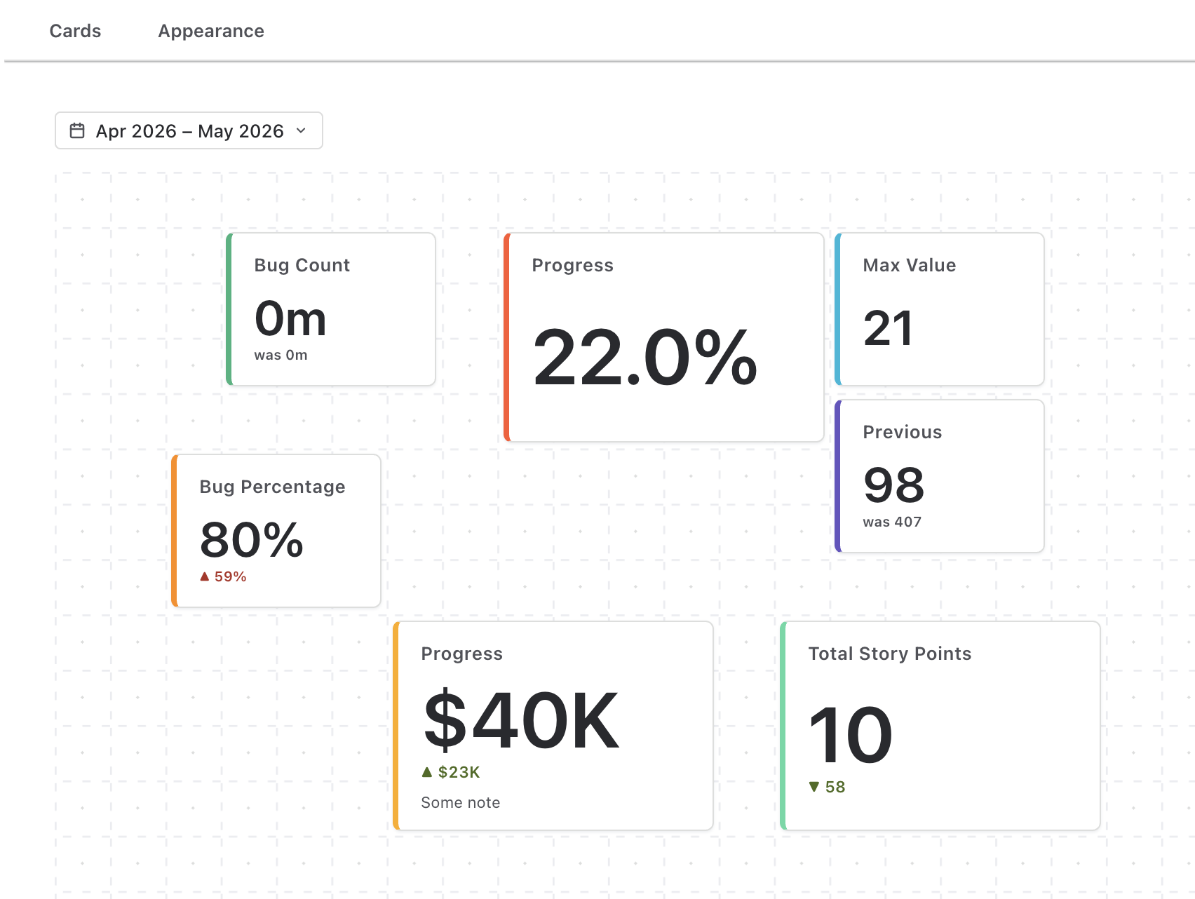
Short answer. Jira Cloud ships no big-number gadget; the usual workaround is reading the count off a Filter Results or Issue Statistics gadget. A KPI card gadget turns each JQL query into a card with one large number — a count, the sum or average of a field, or a formula over several queries — formatted as a number or a duration, compared with the previous period (▲ 12 %), and coloured by threshold rules. Several cards share one gadget, so a whole KPI row is a single configuration.
What Jira shows natively
- Filter Results lists the issues; the count is visible only in the pager ("1–20 of 57") and the gadget is as tall as its list.
- Issue Statistics breaks one filter down by a field, with counts per value — a small table, not a headline.
- Two Dimensional Filter Statistics crosses two fields, again as a table of counts.
All three answer "which issues" well and "how many, versus what" poorly. None sums a field (story points, time, a custom number), none compares with last week, none sets a target, and none is readable from across a room.
Which Plugio gadget?
Four Plugio gadgets can put a big number on a Jira dashboard. They overlap on purpose — a number is a number — and differ in what sits around it. Pick by the question you want the tile to answer:
| If the KPI is… | Use | Why |
|---|---|---|
| A number with context — a formula, "vs. last month", cycle time or age, hours and days, a $ or % sign, colour by rule | KPI Formula, Trend & Big Number (the setup below) | Metrics A, B, C… per card, formulas over them, previous-period badge, duration formatting, threshold colours, grid or list layout. |
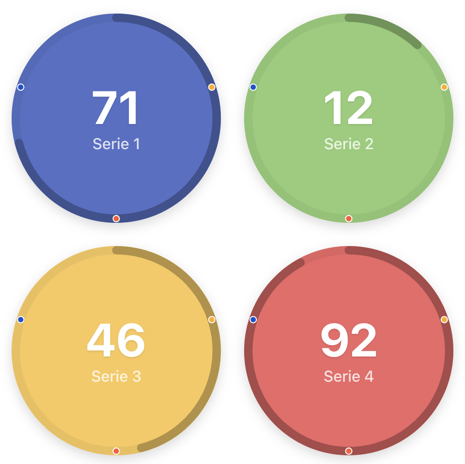
| A number with a target — "42 of 60", a progress ring, marker dots | Gauge Chart, Progress Bars & Counters (Counter) | Same series as the gauge and progress bar; Max and markers can be live JQL. Minimal by design — no prefix, suffix or decimals. |
| A number next to its trend — sparkline, donut, short list, all on one period | Report Cards & Charts | Six card types in one grid; one period picker for all; ▲/▼ deltas on Trend and Metric cards. |
| Part of a full-page dashboard where every widget shares one filter bar the viewer can change | Plugio Suite (Number widget) | Same values-and-formula model, plus scope/period/filters shared by every widget and sentences that update with the data. |
The rest of this page uses the first — it covers the widest range of KPIs — and notes where the Counter is the better fit.
Build the KPI row
The gadget is KPI Formula, Trend & Big Number Dashboard. Each card defines its own metrics — one JQL plus one aggregation each — and shows one of them or a formula.
- Add the gadget (Add gadget → "KPI Formula, Trend & Big Number"), open Configure and click + Add card.
- Define the metric. Under Define your metrics, give metric A a JQL and an
aggregation — Count for most KPIs, Sum of Story Points for a points total:
Open bugs project = ABC AND issuetype = Bug AND resolution is EMPTY Overdue project = ABC AND due < now() AND resolution is EMPTY Resolved project = ABC AND resolved is not EMPTY Backlog points project = ABC AND sprint is EMPTY AND resolution is EMPTYOne card per KPI; a card's metrics are its own, so cards can be copied and understood independently.
- Make it move with time (for throughput KPIs). On "Resolved", set Filter by date to Resolved. A period picker appears above the cards — this week, last 4 weeks, this month — and the metric follows it. Leave the filter off for point-in-time counts like "open bugs right now".
- Compare with the previous period. Under Choose what to show, turn on Compare — % change (▲ 12 %), absolute (▲ 9) or show previous ("was 33"). Tick Lower is better for bug counts so a drop reads green.
- Format and colour. Number or Duration; decimals; a prefix or suffix ("pts",
"%"); colour rules such as
≥ 0 green · ≥ 20 yellow · ≥ 40 red. Pick a card shape and accent, arrange the grid, Save.
Team-managed projects
Team-managed projects estimate in Story point estimate, not Story
points. Pick that field in the aggregation; the JQL is unchanged. For a mixed
dashboard, add one metric per field and show the formula {A} + {B}.
Variations
Ratios and net flow
Add a second metric and show a formula instead of a single value: {Done} / {Total} *
100 for a completion percentage, {Created} - {Resolved} for net flow in the
period, {Points} / {People} for load per person. Division by zero renders as
-, never a wrong number.
Cycle time, age and runway
The field list includes values Jira doesn't store but two dates imply: Date difference (Created → Resolved, averaged and formatted as a duration = cycle time), Days since a date (max of days since Created = oldest backlog item), Days until a date (min of days until Due = nearest deadline). These are the KPIs that are hardest to get out of Jira any other way.
A number with a target
For "42 of 60" with a ring or marker dots, the Counter visualization in Gauge Chart, Progress Bars & Counters is the simpler tool: one series per card, Max drives the ring, target markers sit on it and turn "reached" once passed — and both can be live JQL. It has no formatting or comparison options on purpose; if you need those, stay with the card gadget above and express the target as a formula or colour rule.
A number with its trend
If the tile should show where the number is heading — a sparkline of resolved-per-week next to this week's count — that is the Trend card in Report Cards & Charts, which also mixes progress bars, donuts and short issue lists into the same grid under one period picker.
Native vs. KPI card gadget
| Filter Results / Issue Statistics | KPI card gadget | |
|---|---|---|
| What you see | A list or a table of counts | One large number per card, with label, badge and colour |
| Metric | Issue count | Count, sum, average, min, max of any numeric field; cycle time, age, days-until; formulas over several queries |
| Time | Whatever the filter says | Period picker (day → year presets, custom range), previous-period comparison |
| Format | — | Number or duration, decimals, compact (1.2K), prefix/suffix, colour rules |
| Several KPIs | One gadget each | Many cards in one gadget — drag-and-drop grid or list |
| Cost | Included | Free on the Marketplace |
Build the row on your own dashboard. KPI Formula, Trend & Big Number Dashboard is free on the Atlassian Marketplace; the documentation covers metrics, formulas and comparison in detail.
Prefer a counter with a target ring? Gauge Chart, Progress Bars & Counters. A number next to its sparkline? Report Cards & Charts. Both free.
Frequently asked questions
Is there a native Jira gadget that shows just a number?
Not in Jira Cloud. Filter Results shows a list with the count in its pager, and Issue Statistics shows counts per field value. A single large number with a comparison or a target needs a Marketplace gadget.
Which Plugio gadget should I use for KPI tiles?
KPI Formula, Trend & Big Number for numbers with context (formulas, previous period, durations, colour rules); the Counter in Gauge Chart, Progress Bars & Counters for a number with a target ring; Report Cards & Charts for a number next to its sparkline; Plugio Suite when the tiles are part of a full-page dashboard with a shared filter bar.
Can a card show the sum of story points or time spent instead of a count?
Yes — the aggregation is Count, or Sum/Average/Min/Max of any numeric field, including Story Points, custom numbers and Jira's time-tracking fields. Time fields arrive in seconds and can be formatted as durations (4d 2h 30m).
How does "compared to last month" work?
Every metric with Filter by date set is evaluated twice: over the selected period and over the window immediately before it, of the same length. The badge shows the difference as % change, an absolute value or the previous value itself.
Can I use my saved filters instead of writing JQL?
In the KPI card gadget, write filter = "My filter" as the JQL. The Gauge gadget's data sources also accept a saved filter picked from a list.
How fresh are the numbers?
The gadgets query Jira when the dashboard loads (and when the period changes). Reload the page for fresh figures; there is no background sync or stored copy of your data.