
Gauge Chart, Progress Bars & Counters Documentation
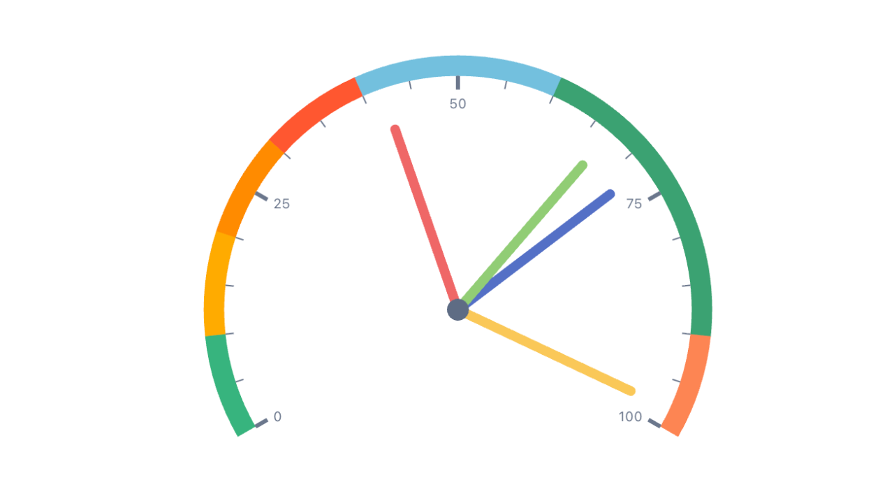
Gauge Chart, Progress Bars & Counters for Jira Dashboards is a dashboard gadget that turns one or more Jira numbers into a radial gauge, a progress bar or a grid of big-number counters. Each number — a series — is an issue count or the sum of a numeric field over a JQL query or a saved filter, optionally as a percentage of a second query. The range (Min and Max) and every target marker can be fixed numbers or live JQL results, so "% of this sprint's commitment" or "open bugs vs. last month's baseline" stay current without editing the gadget.
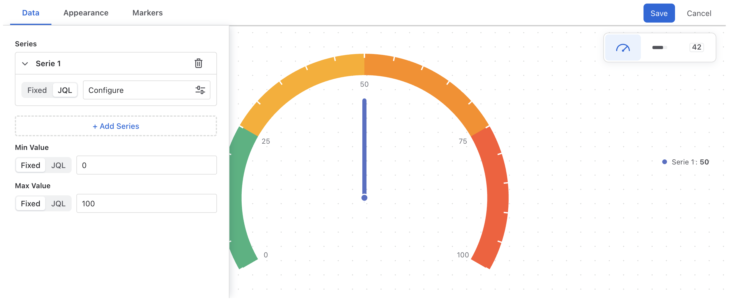
Everything is configured in a live-preview editor with three panels — Data, Appearance, Markers — and a floating switcher for the visualization type.
Data & permissions. The gadget reads issues with the Jira REST API in the context of the person viewing the dashboard. Everyone sees only the issues their own Jira permissions allow. Nothing is written to Jira and nothing leaves your site.
Getting Started
- 1 Open a Jira dashboard, click Add gadget and search for Gauge Chart, Progress Bars & Counters.
- 2 On the new gadget, open the ··· menu and choose Configure. The editor opens with a live preview.
- 3 Pick a visualization in the floating switcher — Gauge, Progress Bar or Counter.
- 4 In Data, give the first series a JQL query or a saved filter and pick its metric (Issue Count or Sum of a field).
- 5 Set Min Value and Max Value, add threshold bands or target markers, then Save.
The Editor
| Control | What it does |
|---|---|
| Visualization switcher | Floating over the preview: Gauge, Progress Bar, Counter. Series, Min/Max and markers carry over when you switch — only the rendering changes. |
| Data | Series list, and the Min / Max range. See Data. |
| Appearance | Options specific to the selected visualization — legend, style, orientation, shape, layout — plus the colour theme and widget height. |
| Markers | Threshold bands (gauge) or target markers (progress bar & counter). See Thresholds & Markers. |
| Save / Cancel | Save writes the configuration to the gadget; Cancel discards every change since the editor opened. |
The preview is the real widget: it re-queries Jira about a second after your last change, and it is rendered at the exact height you set, so what you see is what the dashboard shows.
Data
Series
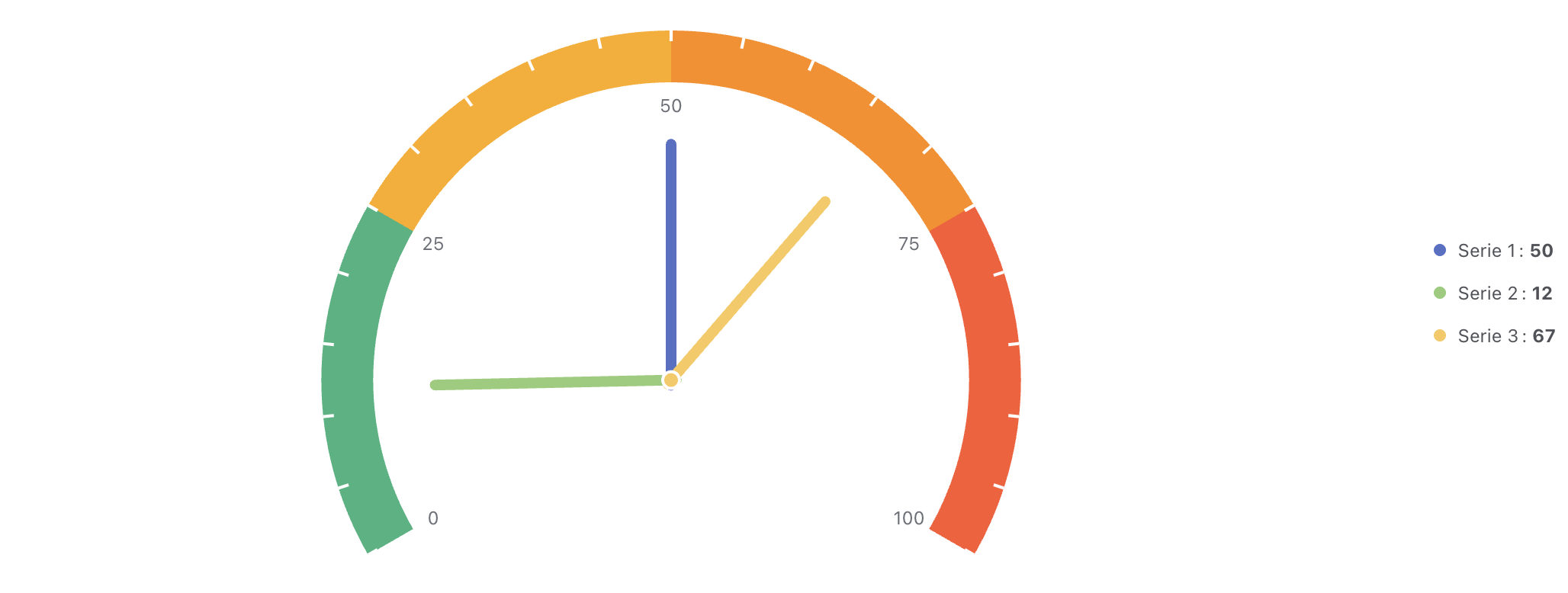
A series is one number. A gauge draws one needle per series, a progress bar one bar per series, a counter one card per series. Add as many as you need with + Add Series; each row has an editable name (the legend / bar / card label) and a remove button.
Every value in the gadget — a series, Min, Max, a target marker — is defined with the same two-mode control:
| Mode | Meaning |
|---|---|
| Fixed | A number you type. |
| JQL | Computed from a JQL query or a saved filter. The control shows the current result (or Configure until one is set); click it to open the data modal. |
JQL, filters & metrics
| Setting | Meaning |
|---|---|
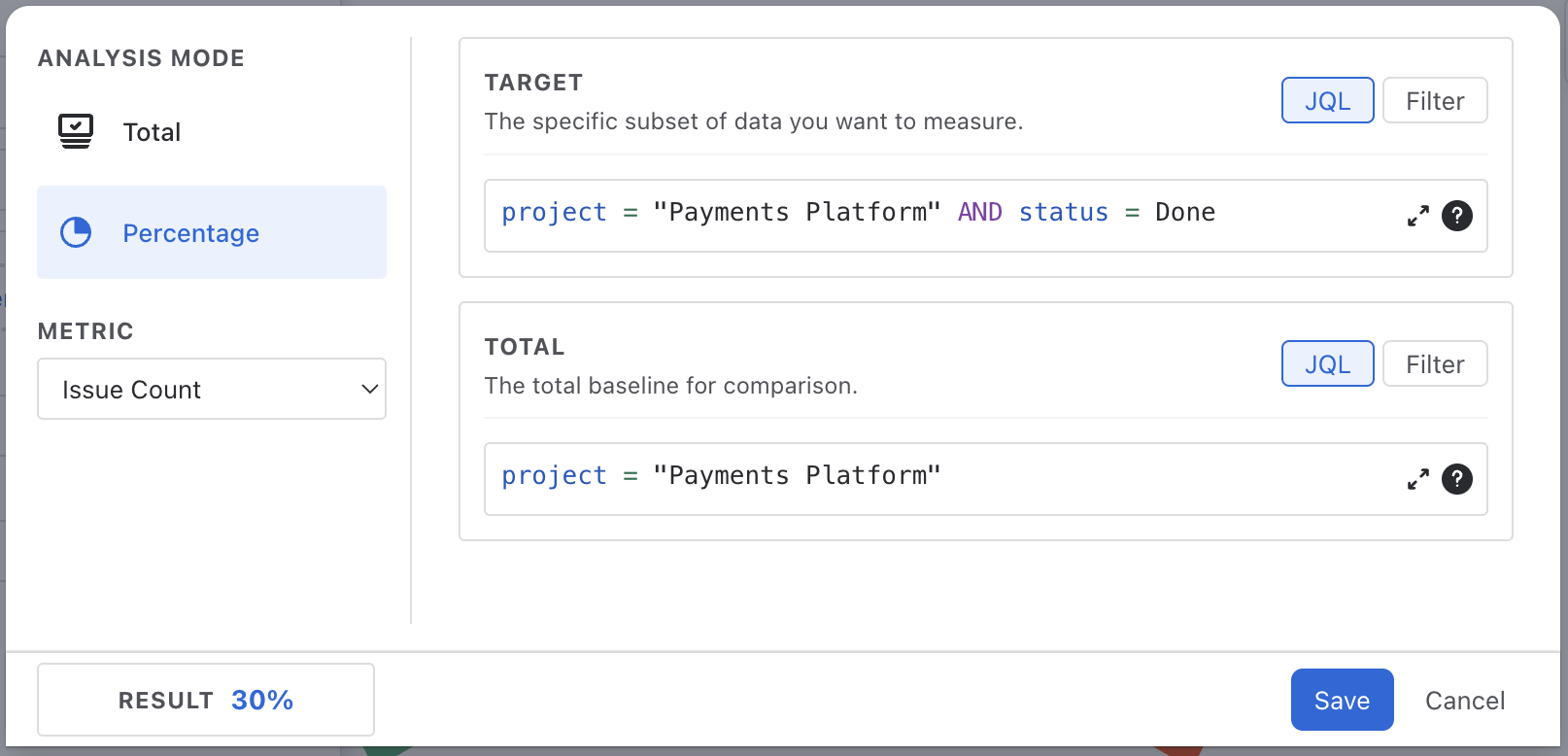
| Data Source | JQL — Atlassian's own JQL editor with autocomplete. Filter — pick one of your saved Jira filters. |
| Metric | Issue Count, or Sum of <field> for any numeric field on your site — Story Points, custom number fields, and Jira's time-tracking fields (Original Estimate, Time Spent, Remaining Estimate, and their Σ variants). |
| Analysis Mode | Total (default) — one query, one number. Percentage — see below. |
| Result | Live preview of the number the query produces; Error if the query fails. |
Time-tracking fields sum in seconds. Jira stores estimates and time spent as seconds, and the gadget shows the raw sum. Divide by 3,600 in your head — or, if you need hours and days rendered as such, the Number widget in Plugio Suite formats durations natively.
Percentage mode
Percentage mode divides one query by another. The Target card is the subset you are measuring, the Total card is the baseline: issues resolved this sprint over issues committed this sprint, bugs with priority Highest over all open bugs. The result is a rounded whole-number percentage. A baseline of zero yields 0 rather than an error.
Percentage results are shown as a plain number (42, not 42%). Set Min 0 and Max 100 so the gauge or bar reads as a percentage.
Min & Max
Min Value and Max Value bound the gauge arc, the progress-bar axis and the counter's fill. Both are full data-source controls, so the range itself can be live: Max = Sum of Story Points in the active sprint turns a fixed "0–100" gauge into "0 to whatever the team committed". Defaults are 0 and 100.
Visualizations
Gauge
A radial dial with one needle per series on a shared Min → Max arc. Threshold bands colour the arc; scale labels sit inside it at the quarter points; the legend lists each series with its rounded value.
| Appearance setting | Options |
|---|---|
| Gauge Style | Standard (a 240° arc) · Half Circle (180°, saves vertical space). |
| Legend Position | Left · Right (default) · Top · Bottom · Hide. |
| Show Ticks | Toggles the scale labels and tick marks inside the arc. |
| Widget Height | 280–700 px. The dial always fits the height exactly. |
| Color Theme | See Colour Themes. |
Progress Bar
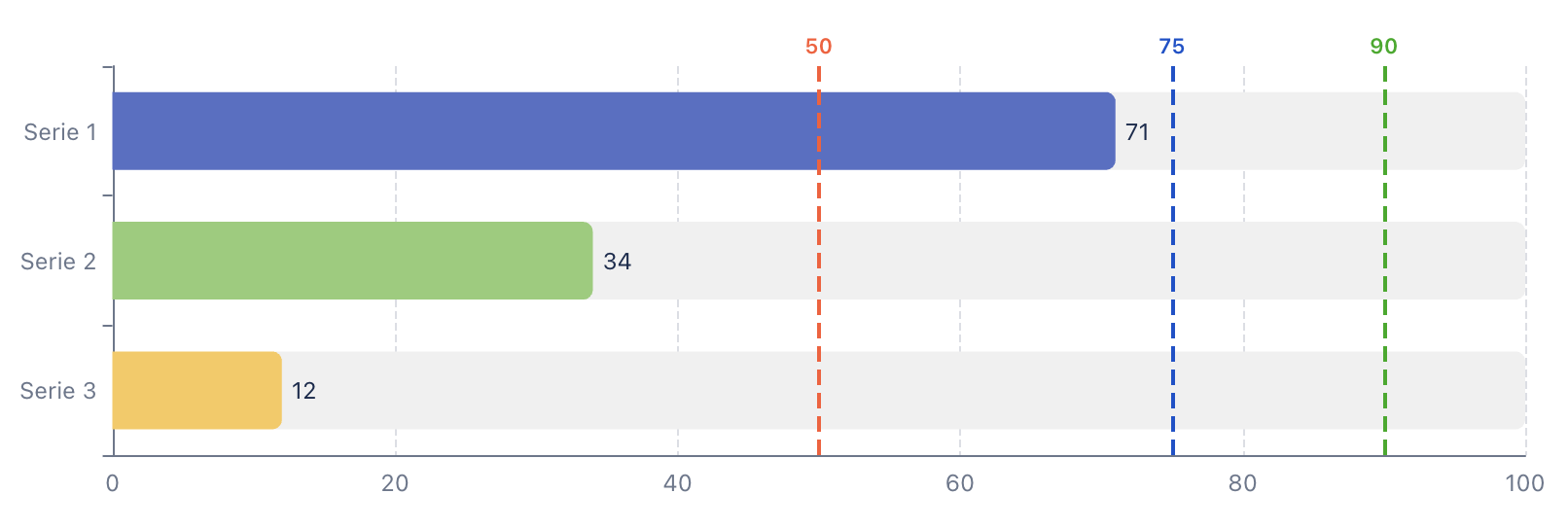
One bar per series, all on the same Min → Max axis, with the value printed at the end of each bar. Target markers render as dashed lines with a numeric label — the classic "current vs. goal" read.
| Appearance setting | Options |
|---|---|
| Orientation | Horizontal (default) · Vertical. |
| Size | Bar thickness, 20–100 px. |
| Widget Height | 280–700 px. |
| Color Theme | See Colour Themes. |
Counter
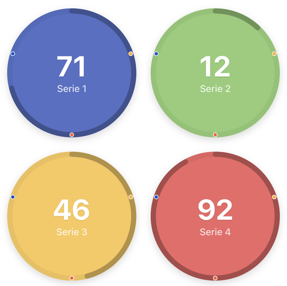
A grid of big-number cards, one per series, filled in the series colour. Each card can carry a progress indicator toward Max — a ring on circular cards, a rising fill on square ones — and target markers as dots on the ring or "waterlines" on the fill. Markers turn to their "reached" style once the value passes them; hovering a marker shows its value.
| Appearance setting | Options |
|---|---|
| Shape | Circle (ring + dot markers) · Square (fill + line markers). |
| Show Progress | Toggles the ring / fill. |
| Show Markers | Toggles marker dots / lines. Off by default for counters. |
| Show Labels | Series name under each value. |
| Layout | Rows × columns picker up to 5×5, or Auto — the grid picks the arrangement that gives every card the most room. Extra series always get a row; the grid never drops a card. |
| Widget Height | 280–700 px. Cards resize to fill. |
Thresholds & Markers
The Markers panel changes with the visualization.
Gauge — threshold bands
A contiguous list of ranges over the arc, each with a colour. The start of every band is the end of the previous one (the first starts at Min) and is shown read-only — you only edit ends. New gadgets start with four bands: green to 25, yellow to 50, orange to 75, red to 100. Anything above the last band's end is drawn neutral, so an out-of-range value is visible as such.
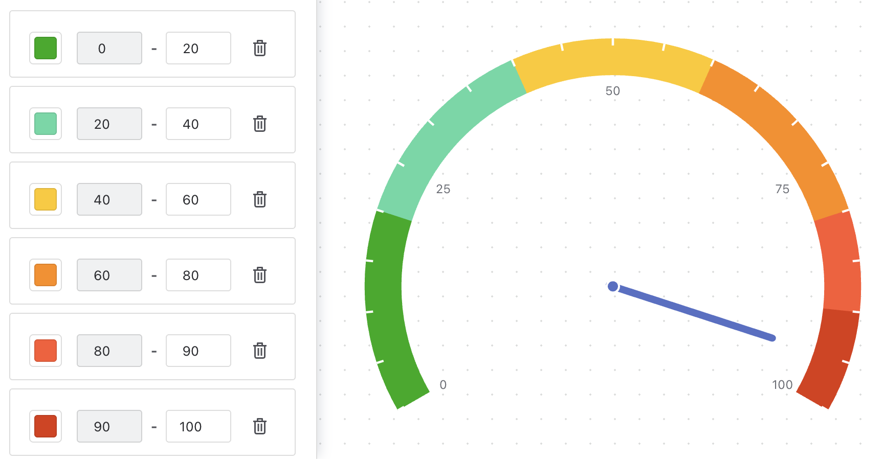
Order the colours to match the meaning: green→red for "low is good" (open bugs), red→green for completion. The direction comes from your colour order.
Progress bar & counter — target markers
Each marker is a colour plus a value, and the value is a full data-source control: a fixed number, or a live JQL / saved-filter result with its own metric. A marker at Count of issues in the sprint keeps the sprint goal moving with the sprint. On the bar, markers are dashed lines with a label; on counters, ring dots or waterlines. Markers are shared by all series in the gadget.
Marker colours: Green, Light Green, Yellow, Orange, Red, Dark Red, Blue, Purple, or a custom colour.
Colour Themes & Sizing
| Setting | Meaning |
|---|---|
| Color Theme | Ten-colour palettes assigned to series in order: Basic (default), Pastel, Dark, Neon, Sunset, or a Custom theme — pick one colour and a ten-step monochromatic palette is generated from it. Counter text flips between dark and white automatically for contrast. |
| Widget Height | 280–700 px in 20 px steps, per visualization. This is the one size control: the chart always fits the height exactly and reflows with the gadget's width. |
| Light / dark | Backgrounds, text and gridlines follow Jira's theme automatically. Series and marker colours are the ones you chose. |
Values are rendered as rounded whole numbers with locale thousands separators. There is no prefix, suffix or decimals setting — the gadget stays minimal on purpose.
Troubleshooting
The gadget shows "No Data"
No series has a value yet, or the Min/Max query failed. Open the editor and check every JQL-mode control shows a number rather than Configure; the data modal's Result badge shows Error for a query Jira rejects.
The number differs from a filter I ran
The gadget runs as the viewer, so someone without access to a project sees fewer issues. Also check the Metric: Sum of a field skips issues where the field is empty.
Time-tracking sums look huge
They are in seconds. See the note under JQL, filters & metrics.
Data isn't refreshing
The gadget queries Jira when it loads. Reload the dashboard for fresh numbers.
Support
Questions, feedback or a feature request? We answer fast.
Email: [email protected]