
Plugio Suite Documentation
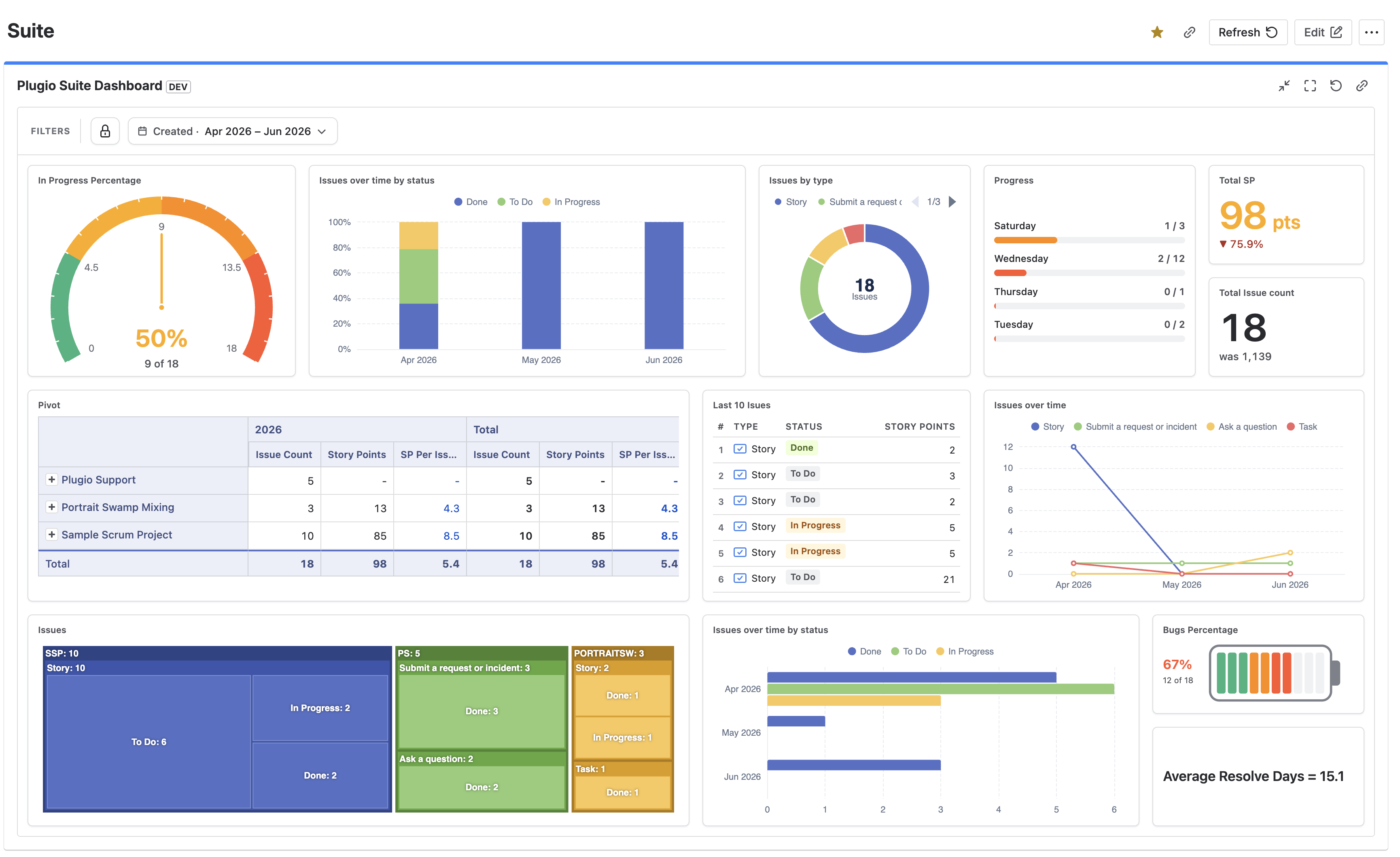
Plugio Suite — Dashboard Builder, Charts & Reports for Jira is a full-page dashboard builder. Instead of configuring one gadget at a time, you compose complete dashboards from a library of fourteen widgets — KPI numbers, gauges, batteries, progress bars, pies, bar and line charts, treemaps, pivot tables, issue lists, epic-progress breakdowns, hierarchy trees and live-value text blocks — on a free drag-and-drop canvas.
Everything on a dashboard reads from one shared set of filters: pick the scope (projects, JQL or a sprint), pick the time window, add any field filters — and every widget follows. Widgets can still narrow their own data with per-widget conditions when they need to.
Finished dashboards can be shared with everyone on your site and placed on native Jira dashboards through the bundled Plugio Suite Dashboard gadget.
Data & permissions. Plugio Suite reads issues with the Jira REST API in the context of the person viewing the dashboard. Everyone sees only the issues their own Jira permissions allow — sharing a dashboard never shares data the viewer couldn't already see. Nothing leaves your Jira site.
Getting Started
Opening Plugio Suite
- 1 Install Plugio Suite from the Atlassian Marketplace.
- 2 In Jira, open the Apps menu in the top navigation and choose Plugio Suite. The app opens as a full page.
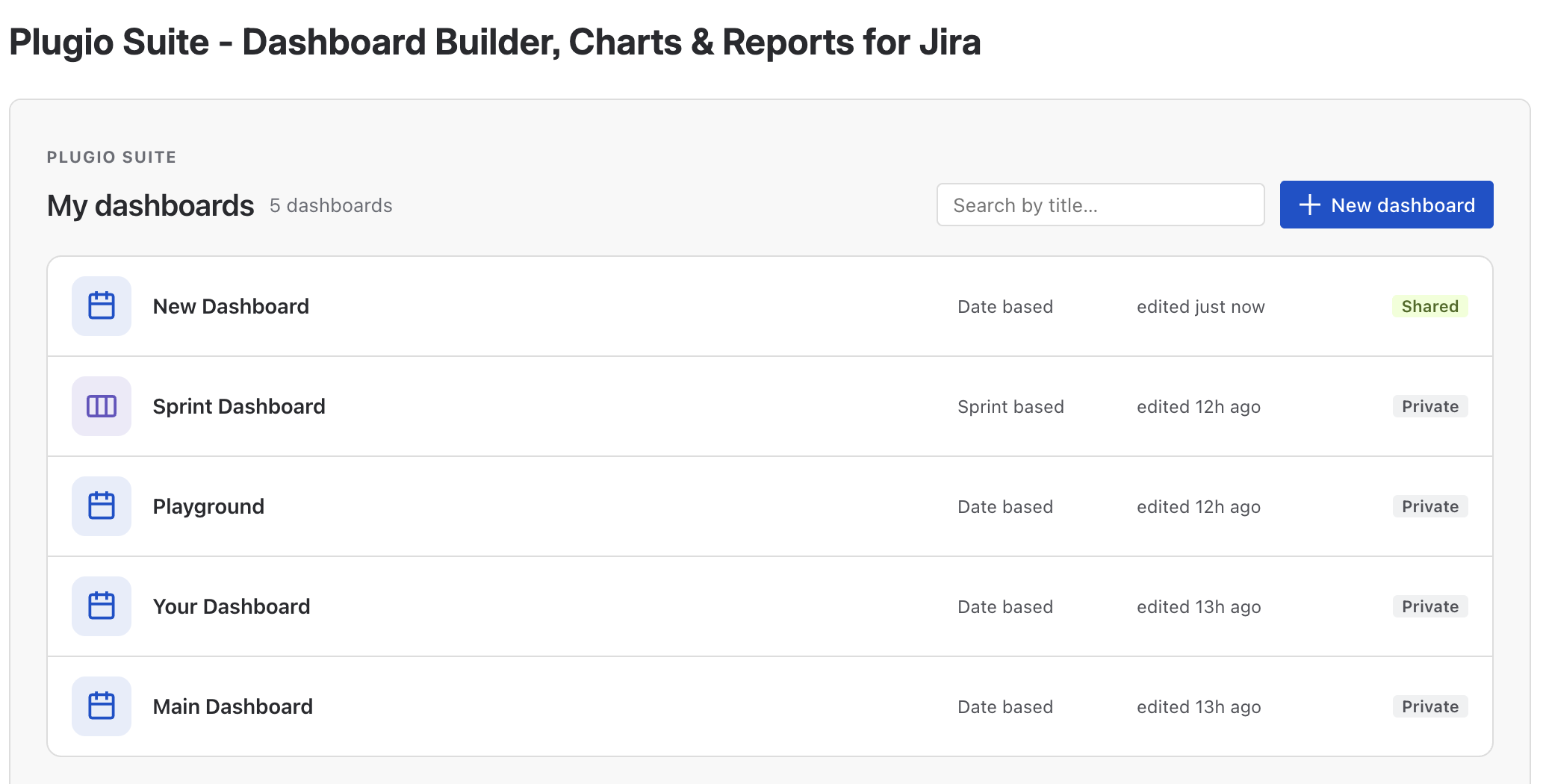
- 3 You land on My dashboards — every dashboard you own, plus dashboards others have shared with the site.
The My dashboards screen
- New dashboard creates a dashboard and opens it in the builder.
- The search box filters the list by title as you type.
- Each card shows the dashboard's mode as a leading icon — a calendar for date-based, a board for sprint-based — plus a Private/Shared badge.
- Hovering a card reveals Edit, Duplicate and Delete. Duplicate copies the whole configuration — a quick way to fork a variant of an existing dashboard.
Your first dashboard in five steps
- 1 Click New dashboard.
- 2 Set the Scope — the dashboard asks for it before loading any data. Pick one or more projects (or JQL, or a sprint board).
- 3 Pick a time window in the filter bar, e.g. Last 30 days.
- 4 Click + Widget and add widgets from the picker. Drag them into place, resize them by their edges.
- 5 Click Save. Flip the dashboard to Shared in Settings when it's ready for the team.
The Builder
Toolbar
| Control | What it does |
|---|---|
| ← Back | Returns to My dashboards. |
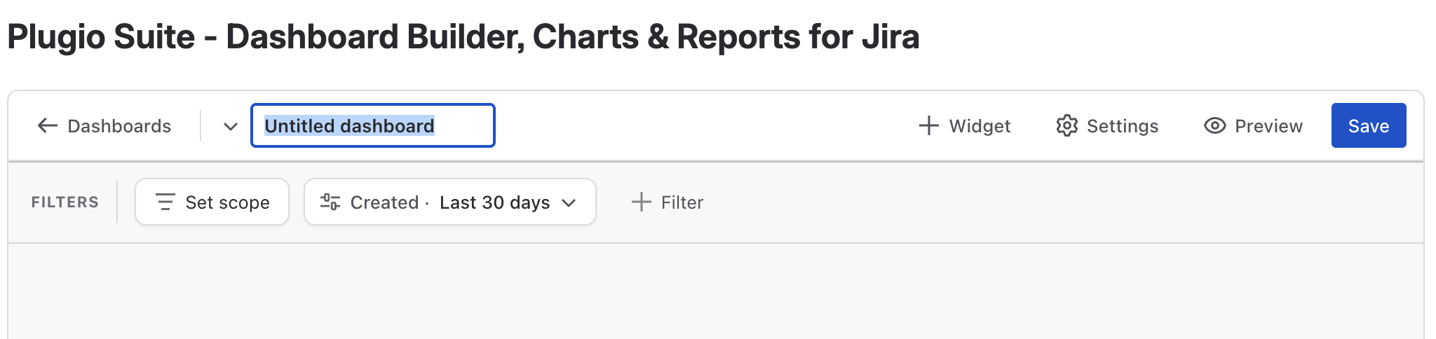
| Dashboard name | Click to rename; the switcher next to it jumps to another dashboard without leaving the builder. |
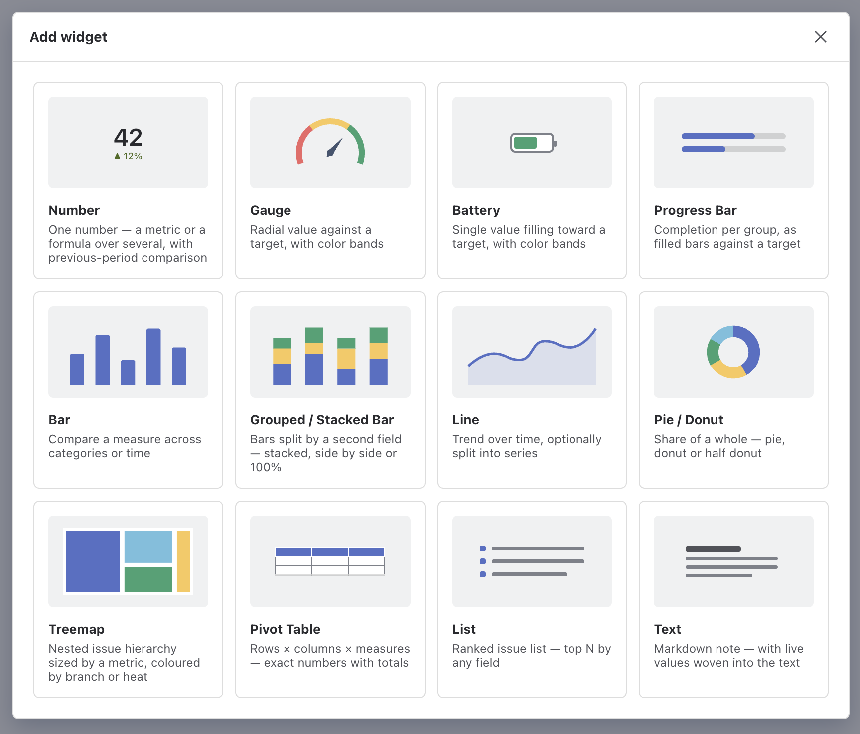
| + Widget | Opens the widget picker — a gallery of all thirteen widget types with previews. Clicking one adds it to the canvas at its default size. |
| Settings | Dashboard-level settings popup: visibility, chart colors, date format, day length. See Dashboard Settings. |
| Preview | Shows the dashboard exactly as viewers will see it — including your unsaved changes. Widgets lose their edit controls and the filter bar switches to the viewer version. |
| Save | Persists the dashboard. The label reads Saved when there is nothing to save. |
The canvas
- The canvas is a fluid 24-column grid. Widgets snap to grid cells while you drag or resize them; a ghost outline previews the drop position.
- Drag a widget by its header (or any non-interactive area) to move it. Resize from the edges and corners.
- Each widget type has a minimum size below which it can't be shrunk — a treemap can't collapse into an unreadable 1×1 tile. There is no maximum: widgets can be as large as you like, and the canvas grows downward without limit.
- Hovering a widget reveals its actions: ⚙ Settings opens the configuration panel, ✕ Remove deletes the widget.
The configuration panel
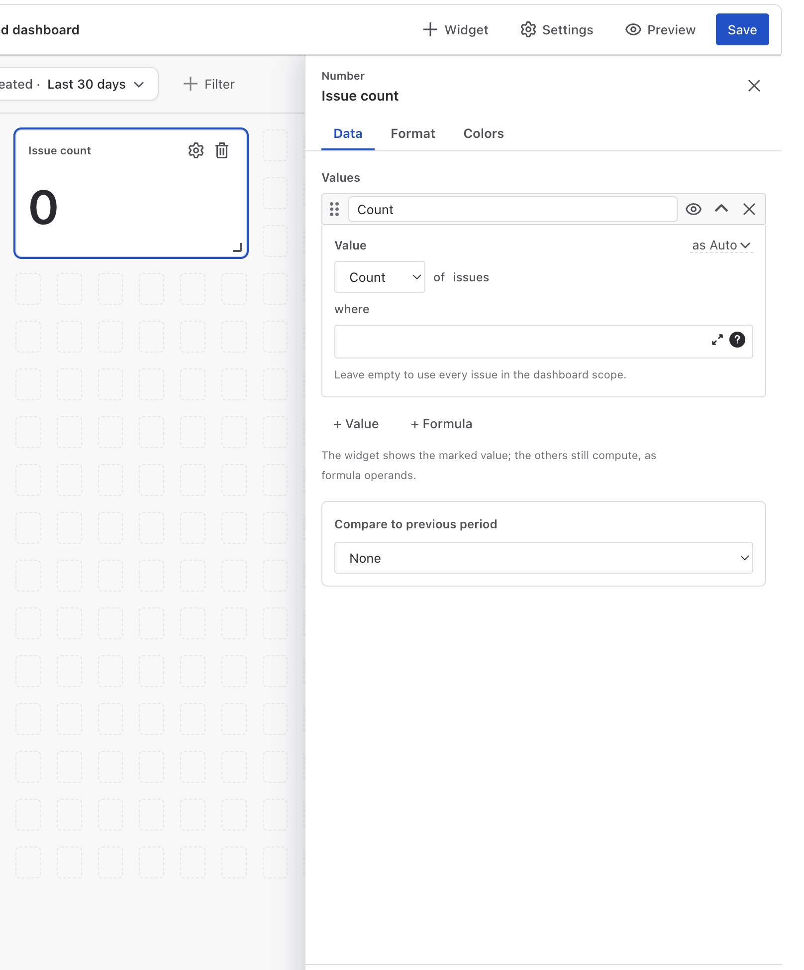
- The panel opens on the right and shows only tabs relevant to the selected widget (for example Data · Format · Colors for a Number, Layout · Values · Format for a Pivot Table).
- Every change applies live — the real widget on the canvas is the preview. The builder scrolls the widget into view next to the panel automatically.
- While the panel is open, clicking another widget switches the panel to it.
- Done keeps the changes; Cancel (or Esc) restores the widget to the state it had when the panel opened.
Scope & Filters
The filter bar defines what data the whole dashboard reads. It has three layers, applied together (logical AND):
- Scope — which issues exist for this dashboard (projects, JQL, or a sprint board).
- Time window — when: a period for date-based dashboards, one sprint for sprint-based dashboards.
- Field filters — any number of attribute filters (status, assignee, labels, custom fields…) layered on top.

A scope is required. The dashboard doesn't fetch anything until a bounding scope is set — an unbounded query over a large Jira site would be slow for everyone. Until then the canvas shows a "choose a scope" state.
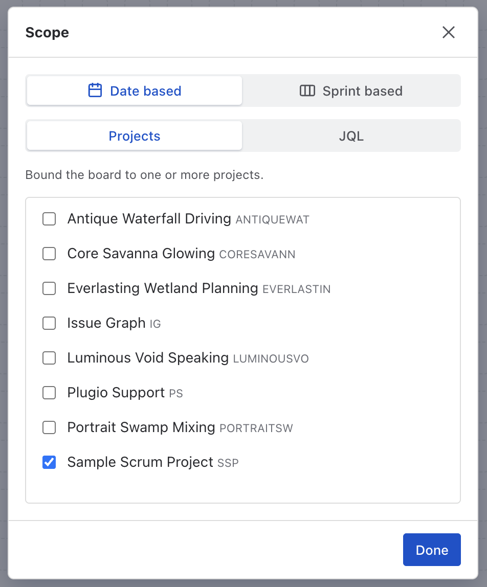
Dashboard scope
Click the scope chip to open the Scope dialog. The first choice is the dashboard's mode:
| Mode | Meaning |
|---|---|
| Date based | Issues are bounded by Projects (pick one or more) or an Advanced JQL query, and windowed by the period picker. |
| Sprint based | Issues are bounded by one Jira board and windowed by one sprint of that board. See Sprint mode. |
In date-based mode, the JQL option accepts any query — Atlassian's official JQL editor with
autocomplete is embedded, so cross-project scopes like
project in (ENG, OPS) AND type != Sub-task work as expected. Switching between
Projects and JQL keeps both values, so you can experiment without losing input.
Date-based mode also hosts the Period applies to selector — the date field the period picker windows on (Created by default).
Time window (period picker)
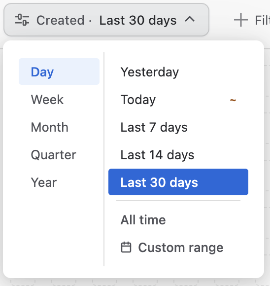
The period chip windows the dashboard in time. Pick a granularity — Day, Week, Month, Quarter, Year — and a preset for it, or a custom date range:
| Granularity | Presets |
|---|---|
| Day | Yesterday · Today · Last 7 days · Last 14 days · Last 30 days |
| Week | Last week · This week · Last 4 weeks · Last 8 weeks |
| Month | Last month · This month · Last 3 months · Last 6 months · Last 12 months |
| Quarter | Last quarter · This quarter · Last 2 quarters · Last 4 quarters |
| Year | Last year · This year |
| All time | No date filter at all. |
- The window is anchored to one date field — Created by default. See Period applies to below to anchor it to Resolved, Due or any custom date instead.
- Charts with a time axis bind the window to their own date field. A line chart plotting Resolved over time shows issues resolved in the window — throughput — regardless of when they were created.
- The granularity also drives chart bucketing: with Last 8 weeks selected, time-axis charts bucket by week automatically (the Auto bucket setting).
- The chosen period is the previous-period baseline too: a Number comparing against the previous period compares This month to last month, Last 7 days to the 7 days before, and so on — and Bar / Line charts can overlay the previous period behind the current one.
Period applies to (anchor date)
By default the period windows issues by their Created date: This month means "issues created this month". In the Scope dialog (date-based mode), Period applies to re-anchors the window to any date field — Resolved, Due, or a custom date. Anchor a dashboard to Resolved and every widget on it reads "issues resolved in the period": a true throughput dashboard, without touching a single widget.
- The anchor applies to the whole dashboard — every widget, and the previous-period baseline too. There is deliberately no per-widget anchor: a board where some tiles count by Created and others by Resolved would be unreadable.
- The period chip shows the anchor's name (e.g. Resolved · This month), so viewers always see what the period means. With the default anchor it reads Created, as before.
- Time-axis charts keep their own binding rule: an axis on the anchor field is served directly; an axis on any other date field re-windows that field.
Issues without the anchor date fall outside every period. On a Resolved-anchored dashboard, unresolved issues are not in the data at all — that is the definition, not a bug. Keep backlog-style boards (open issues, ages, WIP) on Created or All time.
Sprint mode
A sprint-based dashboard is bound to one scrum board and always shows exactly one sprint:
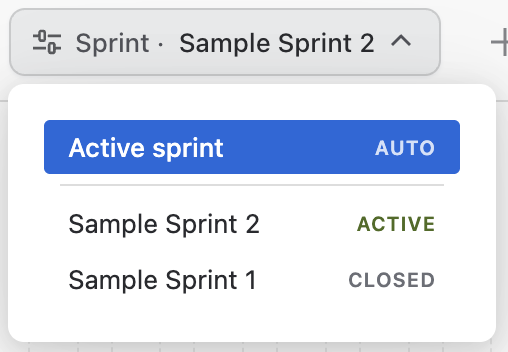
- The default selection is the Active sprint — the dashboard rolls over to the new sprint automatically when one starts. You can also pin a specific sprint.
- The period picker is replaced by a sprint chip. Viewers can flip to past sprints to review history; Reset returns to your default.
- Every widget is restricted to the sprint's issues — including widgets that aren't date-driven.
- "Previous period" comparisons (e.g. on a Number widget) read the previous sprint.
- Time-axis charts use the sprint's start and end dates as their window, with daily buckets.
Field filters
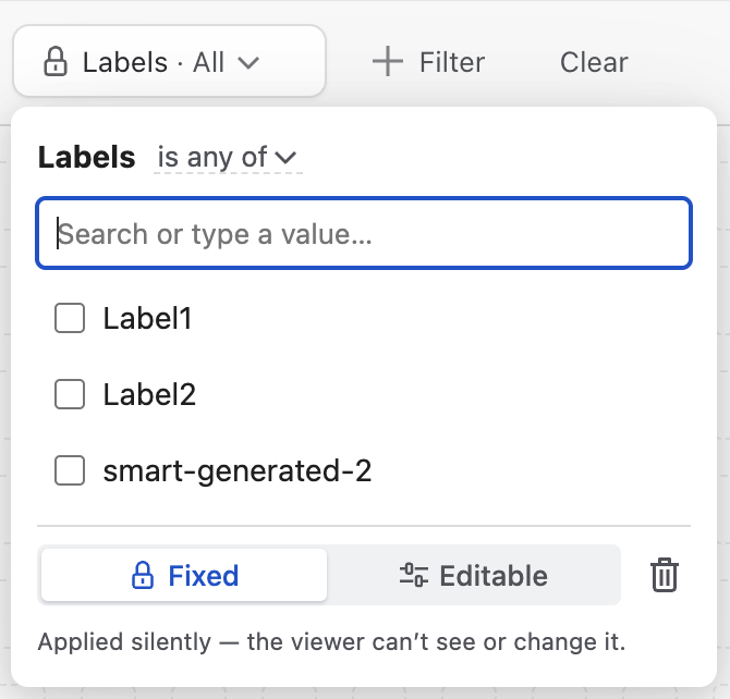
Click + Filter to add a filter on any field — system or custom. The field list comes from your Jira site's live field catalogue, so custom selects, user pickers, dates, numbers and text fields all work. Each filter is a chip; clicking it opens its editor.
Operators by field type
| Field type | Operators | Value input |
|---|---|---|
| Select-like | is any of · is none of · is empty · is not empty | Searchable multi-select fed by Jira's suggestions; free text can be added with Enter. |
| Date | on or after · on or before · between · is empty · is not empty | Date picker (two for between). |
| Number | = · ≠ · > · ≥ · < · ≤ · is empty · is not empty | Number input. |
| Text | contains · does not contain · is empty · is not empty | Text input. |
The Parent (epic) filter
Filtering on Parent narrows the whole dashboard to the children of chosen epics — pick a work item like you'd pick a sprint, not type a string. The picker lists the parents actually present in the dashboard's data (key + summary, busiest first, with live issue counts). Made editable, it turns the dashboard into an epic switcher for viewers.
Cascading (parent → child) selects
Cascading select fields get a special two-level picker whose options are distilled from the dashboard's own data, with live issue counts per value. Selecting a parent means "this parent, any child"; selecting a child matches the exact pair.
Fixed vs Editable — filters for viewers
Every filter has a visibility mode, shown as a small mark on the chip's left edge:
| Mode | Behavior |
|---|---|
| 🔒 Fixed | Applied silently. Viewers can't see or change it — it's simply part of the dashboard's definition. |
| ⚙ Editable | Exposed on the viewer's filter bar. Your value is the viewer's default; they can change it while viewing, and Reset restores your defaults. Viewer changes are never saved back to the dashboard. |
Clear at the end of the bar removes all field filters at once.
Data Concepts
All data-driven widgets share the same building blocks. Learn them once — they behave identically everywhere.
Values (metrics)
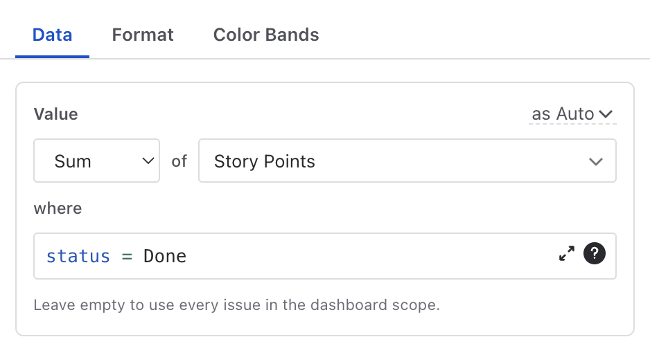
A value is defined as a readable phrase: “Sum of Story Points where status = Done”.
| Part | Options |
|---|---|
| Aggregation | Count · Sum · Average · Min · Max |
| Source | Any numeric field (custom fields included — Story Points, time tracking fields, vote/watcher counts) or a derived duration, see below. Count needs no field. |
| where (condition) | An optional JQL condition that narrows this value only
— always combined with the dashboard scope, never replacing it. Example: a Number counting
priority = Blocker issues inside whatever the dashboard shows. |
Derived durations
Beside stored fields, the source list offers three computed durations, each measured between two dates on the issue:
| Derived value | Measures | Typical use |
|---|---|---|
| Date difference | From one date field to another (default: Created → Resolved). | Cycle time, lead time: Average of Created → Resolved. |
| Age | From a date field to today. | How stale is the backlog: Max of Age (Created) = oldest issue. |
| Time until | From today to a date field. Negative = overdue. | Deadline pressure: Min of Time until Due date = nearest deadline. |
Formulas
Number, Text and Pivot Table widgets accept formula rows alongside plain values. A formula references other rows by their label in curly braces and supports arithmetic:
{Done} / {Count} * 100- Clickable chips under the formula input insert references — no need to type labels.
- Renaming a value automatically rewrites its references inside every formula (and inside Text widget bodies), so renames never break anything.
- Division by zero or a missing operand renders as “—”, never as a wrong number.
Display formats
Each displayed value carries a format, chosen inline in its editor:
| Type | Formats |
|---|---|
| Numbers | Auto (1,234.5) · Compact (1.2K) · Percent (42%) |
| Durations | Days · Hours · 3d 10h · 3d 10h 5m · 82h 5m |
Derived durations and Jira's time-tracking fields (Original Estimate, Time Spent, Remaining) format as durations by default. How many hours a displayed “day” contains is a dashboard setting (calendar 24h vs 8h workday).
Color bands (thresholds)
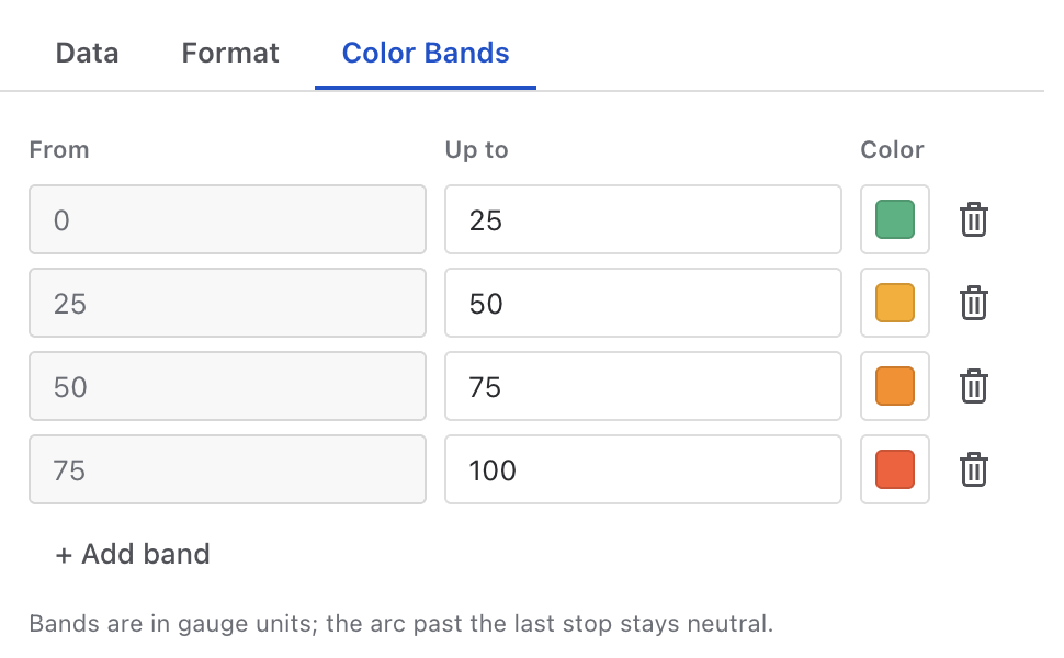
Number, Gauge, Battery and Progress Bar color their value through a free list of bands — each band is an end value and a color; a band starts where the previous one ends.
- Order the colors any way you like — green→red for “low is good”, red→green for completion. The direction comes from your color order, not a switch.
- Past the last stop the widget falls back to a neutral color, so out-of-range values are visible as such.
- With no bands defined, Gauge/Battery/Progress use the first color of the dashboard palette; a Number keeps the default text color.
How widgets read data
- All widgets on a dashboard share one base query — adding more widgets does not multiply API calls. Only values with their own where condition run a narrow extra query.
- The base fetch is capped at 2,000 issues. Beyond that, affected widgets show an orange warning icon in their title and a banner explains how to narrow the scope. Numbers may be partial until you narrow the scope or the filters.
- Zero is a value: a Number/Gauge/Battery over an empty result shows 0 (a real measurement). Series widgets (charts, lists) show a “no matching issues” state instead of an empty axis.
- If one widget fails or is misconfigured, only that tile shows an error card — the rest of the dashboard keeps working.
Widgets
The widget types, grouped by what they answer. Each widget's configuration lives in tabs shown in its side panel — the tables below walk through every setting.
Hierarchy
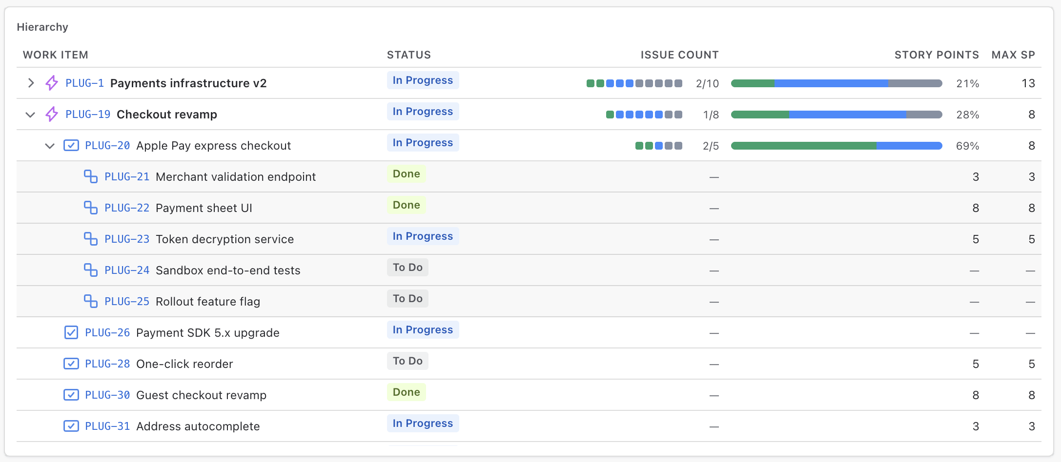
The epic → story → sub-task tree, with roll-up value columns. Every epic in scope is a row you can expand down to sub-tasks; columns are yours to compose — the row's own fields (Status, Assignee, a date) next to value columns that aggregate each row's subtree. The default setup shows Status, Assignee and a Progress bar per branch. The dashboard window filters the epic rows — an epic that shows always brings its whole tree, so a branch is never cut in half; sprint dashboards derive the tree from the sprint's issues.
Data tab
| Setting | Meaning |
|---|---|
| Columns | An ordered mix of two kinds. Field columns show the row's own attribute (status, assignee, dates — anything qualitative). Value columns are a metric — issue count, sum of Story Points, a derived duration — rolled up over each parent's subtree and shown as a Bar (status split + % done), Dots (one square per item), Fraction (done/total) or a plain number. Leaf rows show their own value. Numbers always live in value columns — the field picker deliberately offers no numeric fields. |
| Sub-tasks | Shown in the tree by default. With sub-tasks on, Roll up from picks the team's reading: Lowest level counts each branch at its deepest items (sub-tasks are real work), Stories & tasks keeps sub-tasks visible but out of every number (sub-tasks are a checklist). A story with sub-tasks always shows its own checklist bar either way. |
| Epics | Unresolved only (default) or all statuses, up to 100 epics in rank order; optionally include epics with no items. |
Format tab
| Setting | Meaning |
|---|---|
| Sort epics by | Rank order (default), one of the widget's value columns, Priority, or any date or numeric field. A bar, dots or fraction column ranks epics by % done, a number column by its total; pick highest or lowest first. Only the epics reorder — items keep their rank, and epics with no value sit at the bottom. |
| Expand by default | Collapsed, epics open (default), or the whole tree. |
| Search box | Off by default. When on, a quick find over keys and summaries — a view filter only: a parent that stays keeps its full numbers, so bars never change while searching. |
Reading the tree: the caret expands a branch; the issue key opens the issue in a new tab. Hovering a bar, dots or fraction shows the exact split with a total. The footer counts what the tree holds ("18 epics · 57 work items"; while searching, how many epics match). If very large scopes force a cut, whole branches are dropped and reported ("Showing N of M epics") — a rendered bar is never a partial count.
Number
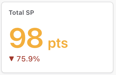
One number — a metric or a formula over several, with previous-period comparison. The classic KPI tile: issue counts, story point sums, average cycle time, SLA percentages.
Data tab
| Setting | Meaning |
|---|---|
| Values | A list of value rows (metric or formula). The row marked with the
eye is displayed; every other row exists as a formula operand. Example: rows
Done (Count where statusCategory = Done), Count, and a displayed formula
{Done} / {Count} * 100 = completion %. |
| Compare to previous period | None · % change (▲ 12%) · Difference (▲ 9) · Previous value (“was 33”). The baseline is the preceding equivalent of the dashboard window (This month → last month); on a sprint-based dashboard, the previous sprint. With All time there is no previous period, so no badge. |
| Lower is better | For % change / Difference: flips the badge colors so a drop shows green — right for bug counts, wrong for velocity. |
Format tab
| Setting | Meaning |
|---|---|
| Title | The tile's header text. |
| Prefix & suffix | Rendered around the value — $ 1,204
pts. Also applied to the badge's numbers (“was $33”), never to a %
change. |
Colors tab
Absolute-value color bands — the hero digits take the color of the band the value falls in; past the last stop the default text color returns.
Gauge
A radial value against a target, with color bands. Best for “how close are we” questions where the current level should be readable in half a second — SLA compliance, sprint completion, open-bug pressure.
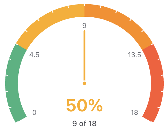
Data tab
| Setting | Meaning |
|---|---|
| Value | The gauge's current value — any metric, with an optional where condition. |
| Target | Fixed: a number you type. Dynamic: the same measure computed over a target condition — leave the condition empty and the target is the whole scope. That's the zero-config “% done” recipe: value = Count where status = Done, target = Dynamic, empty. |
| Minimum | The dial's start value (default 0). |
Format tab
| Setting | Meaning |
|---|---|
| Title | Header text. |
| Show value as | Value (raw units) or % of target. |
| Scale — value labels | Toggles the subtle scale labels inside the arc (and the segment gaps at band boundaries). |
Color Bands tab
Free band list. Band end values follow the display mode — percent of target when the gauge shows percent, gauge units otherwise — so the numbers you type are the numbers viewers read on the dial.
Battery
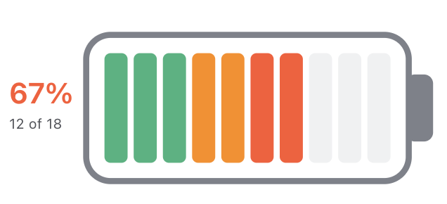
A single value filling toward a target. The same data model as the Gauge — value, Fixed or Dynamic target, color bands — rendered as a linear fill. Use it where a dial is too heavy: compact rows of team KPIs, capacity used, quota consumed.
Data tab
Identical to the Gauge: Value, Target (Fixed | Dynamic), Minimum.
Format tab
| Setting | Meaning |
|---|---|
| Show value as | % of target · Value. |
| Orientation | Horizontal · Vertical. |
Color Bands tab
Same free band list as the Gauge.
Progress Bar
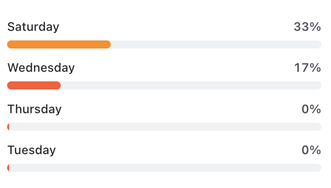
Completion per group, as filled bars against a target. One measure split into rows by a field — % done per epic, per assignee, per component. Not a bar chart: every row runs on the same 0–100 track, so rows are comparable as progress, not as raw size.
Data tab
| Setting | Meaning |
|---|---|
| Value | The numerator. Its where condition defines what counts as “completed” — e.g. Count where statusCategory = Done, or Sum of Story Points where status = Done. |
| Group by | The field that splits the rows — Epic, Assignee, Component, any categorical field. Rows appear and disappear with the data. |
| Target | Ratio in group (default): each bar fills to its value ÷ the whole group — the classic completion ratio. Fixed: one constant target applied to every row (e.g. 10 issues per person). |
Format tab
| Setting | Meaning |
|---|---|
| Show value as | % complete · Value / target. |
| Max bars | Cap on rendered rows (default 12). |
Color Bands tab
Bands are always in percent — rows carry different targets, so completion is the only scale comparable across rows.
Pie / Donut
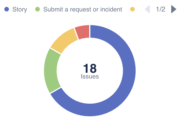
Share of a whole — pie, donut or half donut. One measure split by one field: issues by type, story points by team, tickets by priority.
Data tab
| Setting | Meaning |
|---|---|
| Value | Any metric (with optional where). |
| Slice by | Each value of this field becomes one slice. Status category slices always wear Jira's own colours (Done green, In Progress blue, To Do gray); every other field follows the dashboard palette. |
| Fold small slices | Top N (default 8): keep the N biggest. Under % (default 3%): fold every slice below the share threshold — the better guard on skewed data. Folded slices merge into a neutral gray “Other”. |
Format tab
| Setting | Meaning |
|---|---|
| Shape | Pie · Donut · Half donut (saves vertical space — strong in small tiles). |
| Centre shows | Donut/half only: Total · Largest slice (name + share — “mostly Done” at a glance) · Nothing. |
| Slice labels | Off · % · Value. Labels sit inside slices and hide below 5% share (the tooltip always has the exact numbers). |
Slices are always ordered largest-first, clockwise from 12 — a reading convention, not a setting.
Bar
Compare a measure across categories or time. The workhorse: issues by status, story points by assignee, created per month.
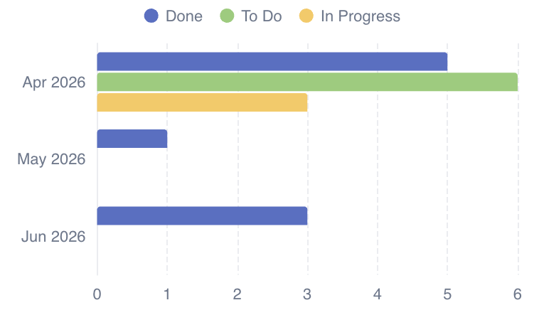
Data tab
| Setting | Meaning |
|---|---|
| Value | Any metric (with optional where). |
| X axis | A category field (Status, Assignee, Labels…) or a date field (Created, Resolved, Due, custom dates). Date fields add a bucket control: Auto · Day · Week · Month · Quarter · Year. Auto follows the dashboard period's granularity. |
| Compare to previous period | Show previous period behind draws the preceding window's bars — faint, in the same color — beside the current ones. On a time axis, buckets pair by position (this month's week 1 vs last month's week 1); on a category axis, the previous value of each current category. Same baseline as the Number's badge: the preceding equivalent of the dashboard window, or the previous sprint; with All time there is no previous period, so no overlay. |
With a date X axis other than the dashboard's anchor date (Created by default), the widget binds the dashboard window to that field — X = Resolved gives true throughput.
Format tab
| Setting | Meaning |
|---|---|
| Orientation | Vertical · Horizontal (horizontal suits long category labels). |
| Order | Category axis only: By value · A → Z. |
| Max groups | Category axis only: the biggest groups get a bar, the rest fold into “Other” (default 12). |
| Labels | Show values on bars. |
Grouped / Stacked Bar
Bars split by a second field — stacked, side by side, or 100%. Two dimensions in one chart: created per month by status, workload per assignee by issue type.
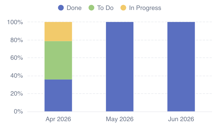
Data tab
Everything the Bar has — except the previous-period overlay, which the second dimension rules out (segments × two periods is unreadable) — plus:
| Setting | Meaning |
|---|---|
| Stack by | Each value of this field becomes one segment/series of the bar. Status category segments always wear Jira's own colours (Done green, In Progress blue, To Do gray) regardless of the dashboard palette; splitting by Parent compares epics inside each bar. |
Format tab
| Setting | Meaning |
|---|---|
| Bar layout | Stacked — totals plus composition. Side by side — direct series-to-series comparison. % of total — composition only; tooltips show both percent and raw value. |
| Max series | The biggest series stay, the rest fold into “Other” (default 8). |
| Orientation / Order / Max groups / Labels | As in the Bar widget. |
Line
A trend over time, optionally split into series. Created-vs-resolved trends, priority mix over time, average cycle time per week.
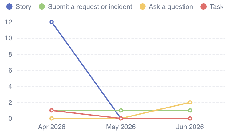
Data tab
| Setting | Meaning |
|---|---|
| Value | Any metric. |
| X axis | Usually a date field with a bucket (Auto · Day…Year); category fields also work. |
| Split into series | Optional — each value of this field becomes its own line. |
| Compare to previous period | Show previous period behind adds the preceding window as a dashed, faint line in the same color — as in the Bar. Not available while the chart is split into series: one measure across two periods stays readable, many series across two periods doesn't. |
Format tab
| Setting | Meaning |
|---|---|
| Fill the area under lines | Turns the line into an area chart — same data, cosmetic fill. |
| Max series | When split into series (default 8, rest fold into “Other”). |
Empty buckets are honest. For Count/Sum an empty bucket plots 0 — a real measurement. For Average it plots a gap instead of inventing a trend through missing data.
Treemap
A nested hierarchy sized by a metric, colored by branch or by heat. Where is the work concentrated: Project → Epic → Status, sized by issue count, colored by average age.
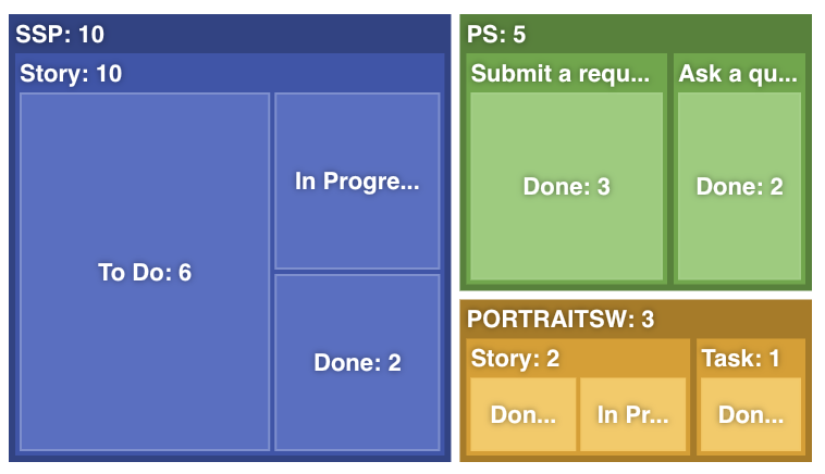
Data tab
| Setting | Meaning |
|---|---|
| Hierarchy | An ordered list of categorical fields — each is one nesting level, top-to-bottom = outer-to-inner. Add as many levels as your data can carry. |
| Size by | The metric that drives tile area (Count, Sum of Story Points…). |
| Colour by | None: each top-level branch takes its own palette color. Metric: a second measure (Count / Sum / Average of a field) drives a light→dark heat ramp toward a color you pick — e.g. tiles darken with average issue age. Heat is normalized globally, so colors compare across branches; parent strips show their branch's aggregate heat. |
Format tab
| Setting | Meaning |
|---|---|
| Tile order | Largest first · Smallest first. |
| Hierarchy | All levels at once (static, everything visible) or Drill-down showing one or two levels per view — click a tile to open what's inside it, climb back with the breadcrumb. Best for 3+ level hierarchies. |
| Max groups per level | The biggest groups render as tiles; the tail folds into an “Other” tile (which still contains its sub-levels). Default 12. |
| Labels | Toggle the parent name strips on branch tiles. |
Pivot Table
Rows × columns × measures — exact numbers with totals. The precision instrument: story points by assignee and month, counts by component × priority, late-delivery rates per team.
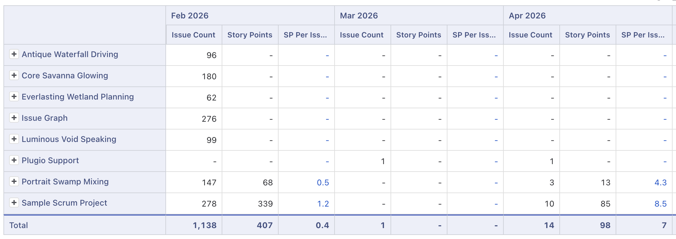
Layout tab
| Setting | Meaning |
|---|---|
| Rows | One or more fields, each a nesting level (top-to-bottom = outer-to-inner). Date fields appear as bucketed variants — Created · Month, Resolved · Quarter — so the picker itself chooses the bucketing. Day-of-week and month-of-year variants enable seasonal breakdowns. |
| ⇅ Swap rows & columns | One click transposes the table. |
| Columns | Optional, also multi-level. Without columns the table shows one value column per measure — a grouped summary table. |
Values tab
An ordered list of measures — each renders as one value column (drag to reorder = reorder columns). Two kinds of rows:
- Value rows — the standard metric phrase (Count / Sum / Average / Min / Max
of a field or derived duration), plus an optional if-condition: count only
issues where one field compares to another —
Resolved after Due date,Time Spent > Original Estimate, things plain JQL cannot express. - Formula rows — reference other measures by label:
{Late} / {Count} * 100.
- The eye hides a measure's column while keeping it computed — perfect for formula operands that shouldn't clutter the table.
- Labels auto-derive from the definition and stay short (they're column headers); rename them inline, and formulas rewrite themselves.
Format tab
| Setting | Meaning |
|---|---|
| Table style | Drill-down: groups start collapsed and expand with +/− (rows and columns both). Flat: every level open — a standard grouped table. |
| Totals | Row totals (Total column) and column totals (Total row), independently toggleable. Totals compute over the underlying issue set — an Average total is the true average, not an average of averages. |
Large tables scroll inside the tile with sticky headers and sticky dimension columns.
List
A ranked issue list — top N by any field. Not a query result page: a deliberate short slice. The 10 oldest open bugs, the 5 highest-priority tickets, the most recently resolved work.
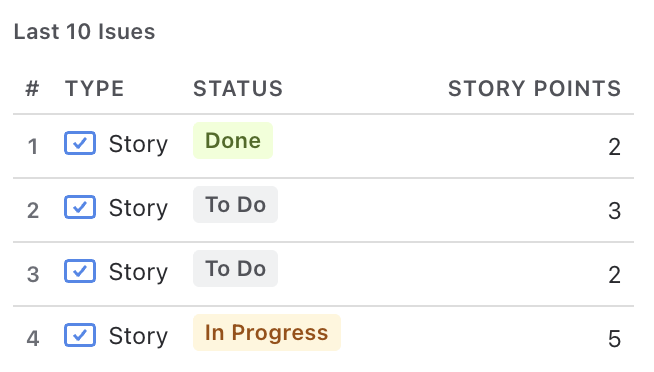
Data tab
| Setting | Meaning |
|---|---|
| Columns | Any discovered fields (custom included), ordered — top-to-bottom in the editor = left-to-right in the tile. |
| Rank by | The ranking driver — any date or numeric field (plus Priority), with a readable direction: Newest / Oldest first for dates, Highest / Lowest first for numbers. It doesn't have to be a visible column. Issues with an empty rank field are excluded — a “top 10 by Story Points” never pads with blanks. |
| Extra filter | Optional JQL AND-ed with the dashboard filters — one list can show only bugs while the rest of the dashboard shows everything. |
Format tab
| Setting | Meaning |
|---|---|
| Max rows | The N of top-N (default 10). |
| Rank | Show rank numbers (#1, #2…). |
Clicking a row opens the issue in Jira.
Breakdown
Rows of any field with a stacked split and drill-in — the pivot's data as a scannable list. The default setup is workload — one row per assignee with a Done / In Progress / To Do bar over the dashboard window — but rows and segments are free: components by priority, statuses by type. Looking for epic progress? That lives in the Hierarchy widget.
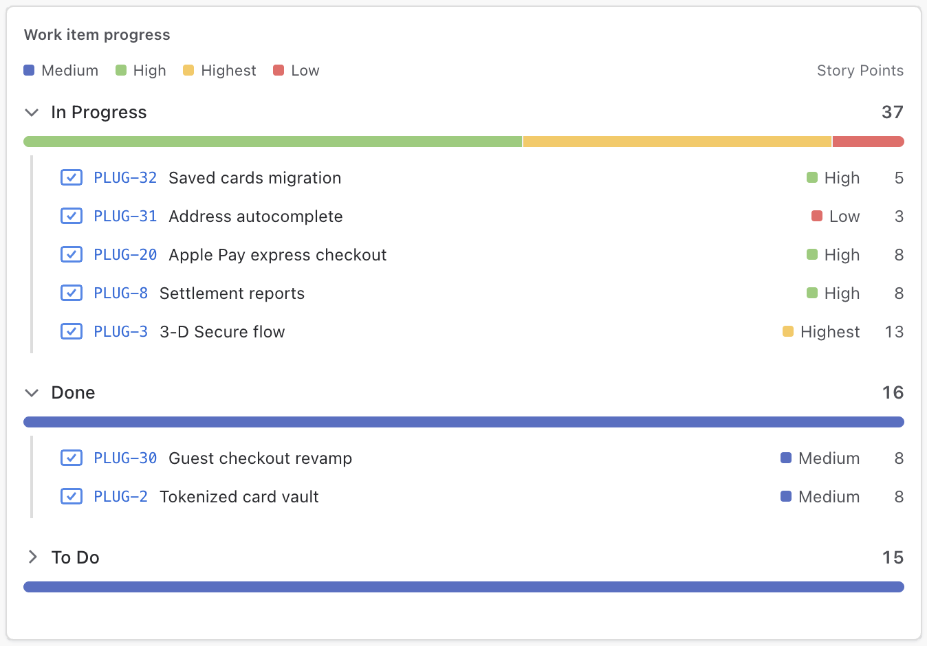
Data tab
| Setting | Meaning |
|---|---|
| Value | Any metric — issue count, sum of Story Points, a derived duration — with an optional where condition. The legend names the measure — “avg Story Points”, “work items” — so a row's number never depends on remembering the configuration. |
| Rows | Each value of this field becomes one row. |
| Split each bar by | Status category (default) shows Done / In Progress / To Do in Jira's own colours and adds the % complete figure; any other field splits the bar in the dashboard palette. |
Format tab
| Setting | Meaning |
|---|---|
| Max rows | Cap on rendered rows (default 15). |
Drill-in: clicking a row expands the work items behind it. Each item line carries the type icon, the key (linking to the issue), the summary, and one badge: the status when the bar is split by status category, or a chip naming the item's segment when it is split by any other field. When the metric measures a field, the item's own value sits at the end of the line — an item that doesn't carry the field shows a dash and stays out of averages rather than counting as zero. Hovering a bar shows the split and the total. If the row list ever has to be cut (very large scopes), whole rows are dropped and reported — a rendered bar is never a partial count.
Text
A markdown note — with live values woven into the text. Section headings, explanations, and one-line summaries that update with the data.
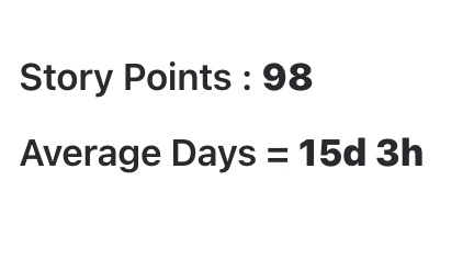
Content tab
| Setting | Meaning |
|---|---|
| Text | Markdown subset: # headings, **bold**,
*italic*, lists, links, --- dividers. Raw HTML renders as plain
text (by design — no injection surface). |
| Values | The same value/formula list as the Number widget. Reference any row in
the text as {Label} and it renders as the live number, following every
dashboard filter. |
Conditional text
Text can change with the data:
{if {Done} >= {Target}}✅ On track{else}⚠️ Behind — {Remaining} issues left{end}- Operators:
> >= < <= = !=; conditions can nest. - Compare values against each other, against plain numbers, or against durations like
5d,4h 30m. - Broken syntax stays visible as plain text — a typo never blanks the widget.
A heading-only Text widget costs zero API calls, and the widget renders without the standard header chrome — the content is the heading.
Dashboard Settings
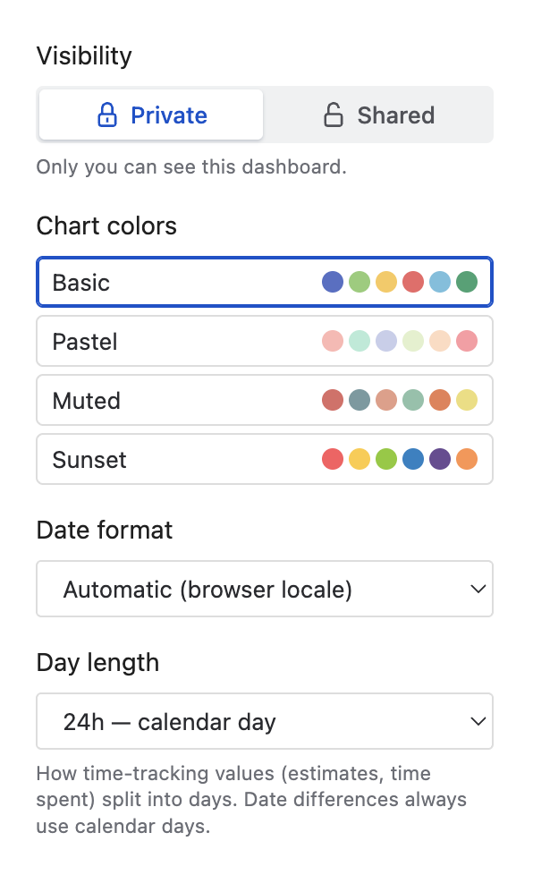
The toolbar's Settings gear opens dashboard-level options — one choice that every widget follows:
| Setting | Meaning |
|---|---|
| Visibility | Private — only you can see the dashboard. Shared — everyone on the site can view it (see Sharing & Viewing). |
| Chart colors | One categorical palette — Basic, Pastel, Muted, Sunset — applied to every chart widget (Pie, Bar, Line, Treemap…). No per-widget palette juggling; the dashboard stays coherent. |
| Date format | How full dates render in lists and day-level labels: browser locale (default), 15/07/2026, 07/15/2026, 2026-07-15, or 15 Jul 2026. |
| Day length | How time-tracking values (estimates, time spent) split into displayed days: 24h calendar day, or 12/10/8/6-hour workdays. Display-only — date differences always measure calendar time. |
Sharing & Viewing
Set a dashboard to Shared and anyone on the site can open it (and the gadget can display it). What viewers get:
- Read-only layout — only the owner can edit widgets, layout or saved filters.
- Their own data visibility — all queries run with the viewer's Jira permissions. A viewer without access to a project simply doesn't see its issues.
- Live controls for what you chose to expose: the period (or sprint) picker and every Editable field filter are functional. Viewer changes are ephemeral — Reset returns to the author's defaults, and nothing is saved back.
- Scope transparency: a locked chip names the dashboard's bound (e.g. “PLG, WEB”); its popover lists everything the owner fixed.

Author tip: build dashboards so the filters viewers will actually want to flip — assignee, team, component — are Editable, and everything that defines the dashboard's meaning stays Fixed. One dashboard then serves the whole team instead of one copy per person.
Adding a Dashboard to a Jira Dashboard (Gadget)
Plugio Suite ships a companion gadget — Plugio Suite Dashboard — that renders a saved Suite dashboard inside a native Jira dashboard, so the team meets your dashboard where they already look every morning.
- 1 Open (or create) a native Jira dashboard and click Add gadget.
- 2 Search for “Plugio Suite Dashboard” and add it.
- 3 In the gadget's edit mode, pick one of your saved dashboards from the dropdown — a live preview renders below so you see exactly what you're placing.
- 4 Click Save.
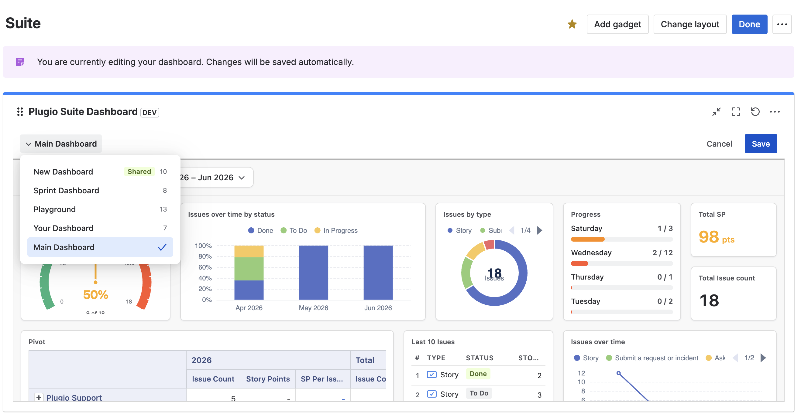
- The gadget renders the dashboard read-only, with the same viewer experience as the full page: editable filters and the period/sprint picker work, layout editing doesn't.
- Authoring always happens in the full-page app — changes you save there appear in the gadget automatically.
- To share via the gadget, the dashboard itself must be Shared — a private dashboard stays visible to its owner only.
Troubleshooting
“Choose a scope” — the canvas is empty
Every dashboard needs a bounding scope (projects, JQL or a board) before it fetches data. Open the scope chip and set one.
Orange warning icon in a widget title
The dashboard's scope matched more than 2,000 issues, so results were truncated and numbers may be partial. Narrow the scope (fewer projects, shorter window, tighter filters) until the warning disappears.
A widget shows “configure” instead of data
The widget is missing a required setting (e.g. a Progress Bar without a Group by field). Open its ⚙ settings — the panel highlights what's needed.
A widget warns about a missing field
The widget references a field that doesn't exist on this site (common when a dashboard was built against another instance, or a custom field was deleted). Re-pick the field in the widget's settings. The rest of the dashboard is unaffected.
“No sprints” on a sprint-based dashboard
The bound board has no sprints (or no active sprint and no pinned one). Pick a sprint in the sprint chip, or bind a different board in the Scope dialog.
Numbers differ from a Jira filter I ran
Remember the layered filters: scope and time window and field filters and the widget's own where condition all apply together. The most common surprise is the time window — set the period to All time to compare against an unwindowed JQL result. Also check the period's anchor date on the chip: a dashboard anchored to Resolved excludes every issue without a resolution date.
A viewer sees different numbers than I do
By design: queries run with the viewer's own Jira permissions. If they can't see a project, its issues aren't in their numbers.
Support
Questions, feedback or a feature request? We answer fast.
Email: [email protected]