
Report Cards & Charts Documentation
Report Cards & Charts for Jira Dashboards puts a whole grid of KPI cards in one dashboard gadget. Each card has its own project, JQL filter, date field and measure, and comes in one of six shapes — a plain Metric, a Trend with sparkline and ▲/▼ delta, a Progress bar toward a fixed or JQL-driven target, a Distribution donut, a two-value Comparison, or a short issue List. All cards read one shared period — this month, last 4 weeks, a custom range — chosen from a picker that viewers can flip on the dashboard.
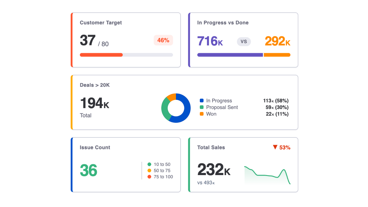
Data & permissions. Cards read issues with the Jira REST API in the context of the person viewing the dashboard — everyone sees only what their permissions allow. Nothing is written to Jira and nothing leaves your site.
Getting Started
- 1 On a Jira dashboard, Add gadget → Report Cards & Charts, then ··· → Configure.
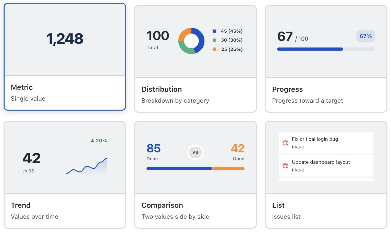
- 2 Click + Add Card in an empty slot and pick a card type from the gallery.
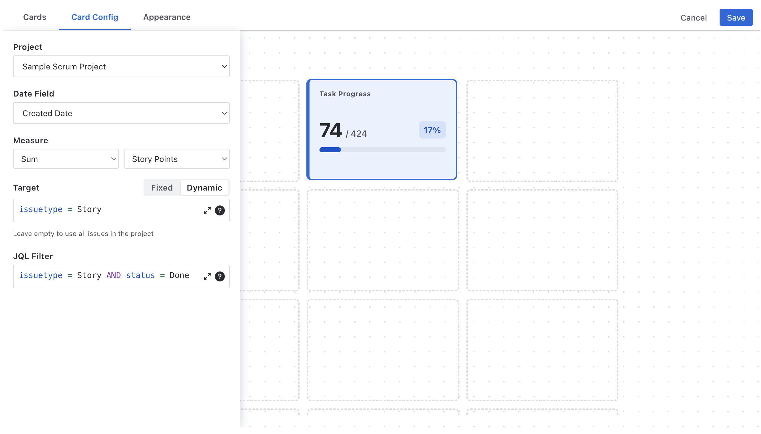
- 3 In Card Config, choose the project, the date field the period applies to, the measure, and an optional JQL filter.
- 4 Name and colour the card in the Cards panel; drag it to the slot you want.
- 5 Set the period in the picker above the grid, then Save.
The Editor
| Panel | What it does |
|---|---|
| Cards | The card list: colour swatch, editable title, hide/show, delete, + Add Card. A ⚠ marks a card that doesn't fit the current grid. |
| Card Config | Data settings of the selected card — appears when a card is selected. See Card Configuration. |
| Appearance | Grid dimensions, card height and number format for the whole gadget. |
| Save / Cancel | Save writes the configuration; Cancel discards changes. |
Grid & layout
| Setting | Meaning |
|---|---|
| Grid Dimensions | Rows × columns, up to 5×5 (default 4×4). Every slot is a fixed-width column, so the grid stays legible at any dashboard width. |
| Card Height | Normal or Large rows. |
| Number Format | 14.3K (compact) or 14,312 (full), for every card. |
Card footprints follow the type: a List card takes 2×2 slots, a Distribution card 2×1, everything else 1×1. Drag cards between slots; a card that would overlap or overflow is refused. If a card no longer fits after you shrink the grid, a banner says so and the card waits (hidden) until there is room.
The period picker
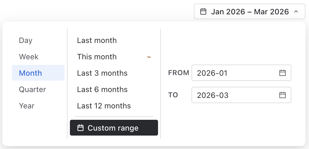
The picker above the grid sets the window every card reads. Pick a granularity — Day, Week, Month, Quarter, Year — and a preset for it, or a custom range:
| Granularity | Presets |
|---|---|
| Day | Yesterday · Today · Last 7 days · Last 14 days · Last 30 days |
| Week | Last week · This week · Last 4 weeks · Last 8 weeks |
| Month | Last month · This month · Last 3 months · Last 6 months · Last 12 months |
| Quarter | Last quarter · This quarter · Last 2 quarters · Last 4 quarters |
| Year | Last year · This year |
Presets that include today carry a ~ badge — "current period, may be incomplete".
The window is applied to each card's own Date Field, so one card can count
issues created this month while the next counts issues resolved this month.
Viewers can change the period on the dashboard; their choice is not saved back, and the gadget
reopens on the period you saved.
Card Configuration
Every card shares these settings; card types add their own (below).
| Setting | Meaning |
|---|---|
| Project | The project the card reads. Required. |
| Date Field | Which date the period windows on — Created, Updated, Resolved, Due Date, or any custom date field. |
| Measure | Count, or Sum / Min / Max of a numeric field (Story Points, estimates, time spent, custom numbers). |
| JQL Filter | Optional, in Atlassian's JQL editor with autocomplete. Combined with the project and the period. |
| Title & colour | Set in the Cards panel. The colour drives the card's accent stripe, sparkline and progress bar; eight presets plus a custom colour, or None. |
Card Types
Metric
One big number for the period. Add Color Rules — Min, Max, colour, first match wins, blanks are open-ended — and the number takes the colour of its band, with a small legend beside it.
Trend
The period's value, "vs" the previous period's value, a ▲/▼ percentage delta in the header, and a sparkline over both periods. The only card with a comparison badge; see How Period Comparison Works.
Progress
value / target, a percentage badge and a bar. Target is Fixed (a number) or Dynamic — a second JQL whose result, with the same measure and period, becomes the target. Leave the dynamic JQL empty to use all issues in the project: "resolved this month over created this month" is one card.
Distribution
The period's issues broken down by a Group By field — status, priority, type, assignee, any select — as a donut plus a legend with value and share, largest first. Two slots wide.
Comparison
Two values side by side — Part A and Part B, each with its own label and JQL, sharing project, date field and measure — with a tug-of-war bar in between. Bugs vs. stories, done vs. total, us vs. them.
List
A short issue list — Max Items (default 3), ordered by your JQL's
ORDER BY. Five Row Layout presets choose what sits beside the
summary: type icon, status lozenge, assignee avatar, priority icon. Clicking a row opens the
issue. Two by two slots.
How Period Comparison Works
Trend cards compare the selected period with the immediately preceding window of the same
length, measured in the picker's granularity: This month vs. last month,
Last 4 weeks vs. the four weeks before, Last 30 days vs. the 30 days before
that. The delta is (current − previous) / previous; a previous value of zero shows as
▲ 100%, no change as —.
Because a "This …" preset is a partial window, early-in-the-period deltas look bad against a full previous window. Use "Last …" presets for like-for-like trends.
The sparkline buckets both windows by the granularity — days for Day presets, weeks for Week presets, and so on — so a Trend card set to Last 12 months shows 24 monthly points.
Formatting & Colours
- Compact format writes 14,312 as 14.3k and 1,500,000 as 1.5M; values below 10,000 always print in full.
- Percentages (progress badge, distribution shares, deltas) are whole numbers.
- Distribution slices use a fixed six-colour palette so shares are distinguishable regardless of the card colour.
- The gadget follows Jira's light and dark mode.
Troubleshooting
A card shows "Not configured"
Its measure is Sum / Min / Max but no numeric field is selected. Open Card Config and pick one.
A card shows 0 or "No data" although the JQL matches issues
Remember the period: the window is applied to the card's Date Field. A card on Resolved shows nothing for issues that aren't resolved; a card on Created windows by creation date even if your JQL is about resolution. Also check that the project is set — a card without a project matches nothing.
The Trend delta looks wrong on the first days of a month
See How Period Comparison Works — a partial "This month" is compared with a full "last month". Use "Last month" or "Last 4 weeks".
Some cards vanished after I changed the grid size
They no longer fit; the banner above the grid says which. Enlarge the grid or hide other cards.
Data isn't refreshing
Cards query Jira when the gadget loads and whenever the period changes. Reload the dashboard for fresh numbers.
Support
Questions, feedback or a feature request? We answer fast.
Email: [email protected]