
Plugio Panels Documentation
Jira's work item view shows the item, not the work around it: the progress bar counts issues, linked work is a flat list, nothing adds up. Plugio Panels — Progress, Charts & Related Issues for Jira fixes that by putting live, configured widgets — story point roll-ups, a progress tree, KPI tiles, charts, a matrix, related work by link type — on the work item itself. A project admin builds a panel once — a set of widgets with their sources, formats and color rules — targets it at a work item type, and from then on everyone on the team sees it on every matching work item, with no action of their own.
Panels render on two surfaces: the sidebar in the right column of the work item (compact widget forms, always visible) and the wide panel in the main column (large forms — full tables, trees, grids and date strips). Each widget belongs to exactly one surface, so the compact and the wide reads are designed separately rather than squeezed.
Every widget reads either the work item you are on — its fields, dates, status history, where it sits in the hierarchy — or a set of work items around it: subtasks, children, the full hierarchy, linked work items, or any JQL query.
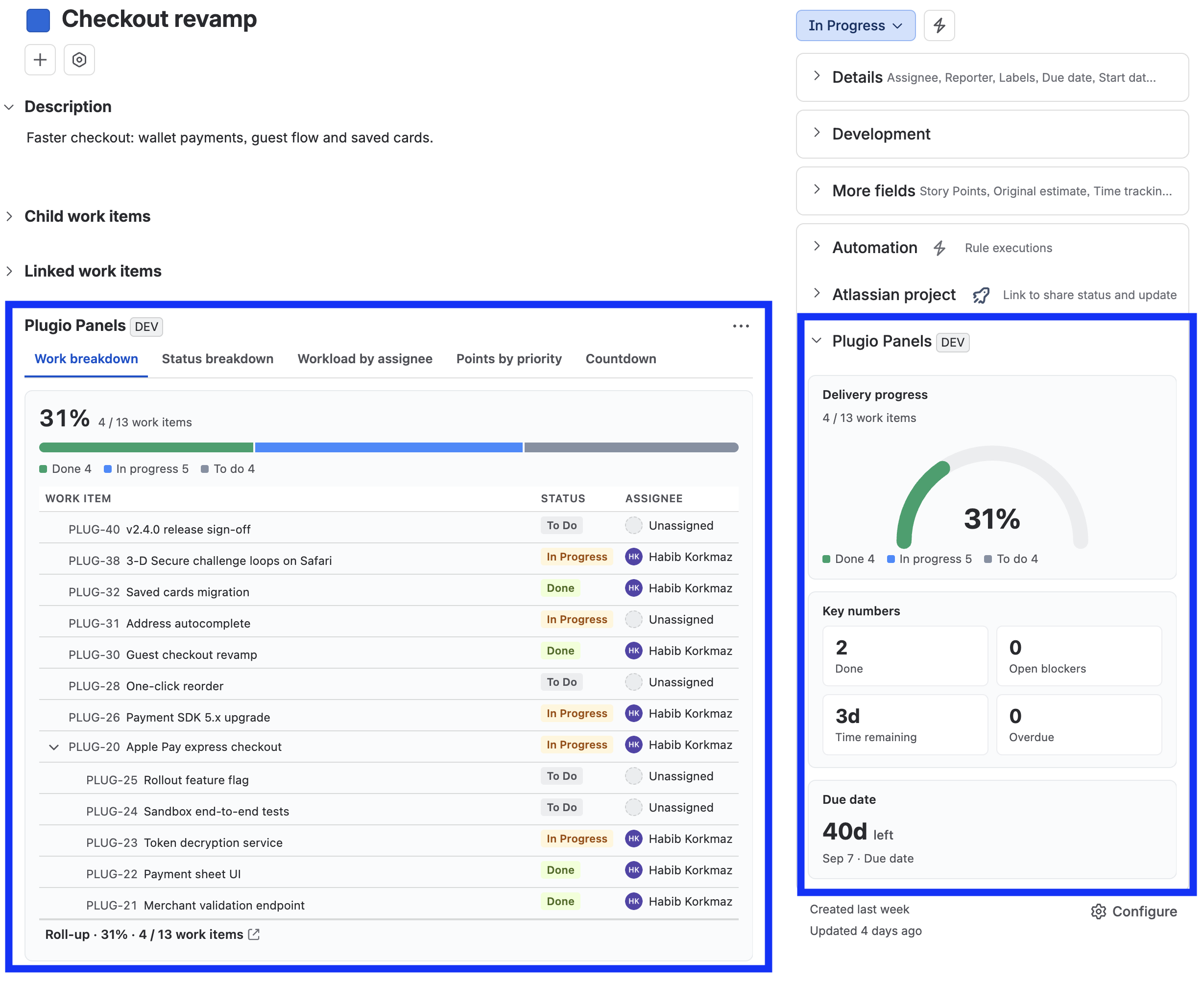
Data & permissions. Plugio Panels reads work items with the Jira REST API in the context of the person viewing the work item. Everyone sees only what their own Jira permissions allow — a panel never exposes work items the viewer couldn't already open. Nothing leaves your Jira site.
Installation & Setup
Setup is five steps, and two of them are one-time-only. Read this section in order — the wide panel in particular needs one deliberate click that is easy to miss.
1 · Install the app
- 1 Install Plugio Panels from the Atlassian Marketplace, or from Settings → Apps → Find new apps in your Jira site.
- 2 No global configuration is needed. Panels are configured per project, by that project's admins.
Nothing appears yet — that is deliberate. In a project with no panels configured, neither the sidebar section nor the app's entry in the work item's Apps menu is shown at all. The surfaces appear the moment a project has its first saved panel.
2 · Open the config screen
All configuration lives inside the project, so you never leave the project you are configuring:
- 1 Open the project.
- 2 Go to Project settings (left sidebar, at the bottom).
- 3 Choose Apps → Plugio Panels.
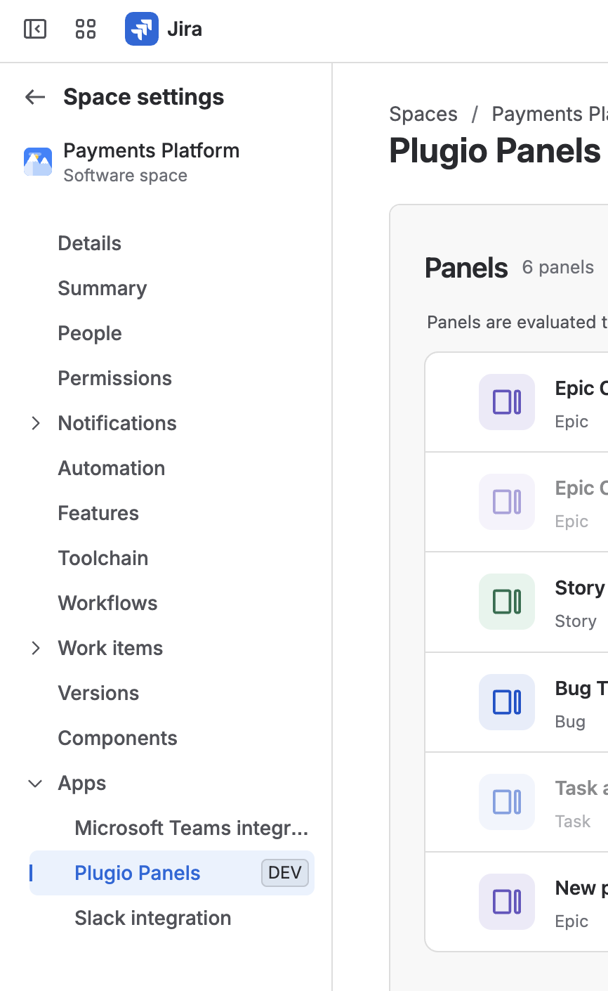
Who can configure panels? Only project administrators. Panel definitions are stored as a project property, and Jira itself enforces the write permission — there is no separate app-level permission to manage.
3 · Build your first panel
The first time you open the screen the project has no panels, so the page shows the empty state:
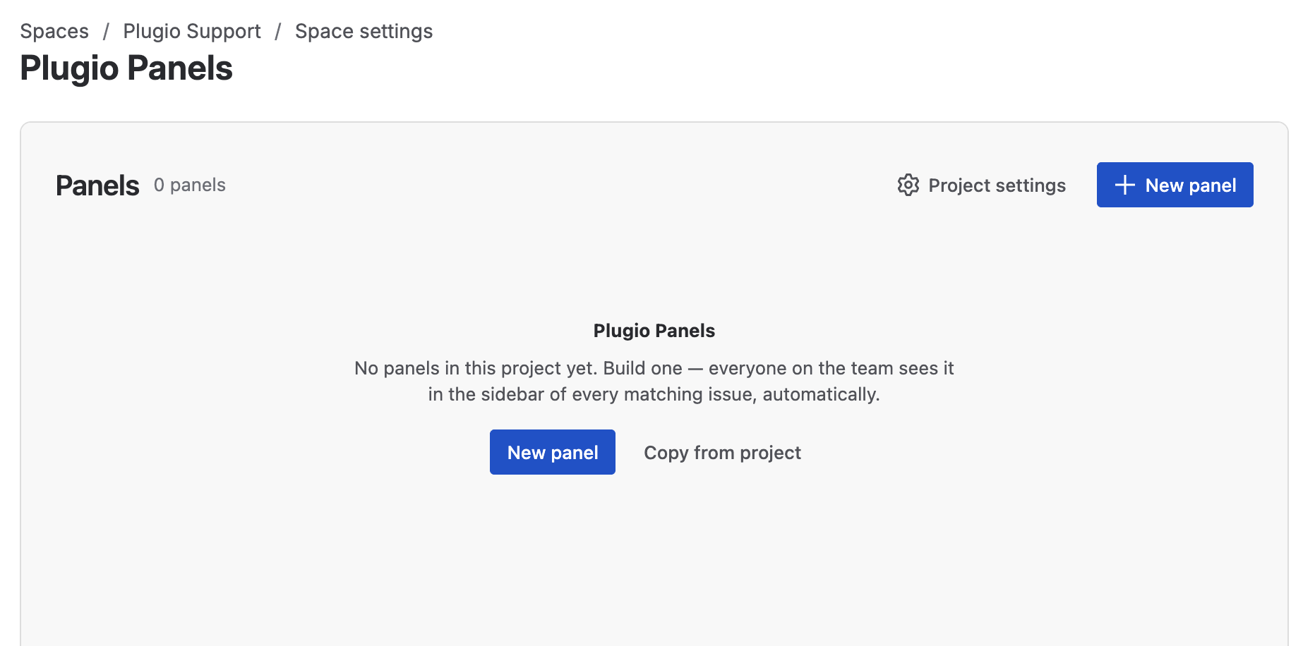
- 1 Click New panel. The template gallery opens.
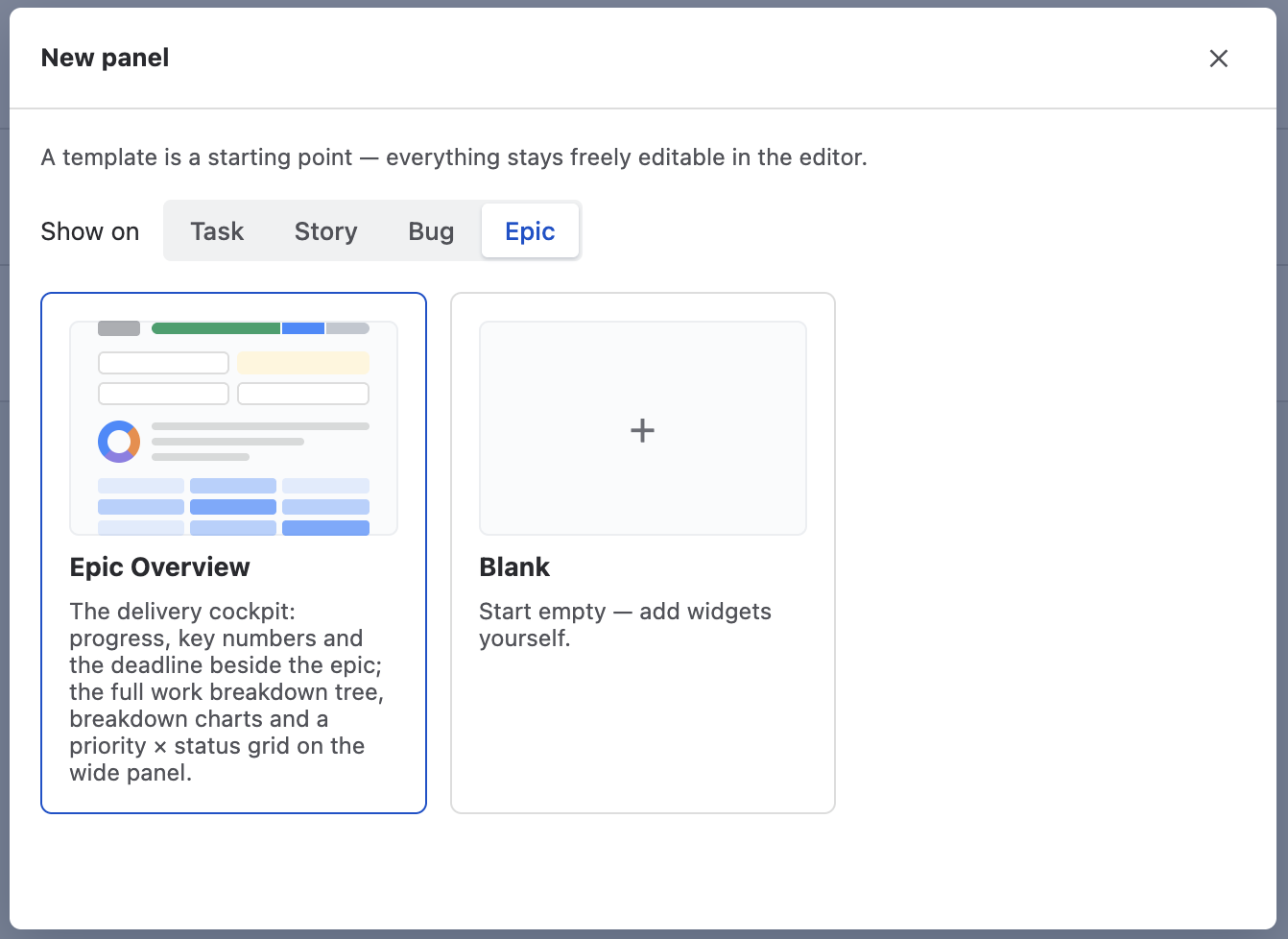
- 2 Under Show on, pick the work item type this panel is for — the list is your project's real types, custom types included.
- 3 Pick a template. Each one fills both surfaces with a widget set that makes sense for that type; Blank starts empty. A template is only a starting point — everything stays freely editable.
- 4 The editor opens with the panel pre-filled and a real work item from your project loaded into the preview. Adjust widgets, add or remove them, drag them between the two zones.
- 5 Click Save.
4 · The sidebar — no further setup
The sidebar surface needs nothing after the save. Open any work item of the targeted type and the Plugio Panels section is there in the right column, below Details, for every user. There is no per-user action, no Apps button, no opt-in.
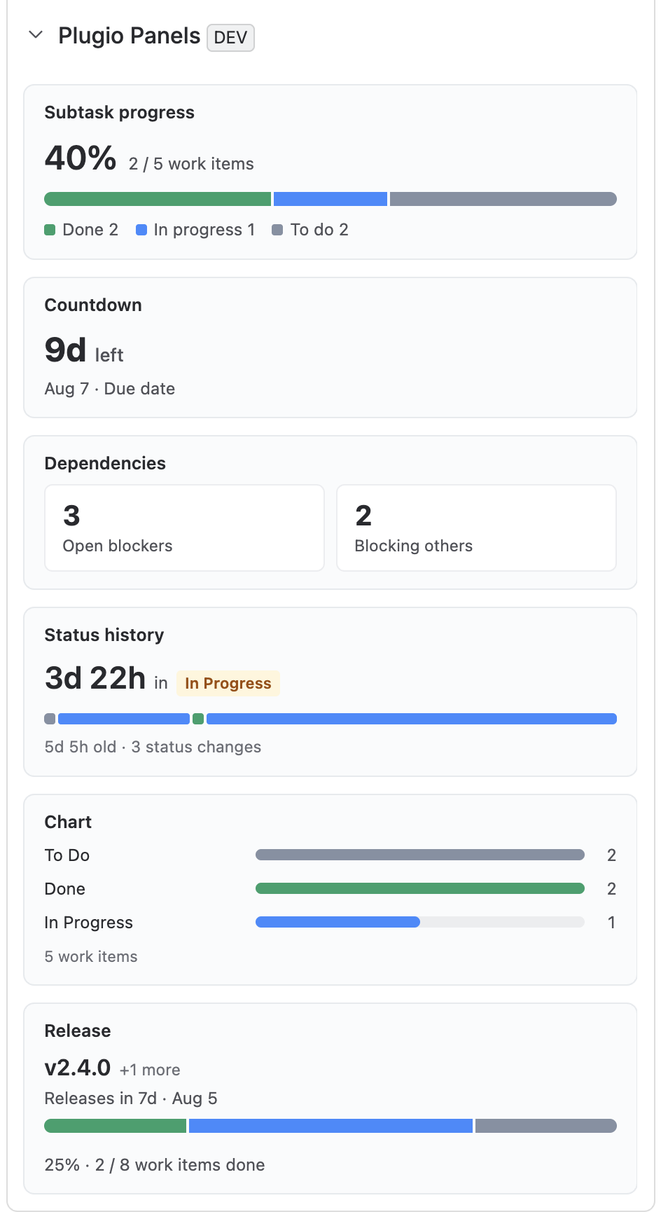
Just saved and still nothing? Jira caches the condition that decides whether an app surface exists on a project for a short while. After a project's first save, reload the work item page once.
5 · The wide panel — one-time setup, then permanent for everyone
The wide panel lives in the main column of the work item, and Jira requires it to be added once per project. This is the step people miss — do it right after your first save and the panel is then permanent for the whole team.
- 1 Open any work item of the type your panel targets.
- 2 Click the Apps button in the work item's action bar and choose Plugio Panels. The panel appears in the main column, below the description.
- 3 This is the important part. Open the panel's ••• menu and choose Show for all work items.
- 4 Done — the wide panel now renders on every work item, for every user in the project. Nobody else has to touch the Apps button.
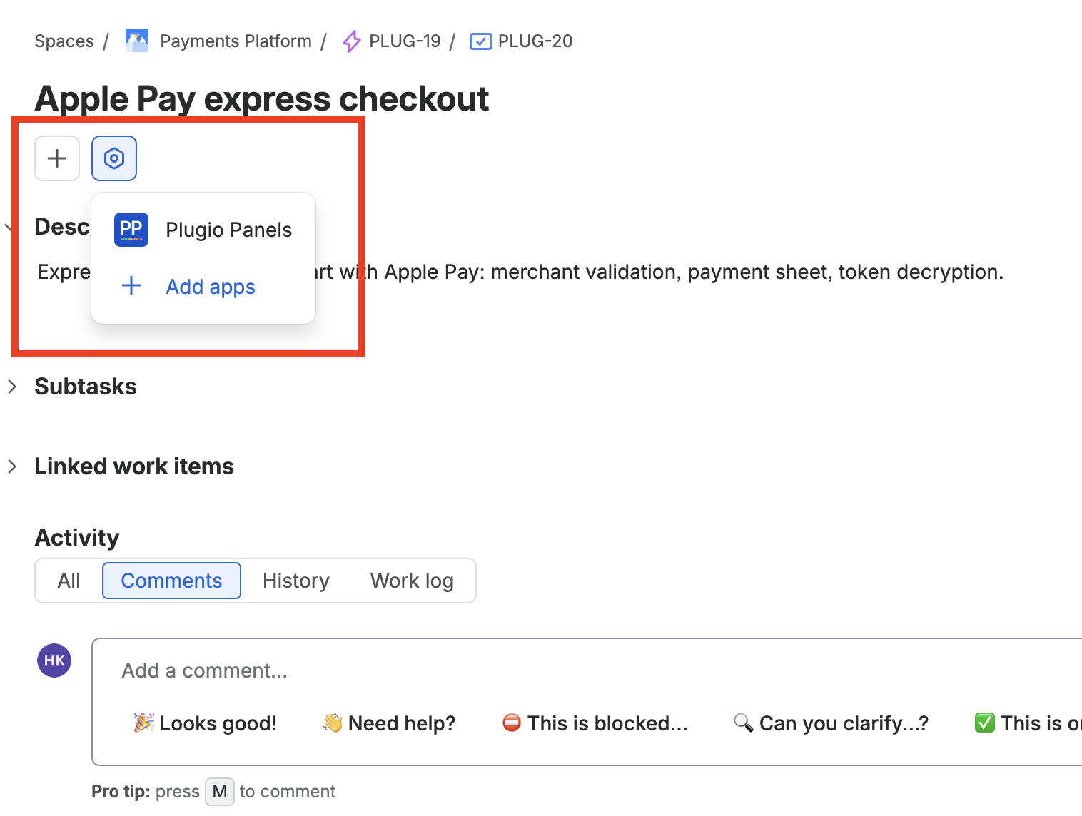
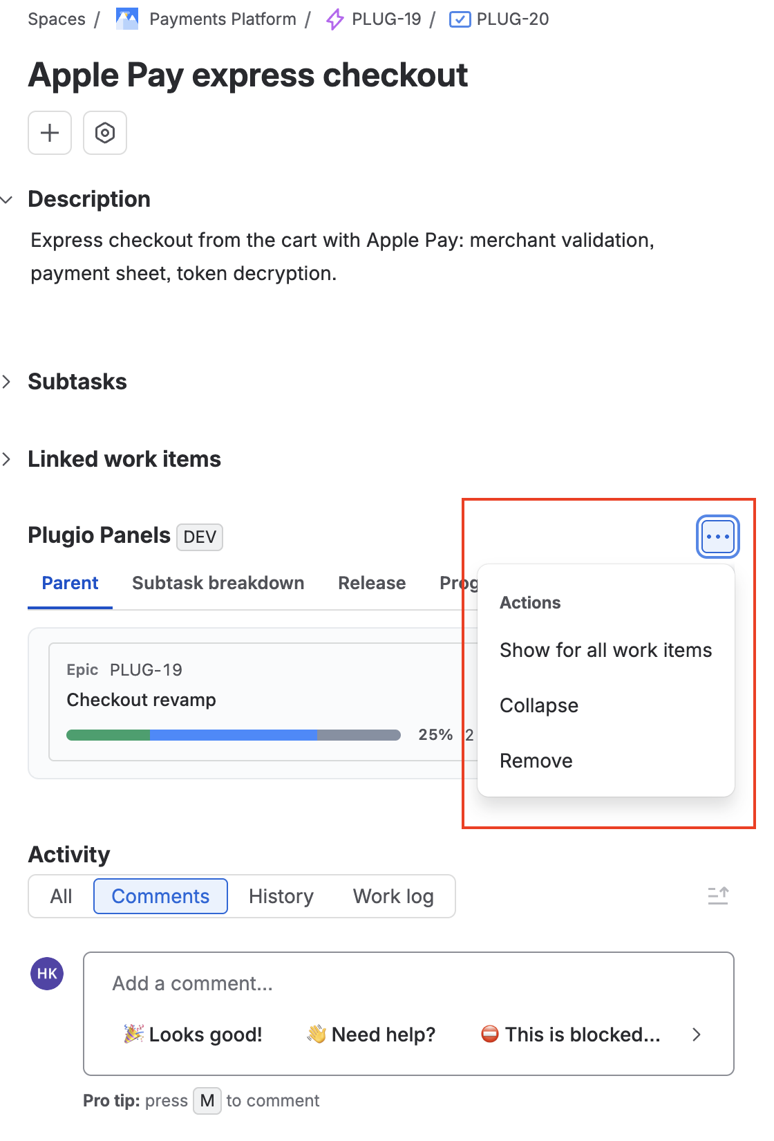
These controls are Jira's, not ours — and they are shared. The wide panel's show, remove and even its collapsed/expanded state are one team-wide state managed by Jira: if one person collapses it, it is collapsed for everyone. Jira also allows any user — not only admins — to use them.
If someone hits “Remove”, nothing is lost. Remove only takes the panel off the work item view; your panel definitions stay safely in the project. Re-add it through Apps → Plugio Panels and everything comes back exactly as it was.
Permissions & data
| Aspect | How it works |
|---|---|
| Who configures | Project administrators, from Project settings → Apps → Plugio Panels. |
| Who sees panels | Everyone who can view the work item. The sidebar is always visible; the wide panel appears once it has been added for all work items. |
| Data visibility | Every query runs with the viewer's own Jira permissions. Two people can legitimately see different numbers on the same panel if they have different project or issue-level access. |
| Where config is stored | In a project property on your Jira site — not on our servers. Deleting the project removes it automatically. |
| Writes to Jira | None. Plugio Panels never modifies work items; it only reads them. |
| Scale ceiling | A widget reads up to 500 work items per source. If a scope is larger, the widget says so in a muted line under it rather than showing a confident, partial number. |
The Two Surfaces
Understanding the difference between the two surfaces is the single most useful thing to know when designing a panel.
| Sidebar | Wide panel | |
|---|---|---|
| Where | Right column of the work item, below Details. | Main column, below the description. |
| Width | ~313–560 px, depending on the viewer's window and column divider. | The full main column. |
| Setup | None — appears automatically once a panel matches. | One-time Apps → Show for all work items per project. |
| Widget form | Compact — the number, the bar, a short list. | Large — full tables, hierarchy trees, grids, date strips, drill-downs. |
| Multiple widgets | Stacked, each with its own title. | Tabs (default) or Stacked — a panel-level setting. |
| User can hide it | No. The sidebar section is always shown; only a project admin can turn it off, for the whole project. | Yes — Jira's own ••• menu, and that removes it for everyone. |
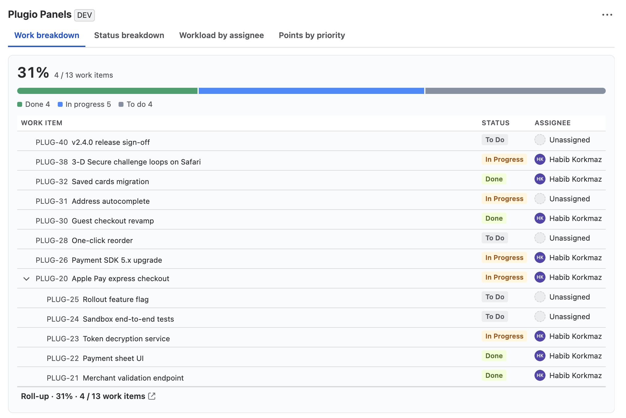
Design guidance. Because the sidebar has no user-side off switch, keep it short and calm: the two or three widgets that answer a question at a glance. Put the wide reads — tables, trees, grids — on the wide panel, where a tab keeps them out of the way until someone wants them.
The Panel List
Once the project has panels, the config screen's home page is the panel list.
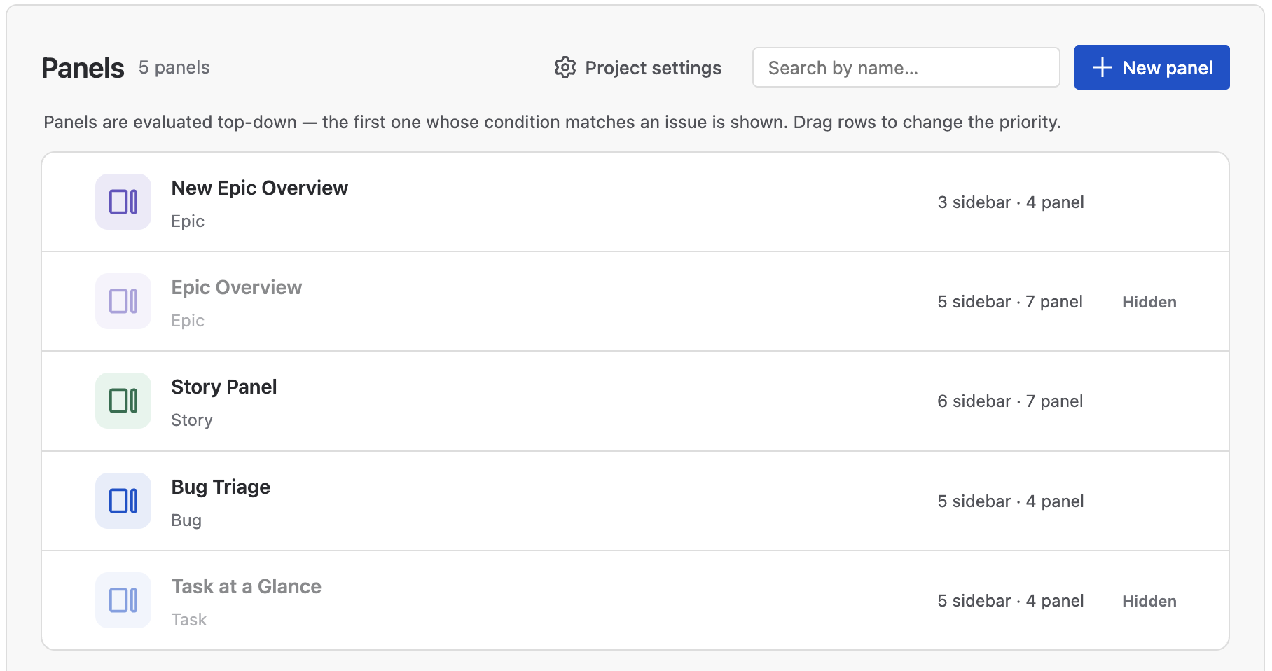
| Control | What it does |
|---|---|
| New panel | Opens the template gallery and then the editor. |
| Project settings | The project-wide options every panel shares — see Project Settings. |
| Search | Filters the list by panel name as you type. |
| A row | Click anywhere to open the panel in the editor. The subtitle shows the panel's target type and its JQL condition, if any; the right-hand column reports how many widgets sit on each surface. |
| Drag handle | Reorders the panels. Order is priority — see below. |
| Eye | Hides or shows the panel. A hidden panel keeps everything in it — widgets, rules, targeting — and simply renders on no work item. Its row stays in place and is marked Hidden. |
| Duplicate | Copies the whole panel, including every widget's configuration, as “name (copy)” right below the original. |
| Bin | Deletes the panel. This asks first, and cannot be undone. |
Priority: one panel per work item
A work item shows exactly one panel — the first one in the list whose condition it matches. Panels are evaluated top-down:
- Hidden panels are skipped entirely.
- A panel matches if the work item's type equals its Show when type, and — if the panel has one — the work item also satisfies its JQL condition.
- The first match wins; nothing below it is considered.
That makes ordering meaningful: put the narrow panels above the broad ones. A
“Payments Bug” panel with the condition component = Payments must sit above a general
“Bug Triage” panel, or the general one will always win first.
List actions save immediately. Reordering, duplicating and deleting are persisted as soon as you do them — the list has no Save button. Visibility toggling follows the editor's rhythm and is written with the next save.
Project Settings
These settings are project-wide rather than per widget, because every widget has to agree on them. Open them with Project settings in the panel list header — it is reachable even when the project has no panels yet. The modal has a section menu on the left; each section is one setting explained below.
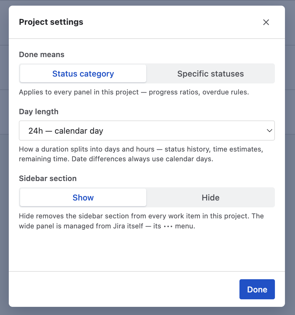
| Setting | Meaning |
|---|---|
| Done means | What counts as resolved, everywhere: progress ratios, done/total counts,
release completion, overdue rules.
Status category (default, zero config) — Jira's own Done category. Specific statuses — you tick the exact statuses, from the project's real status list. Use this when a status like Ready for QA sits in the Done category but isn't done for your team. Switching to this mode starts from the Done-category statuses — the definition already in effect — and at least one status always stays ticked, so “nothing counts as done” can't happen by accident. |
| Overlap | On a Full hierarchy source a story and its subtasks can both carry the same field — say story points at both levels. Overlap decides whose values count: Every item (both levels), Subtasks win (a story with valued subtasks drops its own value) or Parents win (the story's value stands in for its subtasks'). One default covers every numeric field; exceptions pin single fields to their own policy — including back to Every item under a stricter default. Time estimates is one special entry covering Jira's time-tracking pair. The choice applies wherever the field is summed or measured — progress ratios, Σ footers, chart and KPI values — so the same field totals the same in every widget, nothing is counted twice, and every work item stays visible. |
| Day length | How a duration splits into days and hours when it is displayed: 24h (calendar day), 12h, 10h, 8h (work day) or 6h. It affects status-history durations and elapsed-time readings. Display only — date differences always measure calendar time, and it never changes what a number means. |
| Sidebar section | Show / Hide. Hide removes the sidebar section from every work item in this project. This is the sidebar's only off switch — users have none — so it lives here. The wide panel is not listed: Jira already manages that one through its ••• menu. |
Time estimates are the exception to Day length. Jira's own time-tracking fields (original estimate, remaining estimate, time spent) keep Jira's 8-hour work-day convention, so a “3d” estimate in a panel reads exactly like the same field in the Jira UI right next to it.
The Panel Editor
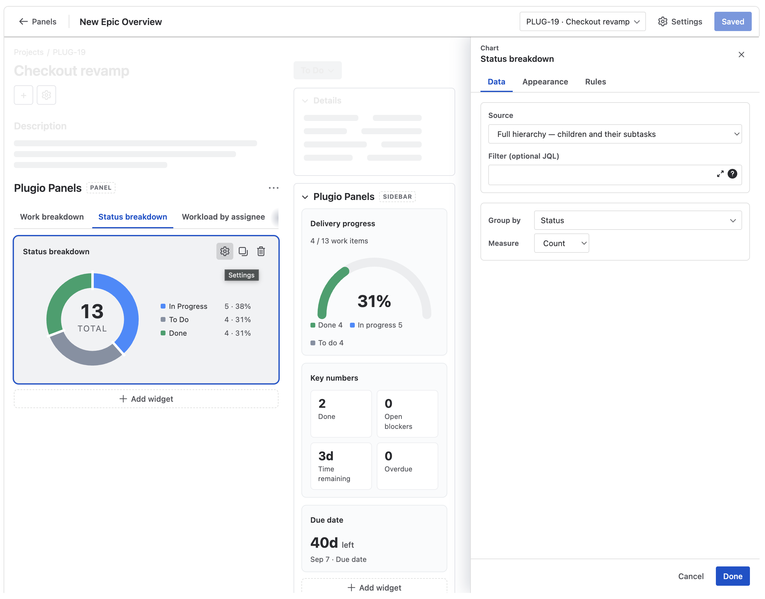
The editor is a low-contrast mock-up of a real work item page, with the two editable zones sitting at their real positions — the Panel zone below the description in the main column, the Sidebar zone below Details in the right column. The greyed-out parts are decoration; only the dashed zones are yours.
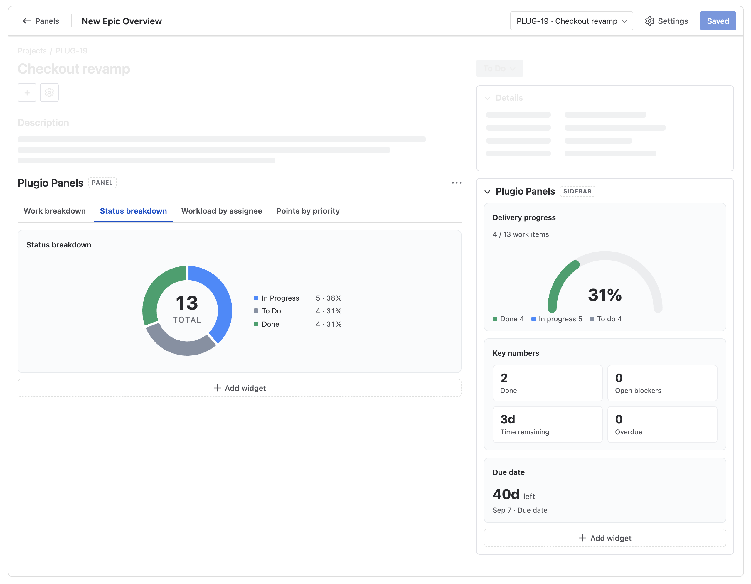
Toolbar
| Control | What it does |
|---|---|
| ← Panels | Back to the panel list. With unsaved changes it asks before discarding them. |
| Panel name | Click to rename, inline. |
| Work item picker | Which work item the preview reads. One matching the panel's target is picked automatically; use the picker to search for any other by key or summary. |
| Settings | The panel's own settings — targeting, visibility, layout. See Panel settings. |
| Save | Persists the panel. The label reads Saved when there is nothing to save. |
The preview is real data. Every widget in the editor is rendered against a real work item from your project with real Jira queries — there is no sample mode. If a widget looks empty in the preview, it will be empty live too, and that is exactly the signal you want before saving.
If the project has no work item of the targeted type yet, the editor says so and the widgets hold their loading skeletons; pick any other work item above to see them render.
Zones and widgets
- Each zone has its own Add widget button. The zone decides the surface, so the picker only asks which type you want.
- Drag a widget to reorder it inside its zone, or onto the other zone to move it to that surface. A widget with no form for the target surface — the Matrix has no compact form — refuses the drop.
- Hovering a widget card reveals Settings, Duplicate and Remove.
- The Panel zone mirrors the live layout: in Tabs mode the widget titles are the tab strip and one widget shows at a time, exactly as viewers will see it.
- Drag the divider between the two columns to preview the sidebar at any realistic width, from 313 px to 560 px — the widths Jira actually gives that column.
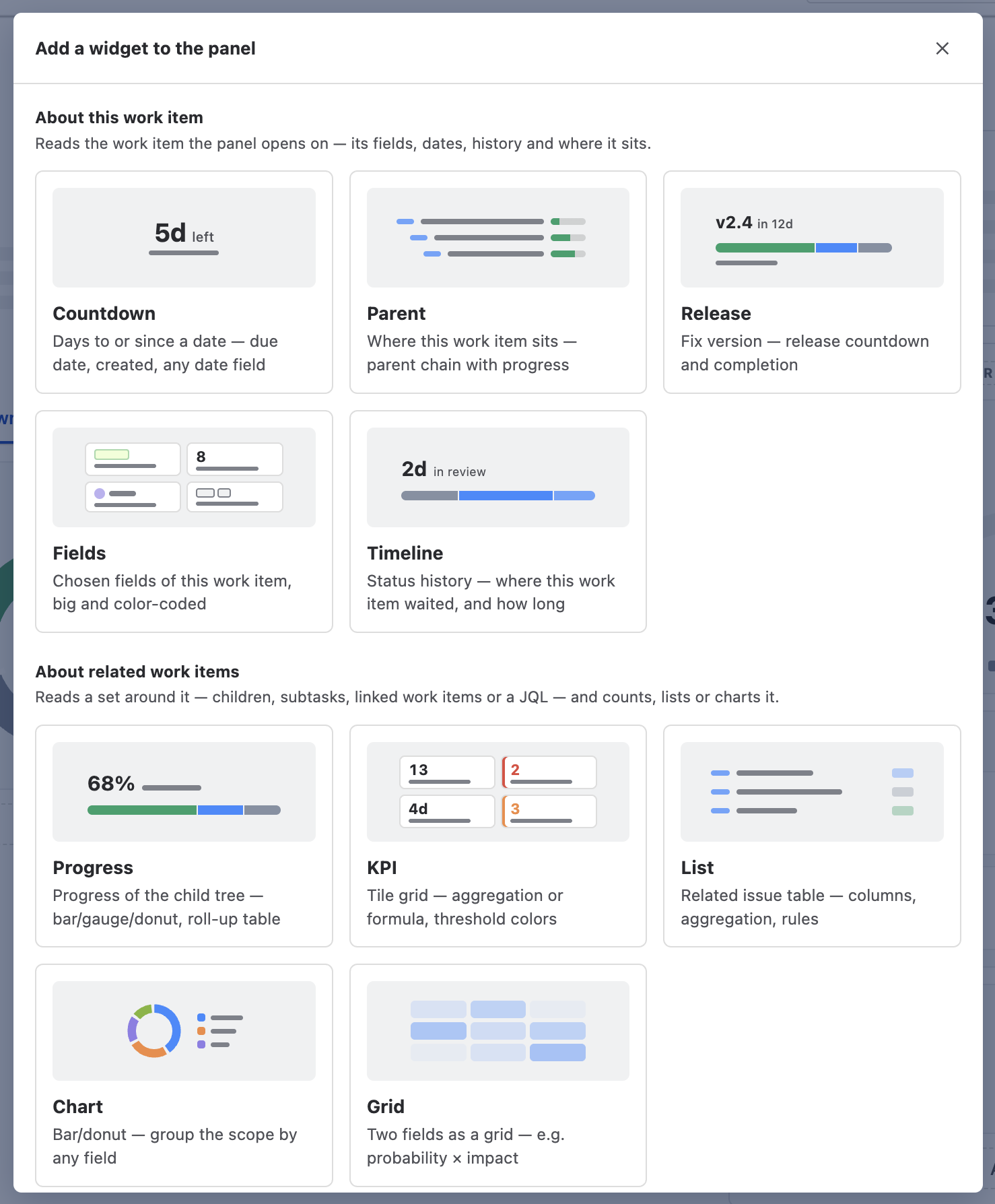
Panel settings
The toolbar's Settings button opens the panel's own four options.
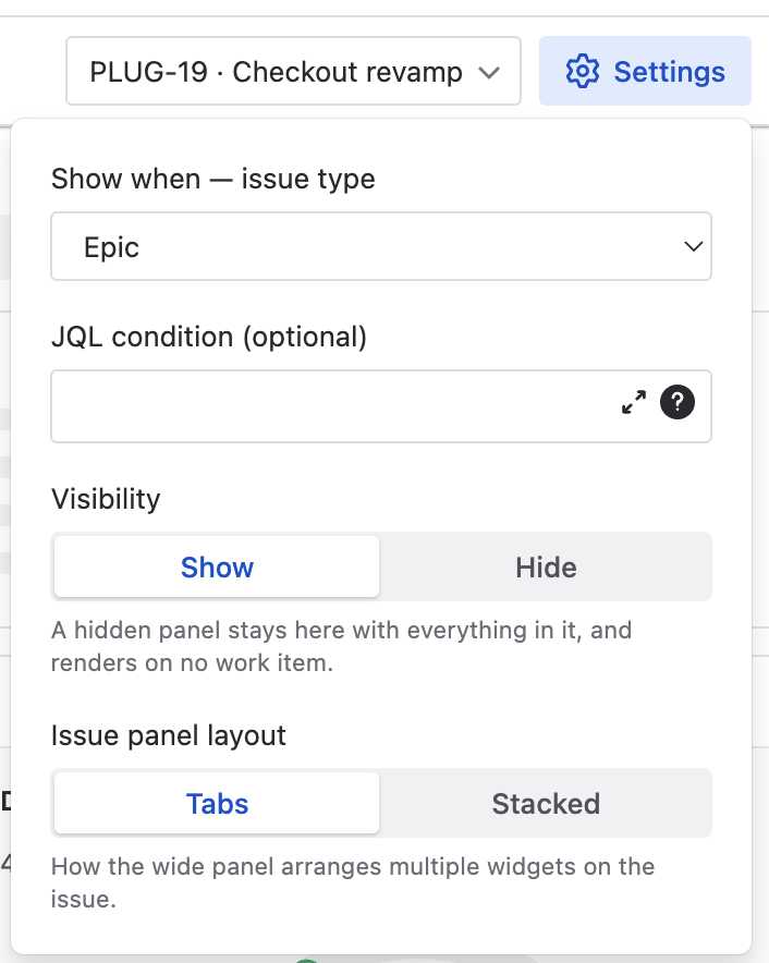
| Setting | Meaning |
|---|---|
| Show when — issue type | The work item type this panel targets, from the project's real type list. Sub-task types are available here even though the creation gallery leaves them out. |
| JQL condition | Optional. The panel only renders on work items that also match this
query — component = Payments, labels = escalated,
priority in (Highest, High). Atlassian's own JQL editor with autocomplete is
embedded here. |
| Visibility | Show / Hide. A hidden panel stays here with everything in it and renders on no work item — the way to retire a panel for a season without rebuilding it later. The same switch is on the panel list row. |
| Issue panel layout | Tabs (default) or Stacked — how the wide panel arranges multiple widgets. Tabs keep the work item page short; stacked shows everything at once. |
Widget settings
Clicking a widget (or its ⚙) opens the settings panel on the right. Its tabs depend on the widget type and on the surface the widget lives on:
| Tab | Contents |
|---|---|
| Data | Where the numbers come from — the source, the fields, the measure. See Source & Filter. |
| Appearance | The widget Title plus the look settings that apply to the surface it is on. A sidebar widget shows its compact options, a panel widget its large ones — a setting that couldn't apply is never displayed. |
| Rules | The conditional-formatting layer — see Rules. Types with nothing to color have no Rules tab. |
- Every change applies live — the widget on the canvas is the preview.
- Done keeps the changes. Cancel (or Esc) restores the widget to the state it had when the panel opened.
- Nothing is written to Jira until you press Save in the toolbar.
Shared Concepts
Four ideas repeat across the widget types. Learn them once and every widget's Data tab reads the same way.
Source & Filter
Every widget that reads a set of work items asks the same question in the same framed box: which work items, and then optionally narrow them.
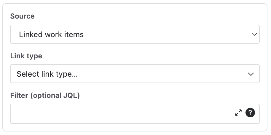
| Source | What it reads |
|---|---|
| Subtasks | The current work item's subtasks only. |
| Direct children | Its direct children — the stories under an epic, the subtasks under a story. One level. |
| Full hierarchy | Its children and their subtasks — the whole breakdown under an epic. Two levels. |
| Linked work items | Work items reached by one link phrase. You pick the phrase in the reader's own words — is blocked by, blocks, relates to — from the link types your site actually has. |
| JQL | Any query. {{currentIssue.key}} is substituted with the current
work item's key, so a query can be relative to it:
parent = {{currentIssue.key}} AND labels = risk. Atlassian's JQL editor with
autocomplete is embedded. |
Filter (optional JQL)
An extra query AND-ed onto the source — issuetype != Bug, status != Done.
One widget can show the whole hierarchy while the one next to it shows only what's still open.
Under the JQL source the Filter row disappears: the query already is the filter, and a hidden row that still narrowed the set would be misleading. If you switch to JQL, any filter you had is cleared rather than left applying out of sight.
The 500 work item ceiling. A source reads up to 500 work items. When a scope is larger, the widget prints one muted line — “Based on the first 500 work items — this scope has more.” Narrow the source or add a filter until it goes away; a panel never quietly reports a partial number as a whole one.
Rules — conditional formatting
Rules are the color layer, and they exist on almost every type. They are bands: an ordered list of up to stops, each with a color. The band containing the current value colors it. Past the last stop, the widget's default color applies.
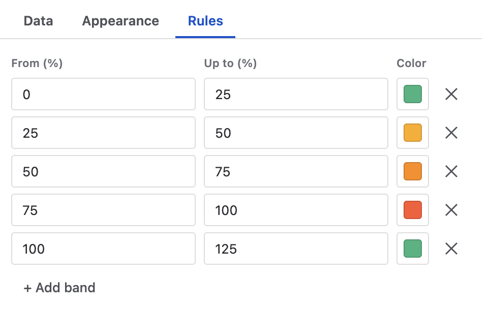
- From is always the previous band's end, shown read-only — the render only consumes the ends, so an editable start would lie.
- The unit is whatever the widget measures: % done for Progress, days left (or days elapsed) for Countdown, days in the current status for Timeline, the value's own unit for a KPI tile, the raw field value for a table column.
- Where a value can be “overdue” — a past due date on an unresolved work item — red is built in and needs no band. Where it can't be, there is no red floor: an age is not a missed promise, and sitting in a status is not wrong in itself.
- Tables and tile grids keep bands per column / per field, in an accordion — one card per rule-capable column, its band colors visible at a glance.
Value format
Anywhere a number is shown, a small link next to its label chooses how it reads. The choice is display only — sums, totals and rules always work on the raw value.
| Kind | Options |
|---|---|
| Plain numbers | Auto (1,234.5) · Compact (1.2K) · Percent (42%) |
| Durations | Days (3.4) · Hours (82.5) · Days · hours (3d 10h) · Days · hours · min (3d 10h 5m) · Hours · minutes (82h 5m) |
- Jira's time-tracking fields are stored in seconds and are recognised as durations automatically.
- Very long calendar durations roll up so they stay readable — “2y 10mo”, not “1035d”.
- Non-numeric columns have nothing to choose, so the link simply isn't there.
Columns & fields
Every table, tree and tile grid picks its columns from one catalogue: your site's real fields, custom fields included, plus three derived columns Jira doesn't store:
| Derived column | Value |
|---|---|
| Age | How long since the work item was created. |
| Due in | How long until its due date — negative when overdue. |
| Cycle time | Created → resolved. |
- Order in the editor is reading order: top-to-bottom in the list = left-to-right in the table.
- Marquee system fields get purpose-built cells — the type icon, the status badge, the assignee avatar, the priority icon — so a panel table looks like Jira, not like a spreadsheet.
- Numeric columns sum in the footer, in the same format as their cells.
- Clicking a row opens that work item; where a widget shows only part of a set, an icon opens the full set in Jira search.
Widgets
The widget types, in the two families the picker uses. Remember that every type has two forms: the compact one for the sidebar and the large one for the wide panel. A type's settings differ per surface, and the panel only shows the ones that apply.
About this work item
These read the work item the panel opens on — no source to configure.
Countdown
Days to or since a date. A deadline, or an age. The day count is computed at paint time, so it never goes stale in a cached page.
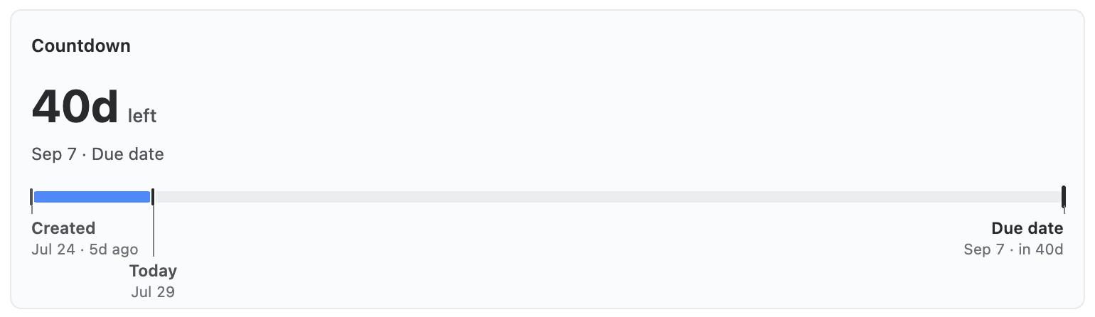
The same number over a date strip — the target between the start anchor and today, with other dates marked.
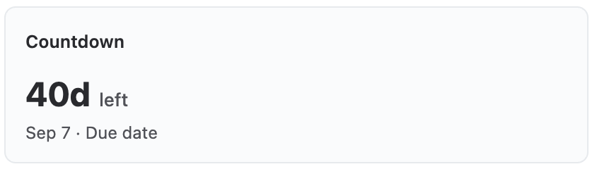
The number and its date line.
Data tab
| Setting | Meaning |
|---|---|
| Date field | Any date field on the work item — due date, a sprint end, a custom target date. |
| Direction | Counts down to — days left; a missed date on an
unresolved work item reads red automatically.
Counts up from — the age since that date (“34d old”). An age is never overdue, and a closed work item's age freezes at its resolution day. |
| Strip starts at | Wide panel, counting down only. Where the date strip's axis begins — Created by default, or your own kickoff date. |
| Also mark | Wide panel only. Extra date fields get a tick and a label on the same axis — a start date beside the deadline, a sprint end beside a release. |
The large form is the date strip: the target placed between the start anchor and today, so the shape of the deadline — how much of the window is already spent — is visible at a glance. Counting up, the strip becomes the work item's lifetime. Neither form has an on/off switch; they are the forms, not options.
Rules band the number: days left (e.g. up to 0 red, up to 3 yellow) or days elapsed.
Parent
Where this work item sits. The ancestor chain — parent → epic → initiative — with each level's own children's progress beside it. Rows open the ancestor.
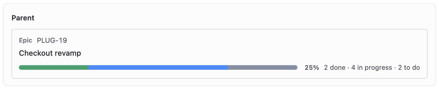
The same chain as cards — type and key over the summary, a wide bar and the counts spelled out.
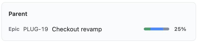
One line per level, each with its progress.
| Setting | Meaning |
|---|---|
| Levels up | How far up the chain to walk: 1 (parent only), 2 (parent and its parent) or 3. |
Progress per level is always on — a level without its children's state is just a breadcrumb, and Jira already has one. Compact is one line per level; the large form is the same chain as cards, with a wide bar and the counts spelled out.
Release
The fix version this work item ships in. The release-date countdown plus the completion of everything in that version. The version is read from the work item's fix versions — the first unreleased one wins.
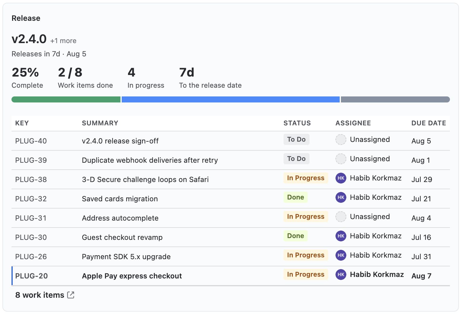
The countdown as stat tiles, the bar, and every work item in the version as a table — the current one marked.
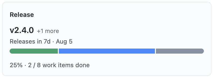
Version name, the release countdown, the completion bar.
| Setting | Meaning |
|---|---|
| Version completion | The bar and the done/total counts under the release date. The release date itself has no toggle — it is what the widget exists to say. |
| Table | Wide panel only. Everything shipping in this release as a real table, with the current work item marked. |
| Columns | Wide panel only. The table's columns, from the shared catalogue. |
| Row limit | Wide panel only. 10 / 25 / 50 / 100 rows. The footer always reports the real total, capped or not. |
Fields
Chosen fields of this work item, big and color-coded. Jira's own Details panel lists the same fields; this one makes the few that matter large, and lets rules paint them.
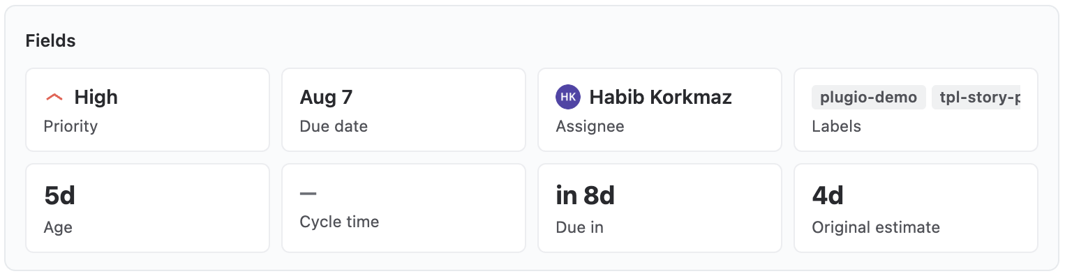
The same tiles across the full width — badges, avatars, chips and formatted numbers.
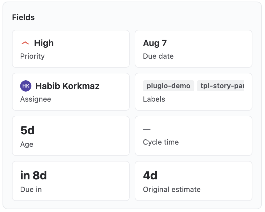
Tiles at one or two per row.
| Setting | Meaning |
|---|---|
| Fields | Which fields to spotlight, in reading order. Every kind renders properly — status badge, assignee avatar, label chips, dates, formatted numbers. |
| Layout | Sidebar only. 1 or 2 tiles per row. |
| Rules | Per field: value bands on numeric fields, an overdue highlight on date fields (a past date on an unresolved work item reads red). |
Timeline
Status history — where this work item waited, and how long. The number that makes someone act is “how long has it been sitting where it is now”, so that is the headline; the proportional band underneath is the context.
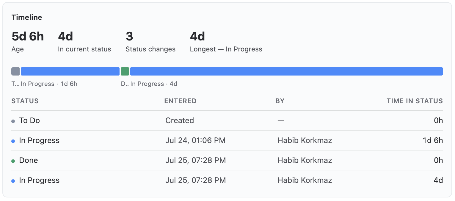
The same band plus the real transition table — what moved, when, who moved it, how long it sat.
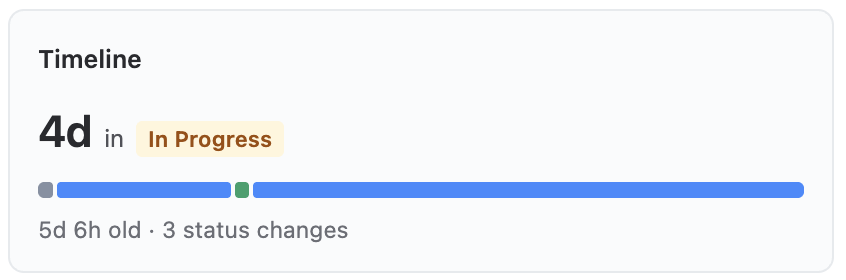
Time in the current status, the proportional band, and the muted age line.
| Setting | Meaning |
|---|---|
| Statuses | All, or Selected only with a checklist of the project's statuses. Hiding a status drops its segment from the band; the times of the others don't change. |
| Re-entered statuses | A work item that goes back to In Progress can keep both visits Separate, or show One total. |
| Age line | Sidebar only. The muted line under the band — total age and the number of status changes. |
| Table | Wide panel only. Every transition with its author and how long the work item sat there. |
| Rules | Bands over days in the current status — e.g. up to 2d green, up to 5d yellow, beyond red. The color paints the number and the current segment. With no bands nothing is colored, and a resolved work item is never colored: “6 days in Done” is not a problem. |
Segment colors come from Jira's status categories, and durations follow the project's Day length.
About related work items
These read a set around the current work item, so each one opens with a Source.
Progress
Progress of the child tree. The ratio widget: a bar, gauge or donut with the percentage, and — on the wide panel — the hierarchy tree that is the ratio's evidence.
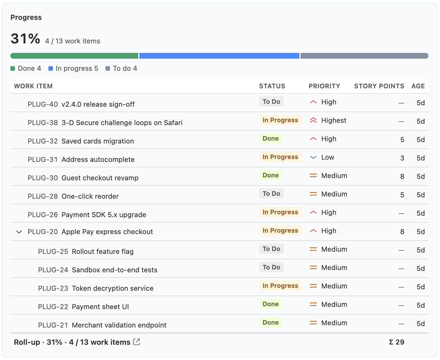
The same hero plus the ratio’s evidence: the work-breakdown tree with indent, collapse and a roll-up footer that sums the numeric columns.
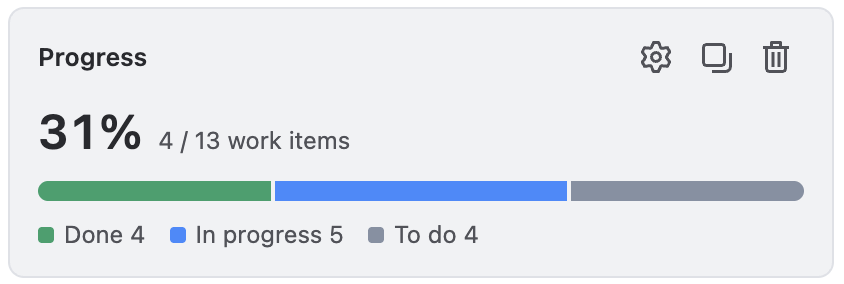
The percentage with its bar, gauge or donut — segments in Jira’s status-category colors.
Data tab
| Setting | Meaning |
|---|---|
| Source | Subtasks, direct children, full hierarchy or JQL. There is deliberately no link source — “% of my blockers” is not a meaningful progress. |
| Basis | What the ratio measures: Issues (head count), Story points, or Time — Σ remaining estimate against Σ original estimate. |
Appearance
| Setting | Meaning |
|---|---|
| Style | Sidebar. Bar, Gauge or Donut. |
| Percent + counts | Sidebar. Show or hide the numbers beside the chart. |
| Legend | Sidebar. Show or hide the status-category legend. |
| Tree columns | Wide panel. The columns shown next to the work-item tree. Numeric columns sum in the roll-up row. |
Segment colors always follow Jira's status categories. Rules band the percentage: up to 40 red, up to 70 yellow, and so on — the band containing the current % colors the bar's done segment, the gauge arc or the donut ring along with the number.
KPI
A grid of numbers, each with its own source. The most configurable type: you define a list of values — aggregations and formulas — and the visible ones are the tiles, in list order.

Tiles across 2–4 columns, each colored by its own bands.
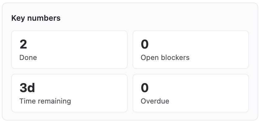
Value tiles at one or two per row, each colored by its own bands.
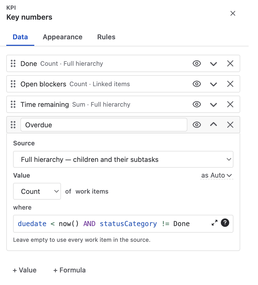
Defining a value
Each row in the list is one value. Expanding it shows the definition:
| Part | Meaning |
|---|---|
| Source | Per value, not per widget — the same five sources as everywhere else. This is why one KPI widget can show a hierarchy count next to a linked-item count next to a JQL result. |
| Value | Reads as a sentence: Count of work items, Sum of Story Points, Average of Time remaining. Aggregations: Count, Sum, Average, Min, Max. |
| Derived values | Numbers Jira doesn't store but two dates imply: Date difference (cycle/lead time), Time since date (age), Time until date (runway; negative = overdue). They aggregate like any numeric field — min of time until due date is “the nearest deadline”, max of age is “the oldest one”. |
| where | An optional JQL narrowing this value alone —
statusCategory = Done, duedate < now() AND statusCategory != Done.
Leave it empty to use every work item in the source. (Under a JQL source it disappears; the
query is already the filter.) |
| Format | The value format link on the label row. |
| Label | Short by design, and auto-derived from the definition until you rename it. Renaming rewrites any formula that references it. |
| Eye | A hidden value still computes — it just isn't a tile. That is how you build an operand for a formula without showing it. |
Formulas
A + Formula row references other values by label and does arithmetic on them:
{Done} / {Total} * 100- Operators
+ - * /, parentheses, and the functionsround(v, decimals),abs,min,max,floor,ceil,coalesce(v, fallback). - A missing or empty operand renders “–” rather than a silent zero.
coalesceis the escape hatch when you want a 0 instead. - The formula field validates as you type and names the exact problem — an unknown reference, a missing bracket, a word typed without braces.
Appearance & Rules
| Setting | Meaning |
|---|---|
| Layout | Sidebar. 1 or 2 tiles per row. |
| Columns | Wide panel. Tiles are arranged in 2–4 columns automatically. |
| Rules | Per value: the band containing a tile's value colors the value and its accent bar. Every value is a card in the list, its bands visible at a glance. |
List
Related work items as a table. Columns, sorting, grouping, numeric footers and cell rules. This is the widget that replaces Jira's fixed Linked issues section.
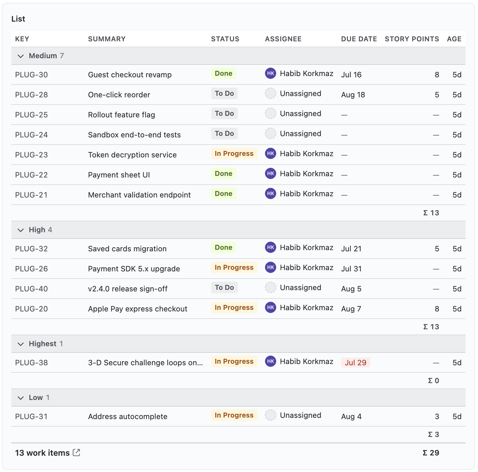
The full table: free column set, group headers with counts, per-group Σ lines and a numeric footer.
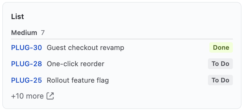
Key + summary + one configurable column, capped at 3–10 rows with a “+N more” tail.
Data tab
| Setting | Meaning |
|---|---|
| Source | The five shared sources; Linked work items is the default. |
| Columns | The full column set of the wide table, from the shared catalogue. Nothing is pinned: Key and Summary are ordinary removable columns. Numeric columns sum in the footer. |
| Group by | Optional. Each value becomes a group with its own header and count,
biggest group first. A work item with several values (labels, components) appears in each.
Link type is the special one, available on the links source: one group per link phrase on this work item — the blocked-by / blocks / relates board that used to need three widgets side by side. Only phrases the work item actually uses become groups, so there are never empty sections. |
| Link types | When grouping by link type. All, or Selected only with a checklist. |
| Sort by | Any date or numeric field, plus Priority, with directions worded for the field's kind — Newest / Oldest first for dates, Highest / Lowest first for numbers. Inside groups, this orders the rows within each one. |
| Group totals | When grouping and a numeric column both exist. A Σ line under each group, in addition to the table footer. |
Appearance
| Setting | Meaning |
|---|---|
| Sidebar column | Sidebar. The compact list is key + summary + exactly one more column — this picks it. |
| Row limit | Sidebar. 3, 5 or 10 rows, with a “+N more” tail. |
| Rules | Per column: value bands on numeric columns, an overdue highlight on date columns. Only the due date starts highlighted — “overdue” is a deadline concept, and on an always-past field like Created it would paint every row red. |
Chart
How does the set distribute over one field? A donut or horizontal bars — status distribution, workload by assignee, points by component.
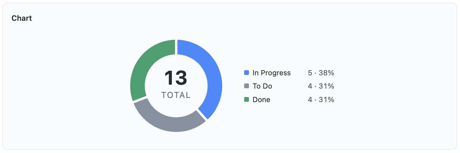
The same chart scaled up, with the legend beside the donut instead of under it.
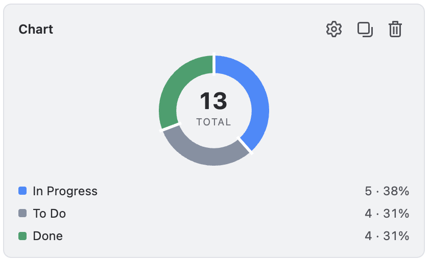
Donut or bars, legend underneath.
| Setting | Meaning |
|---|---|
| Source | The five shared sources. |
| Group by | Any identity-shaped field — status, assignee, priority, type, labels, components, custom select fields. Dates and numbers make continuous axes, not categories, so they aren't offered. |
| Value | Reads as a sentence: Count, or Sum / Average / Min / Max of a numeric field. “Sum of Story Points by assignee” answers where the weight sits, not just the head count. |
| Style | Donut or Bars. |
| Top groups | 3–6. Groups beyond the limit fold into a gray Other — hues are never cycled, so a color always means one thing. |
| Values / Legend | Show or hide. (The legend option applies to the donut; bars label themselves.) |
| Rules | Pinned group colors: name a group and give it a color, and it keeps that color no matter how the data shifts. Grouping by status already follows Jira's own status-category colors. |
Breakdown
Who has how much, and in what state? One field's values become rows — one stacked bar each — and a second field colors the segments inside the bar. The default answers the standup question directly: assignees as rows, split by status category. Where the Chart shows one dimension, the Breakdown shows two, and on the wide panel every row expands into the work items behind it.
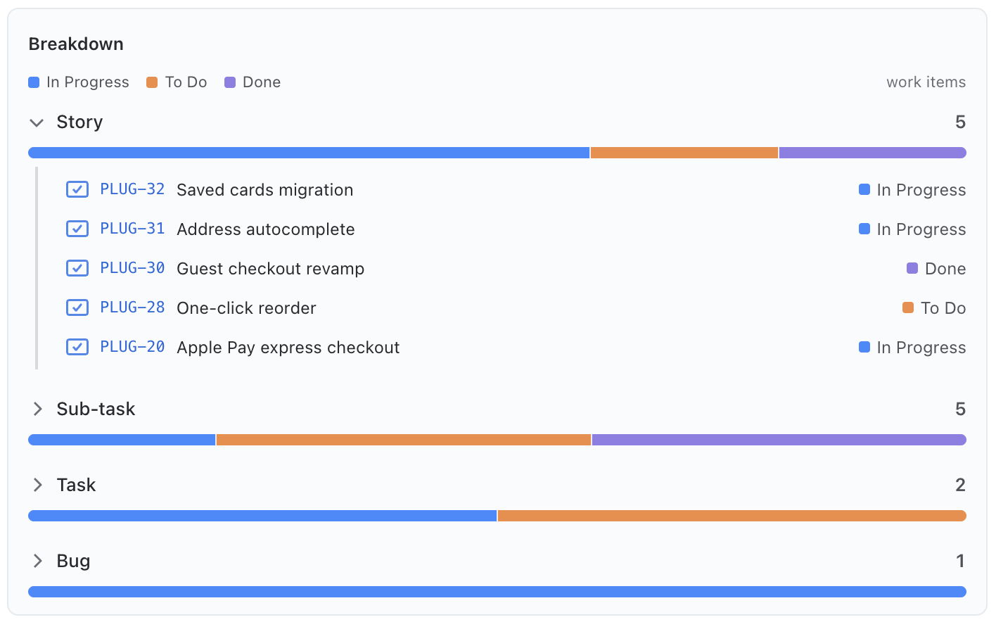
Work item types as rows, split by status. A row expands into its work items — type icon, key, and the segment each one is in.
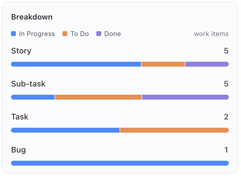
The same rows and bars in the sidebar — no drill at 300 px.
| Setting | Meaning |
|---|---|
| Source | The five shared sources. |
| Rows | Any identity-shaped field — assignee, priority, component, labels, custom selects — or Direct parent: stories as rows, each bar stacked from its own children (the epic reading). |
| Split by | What stacks inside each bar. Status category (the default) keeps Jira's own category colors and adds a %done per row — the Done segment follows the project's Done means definition, the same one the Progress widget reads; any other field takes the chart palette, and values beyond six fold into a gray Other. |
| Value | Reads as a sentence, like the Chart's: Count, or Sum / Average / Min / Max of a numeric field. The legend names the measure — “avg Story Points” — so the row numbers explain themselves. |
| Row limit | 5–25; rows beyond it end in a “+N more” line. |
| Legend | Show or hide the segment legend. The measure name always stays. |
Hovering a bar shows the split and the total. On the wide panel a row expands into its work items — type icon, key, status (or the segment the item belongs to) and its measured value. An item that doesn't carry the measured field shows a dash and stays out of averages rather than counting as zero.
Matrix
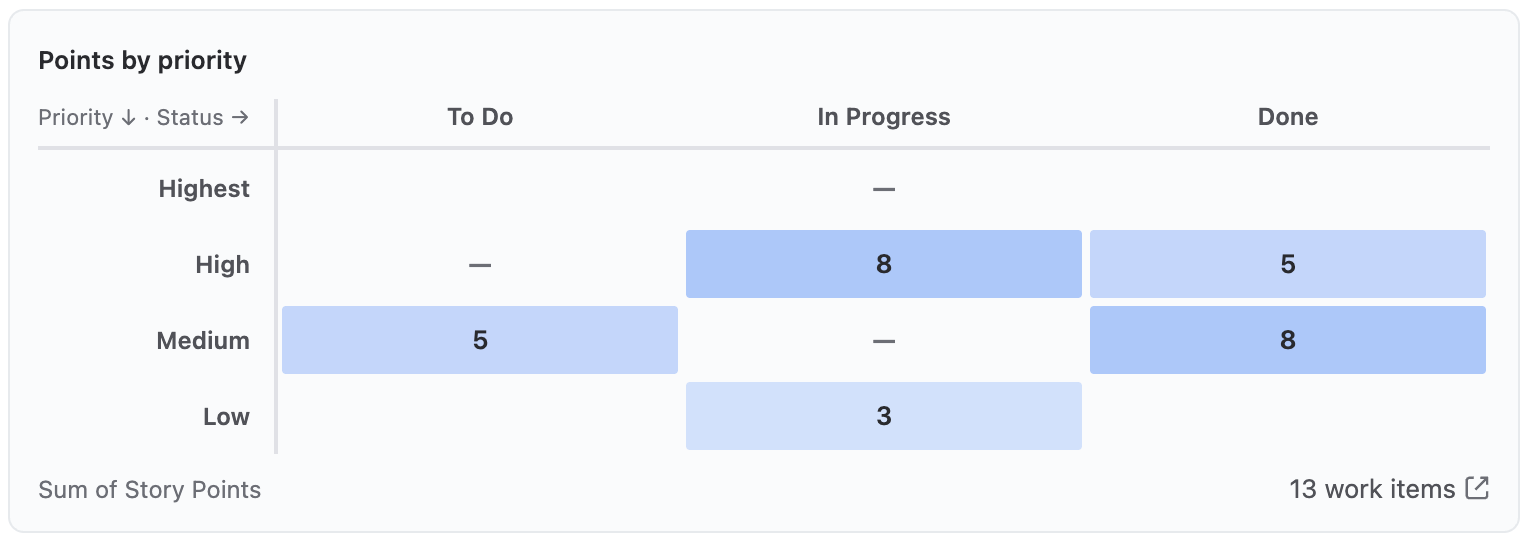
Two fields as a matrix. Probability × impact, priority × status, component × assignee — the risk-matrix shape with free axes. Wide panel only: a real matrix can't say anything at 300 px, so the picker shows it disabled for the sidebar.
| Setting | Meaning |
|---|---|
| Source | The five shared sources. |
| Columns / Rows | The two axis fields — anything with a small discrete value set: status, priority, type, assignee, select-style custom fields. ⇅ Swap exchanges them in one click. |
| Value | Count of work items, or Sum / Average / Min / Max of a numeric field — story points per priority × status. The footer names the measure, so a bare “21” never passes for twenty-one work items. |
| Rows and columns with no value | Only when the cells measure a field. A row or column where no work item carries the measured field reads as dashes. Hiding those shrinks the matrix to what was actually measured — the work items are still counted in the totals. |
Cell color encodes one thing only: density. The tint ramps over a single accent, normalized against the busiest cell. Clicking a cell opens the work items behind it, with one action to open the same set in Jira.
Templates
Templates are the creation step only — they fill in a widget set, and everything stays freely editable afterwards. There is one rich template per core work item type, each filling both surfaces, plus Blank.
| Template | What it builds |
|---|---|
| Epic Overview | Sidebar: delivery progress as a gauge, key numbers, the due date. Wide panel: the full progress tree, a status chart, the per-assignee workload as a Breakdown with drill-in, and a points-by-priority matrix. |
| Story Panel | Sidebar: subtask progress, the parent chain, the target release, status history. Wide panel: blocker numbers, the subtask table, every linked work item grouped by link type, and the release table. |
| Task at a Glance | Sidebar: where the task sits, days to the deadline, how long it has been open, where it has been waiting, its key fields. Wide panel: the subtask table and numbers, linked work, the deadline. |
| Bug Triage | Sidebar: triage fields, the fix version, the deadline, the bug's age, status history. Wide panel: everything it touches grouped by link type, the full status history, the release table, the deadline. |
| Blank | Start empty and add widgets yourself. |
The gallery filters itself to the template for the target you picked, plus Blank. A custom work item type matches no template, so all of them stay available as starting points.
Why the same widget appears on both surfaces in some templates. That is deliberate, not duplication: the sidebar bar is the at-a-glance percentage, the wide form is the hierarchy tree with the roll-up. A release name in the sidebar and the release table on the panel answer two different questions. Remove either one with a single click if your team doesn't need it.
Copy From Project
Building the same panels project by project isn't work anybody should do twice. Copy from project — on the empty state of a project with no panels yet — searches your browsable projects and brings the chosen project's whole Plugio Panels configuration over: every panel, every widget, every rule, and the project-level settings.
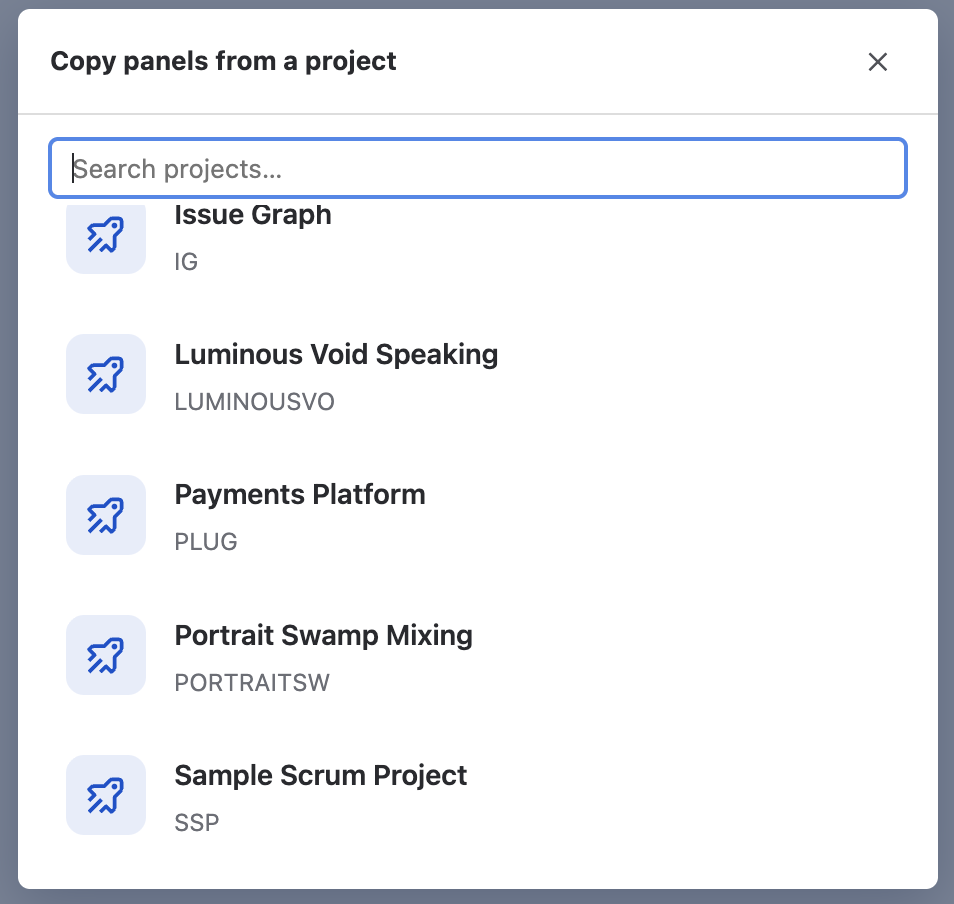
- A project with no panels configured says so on its row rather than failing silently.
- Custom field ids are the same across a Jira site, so copied widgets keep their fields. If you copy into a project whose workflow lacks a status you had ticked under Done means, re-check that list.
- The copy replaces the current project's configuration — which is why it is offered only when there is nothing to lose.
Troubleshooting
I saved a panel but nothing appears on the work item
Three things to check, in order:
- Reload the page once. Jira briefly caches the condition that decides whether an app surface exists on a project. After a project's first save this can delay the surfaces by a page load.
- Does the work item match? The panel's Show when type must equal the work item's type, and its JQL condition — if it has one — must also match. A higher panel in the list may be matching first.
- Is it the wide panel you're missing? That one needs the one-time Apps → Show for all work items setup — see step 5.
“Plugio Panels” isn't in the work item's Apps menu
The app's surfaces are hidden on projects with no panels, by design. Create and save a panel in that project first, then reload the work item.
The wide panel is visible to me but not to my team
It was added to that one work item without being promoted. Open its ••• menu and choose Show for all work items.
Someone removed the wide panel
Jira's Remove takes the panel off the work item view for everyone, and Jira allows any user to do it. Nothing is lost: your panel definitions live in the project, so re-adding it through Apps → Plugio Panels brings everything back unchanged. If it keeps happening, the usual cause is a panel that is too tall or too noisy — trim it.
The sidebar section disappeared
Check, in order: Project settings → Sidebar section is set to Hide; every panel in the project is hidden; or no panel targets this work item's type. The sidebar has no user-side hide, so it is always one of these three.
“Based on the first 500 work items — this scope has more”
The widget's source matched more work items than the engine reads, so its numbers cover the first 500. Narrow the source (direct children instead of the full hierarchy) or add a filter until the note disappears.
Two people see different numbers on the same panel
By design — every query runs with the viewer's own Jira permissions. Someone without access to a linked project simply doesn't see its work items in the counts.
A widget says “configure” or shows no data
Open its settings. Either a required setting is missing (a Matrix without an axis field, a KPI value without a source) or the source genuinely resolved to nothing — a work item with no subtasks, no links of that phrase, no fix version. The editor preview uses real data, so what you see there is what viewers get.
A widget warns about a missing field
It references a field that doesn't exist here — common after copying panels from another project or when a custom field was deleted. Re-pick the field in the widget's settings; the rest of the panel is unaffected.
The preview is empty in the editor
If the project has no work item of the panel's targeted type yet, there is nothing to preview. Use the work item picker in the toolbar to point the preview at any other work item.
Numbers don't match a Jira filter I ran
The layers apply together: the widget's Source AND its Filter AND, for a KPI value, its own where. The other common surprise is Done means — if it is set to specific statuses, a work item in a Done-category status you didn't tick does not count as done.
A duration reads differently than in Jira
Jira's time-tracking fields deliberately keep Jira's 8-hour work-day convention so they match the field beside them. The project's Day length applies to elapsed time — status history, ages — not to estimates.
Support
Questions, feedback or a feature request? We answer fast.
Email: [email protected]