
When Jira dashboards aren't enough: four ways to build full-page reports
A Jira dashboard is a grid of gadgets, and for day-to-day team status that's exactly right. A filter count here, a pie chart there — everyone knows where to look. Then someone asks for more. A sprint review the whole department can follow. A monthly report for a stakeholder who doesn't live in Jira. A board for the office TV. That's usually the moment the grid starts to fight you.
There are four realistic routes from here. Each solves a different version of the problem, and each has limits worth knowing before you commit. In rough order of effort:
01Squeeze more out of the native dashboard
Before adding anything, it's worth making sure the native dashboard is actually set up well. Most "our dashboard is a mess" complaints trace back to a few fixable habits:
- Build on named saved filters, not ad-hoc JQL. One filter per audience or question (Team A open work, Resolved this month), reused across gadgets. When the definition changes, you edit one filter instead of eight gadgets.
- Share the filters, not just the dashboard. The classic failure: the dashboard is shared, the filters behind it aren't, and viewers get empty or broken gadgets. Every filter a gadget uses needs the same (or wider) share as the dashboard itself.
- Pick gadgets that answer questions, not decorate. Filter Results, Issue Statistics, Two Dimensional Filter Statistics, Created vs. Resolved and Sprint Health cover most status questions. Fewer, well-chosen gadgets beat a wall of pies.
- Use the layout deliberately. Headline numbers top-left, detail lists lower down. For a TV, full-screen the dashboard and keep it to what's readable from across a room.
Where it stops: the grid itself. Columns are fixed, gadgets size themselves, and there's no dashboard-wide filter — "show me the same board for last month" or "just Team B" means editing every gadget, or cloning the dashboard per team and letting the copies drift. Viewers can't adjust anything. And everyone who opens the dashboard needs a Jira license; there's no clean way to hand the report to someone outside the instance.
02Move the report to Confluence
If the report is read more than it's poked at, a Confluence page is often the better surface. The Jira macros embed a live filter or a single issue list into a page, and the chart macros render a handful of chart types from a saved filter. Around that live data you can write actual narrative — what happened, why, what's next — which is what stakeholder reports are mostly missing.
- Good for periodic, narrated reports: sprint reviews, monthly summaries, steering-committee updates.
- The data stays live — the page shows current numbers on each view, and viewers see only issues their Jira permissions allow.
- Page history gives you something dashboards never have: a record of what the report said last month.
Where it stops: it's a document, not a dashboard. The chart selection is thin, each macro carries its own filter with no page-wide scope, and there's no interactivity — no drilling in, no switching the period. Heavy pages with many macros also get slow. Confluence works best as the frame around a report, not as the reporting engine itself.
03Export the data: spreadsheets and BI
When the report needs layout freedom Jira will never give you — or needs to join Jira data with anything else — the answer is to take the data out:
- CSV export from issue search is the zero-setup version. Fine for a one-off; the UI export is capped and every refresh is manual.
- Jira Cloud for Sheets / Excel pulls a JQL query into a spreadsheet on a schedule. From there, pivots and charts are your own problem — which is both the power and the cost.
- BI tools (Power BI, Tableau, and Atlassian Analytics on the Enterprise plan) sit at the top end: real data modelling, cross-tool joins, polished distribution.
Where it stops: you now own a pipeline. Field mappings break when someone renames a field, "why does the report disagree with Jira" becomes a recurring meeting, and freshness is whatever the sync schedule says. The quieter risk is permissions: an exported sheet shows whatever the exporting account could see, to whoever the sheet is shared with. Jira's permission model doesn't travel with the data.
04Use a full-page dashboard builder
The gap between "native dashboard" and "full BI pipeline" is what marketplace dashboard builders exist for: a dedicated full-page canvas inside Jira, reading live Jira data under Jira permissions, with more layout and widget freedom than the gadget grid. If you're evaluating one, the questions that actually separate them:
- Is there a dashboard-wide filter? One scope, one time window, one set of filters that every widget inherits — this is the single biggest difference from the native grid.
- Can viewers interact? Switching the period, picking their team or sprint, without being able to break the dashboard — otherwise you're back to one copy per audience.
- Does the widget set go beyond charts? Pivot tables, hierarchy rollups and formula-based KPIs are where native gadgets stop hardest.
- Whose permissions apply? Queries should run as the viewer, so sharing a dashboard never shares data someone couldn't already open.
- Does it meet people where they already look? A way back onto the native Jira dashboard, or into Confluence, so the full-page report isn't one more place to check.
How Plugio Suite approaches it
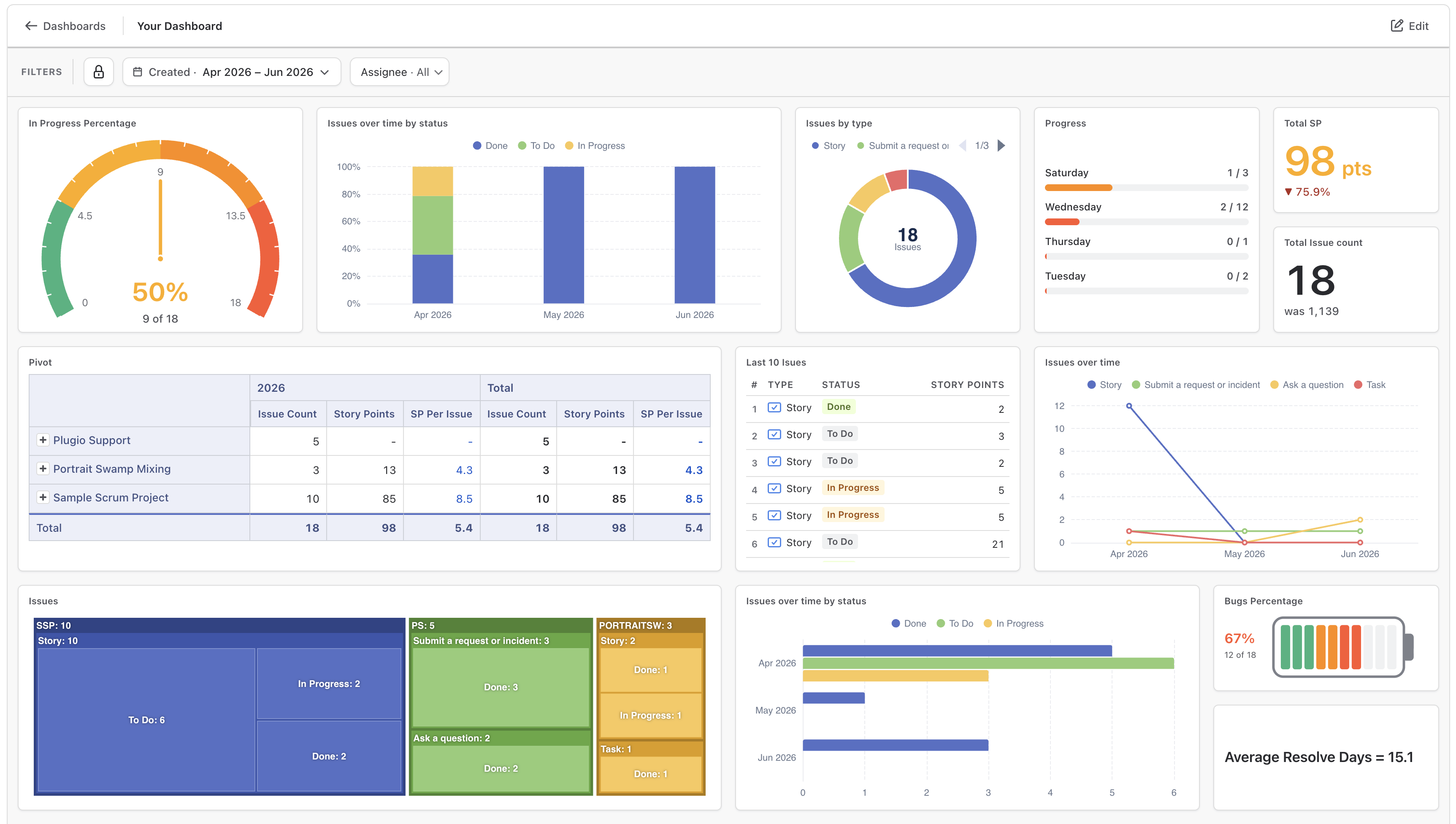
That checklist is essentially the design brief for our app Plugio Suite, a full-page dashboard builder for Jira:
- Every dashboard has a shared scope, time window and field filters that all widgets inherit. Change Last 30 days to Last quarter and the whole board re-queries. The window can anchor to Created, Resolved or Due — so a throughput board is one setting, not a JQL rewrite per gadget.
- Filters can be marked editable: viewers pick their own team or assignee on a live filter bar, the whole board follows, and Reset restores your defaults. One dashboard serves every audience. Sprint-based dashboards follow the active sprint and roll over on their own.
- The widget set covers the gaps the native grid can't: a
pivot table with nested rows and true totals, an
epic hierarchy with story point rollups, treemaps, formula
KPIs like
{Done} / {Count} * 100, and text blocks whose numbers update with the data. - Every query runs as the viewer, so sharing a dashboard never widens data access — and a companion gadget renders any Suite dashboard back inside a native Jira dashboard, live filters included.
Which route fits
- Stay native if the audience is the team itself and the questions are stable. A well-built gadget dashboard is free and zero-maintenance.
- Use Confluence if the report is periodic and narrated — the value is the story around the numbers, not interactive data.
- Export to Sheets or BI if you need to join Jira with other data sources, or the organisation already has a BI team that owns the pipeline.
- Use a dashboard builder if the report should live in Jira, stay live under Jira permissions, and serve several audiences from one page — without anyone maintaining a pipeline.
Try the fourth route on your own projects. Plugio Suite is on the Atlassian Marketplace, and the documentation walks through every widget and setting.
Want the specifics of what the native grid can't do? That's the checklist in 12 things native Jira dashboards can't do.