
12 things native Jira dashboards can't do — and how Plugio Suite does them
Jira dashboards are a grid of independent gadgets. Each one owns its own filter, its own time range and its own idea of what "done" means, and none of them know the others exist. That's fine for a status board with three tiles. It stops being fine the moment someone asks "can you show me the same board for last month?", "can we see this by team?", or "what's our average cycle time?" — and you realise the answer is to edit eight gadgets, or build a second dashboard.
Plugio Suite is a full-page dashboard builder for Jira that starts from the opposite premise: one dashboard, one set of filters, every widget follows. Below are the twelve things people most often ask a native dashboard for and can't get — and how Suite handles each. It's written as a checklist on purpose: if none of these are your problem, native gadgets are the right answer and cheaper.
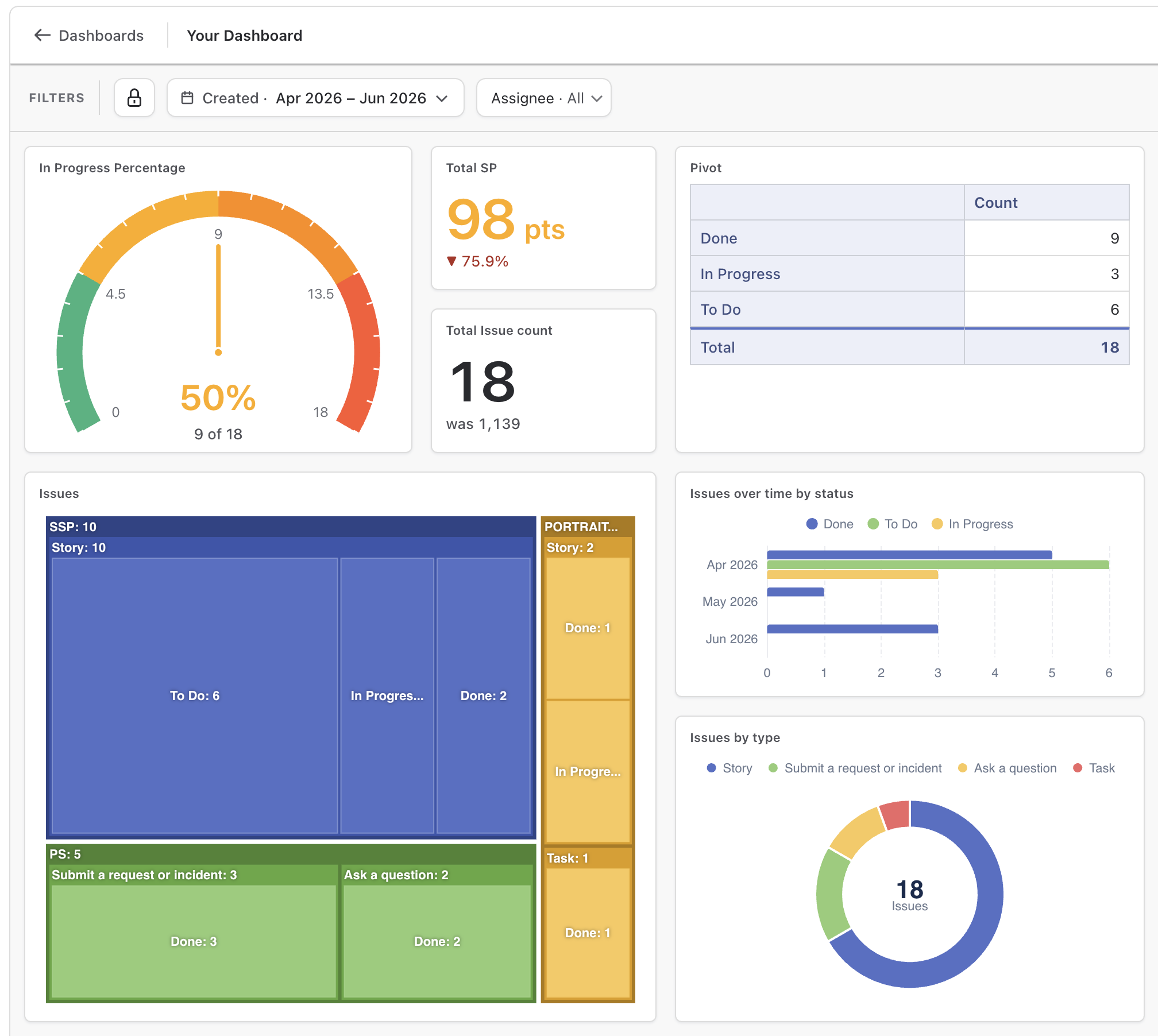
01One shared filter for the whole Jira dashboard
Native: every gadget carries its own saved filter or JQL. Changing the project, the sprint or the date range means editing each gadget in turn.
In Suite the dashboard has three filter layers, applied together and inherited by every widget:
a scope (projects, a JQL query, or a sprint board), a time window
(day/week/month/quarter/year presets or a custom range), and any number of field
filters — status, assignee, labels, a custom select. Change the period chip from
Last 30 days to Last quarter and twenty widgets re-query at once. A widget can still
narrow its own data with a per-value where condition, but it can never escape the
dashboard's scope — so a board never quietly mixes two definitions of "our issues".

02Throughput dashboards: anchor the period to Resolved
Native: "this month" almost always means "created this month". A resolved- or due-date view means rewriting each gadget's JQL with date functions.
The dashboard's time window is anchored to one date field, and you pick which. The default is Created; switch Period applies to in the scope dialog to Resolved and every widget on the board now reads "issues resolved in the period" — counts, sums, charts, the previous-period baseline, all of it. That's a true throughput dashboard without touching a single widget. Anchor to Due and you have a commitments board. The period chip always shows the anchor (Resolved · This month), so a viewer never has to guess what the window means.
03"Compared to last month" — from the dashboard, not per gadget
Native: there is no previous-period concept. Comparing two windows means two gadgets side by side, and doing the arithmetic yourself.
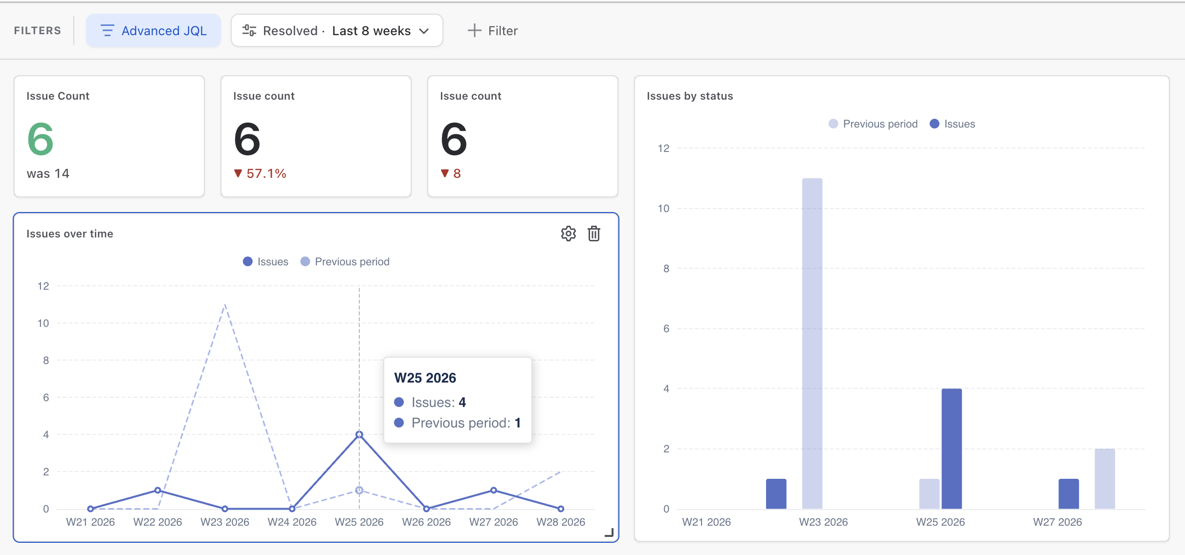
Because the dashboard owns the period, it also knows the previous period — last month for This month, the 7 days before for Last 7 days, the previous sprint on a sprint board. Three widgets use it: a Number tile can show ▲ 12%, a difference, or "was 33", with a Lower is better switch that flips the colours for bug counts; Bar and Line charts overlay the previous window behind the current one — faint, same colour — so a created-per-week chart carries its own baseline. You never define the baseline; it follows the period chip.
04A sprint dashboard that rolls over by itself
Native: sprint gadgets are bound to a sprint by name or by
openSprints() per gadget; a mixed board partly follows the sprint and partly doesn't.
A Suite dashboard can be sprint-based: bound to one board and always showing exactly one sprint. Default is the active sprint, so the board rolls over on its own when the new sprint starts. Every widget is restricted to that sprint's issues — including ones that aren't date-driven — and viewers can flip the sprint chip back to review a past sprint, then reset. Charts with a time axis take the sprint's start and end as their window with daily buckets, and "previous period" means the previous sprint.
05One dashboard for the team, not one per person
Native: a viewer can't change a gadget's filter. The workaround is one dashboard copy per team, per person, per component — and they drift.
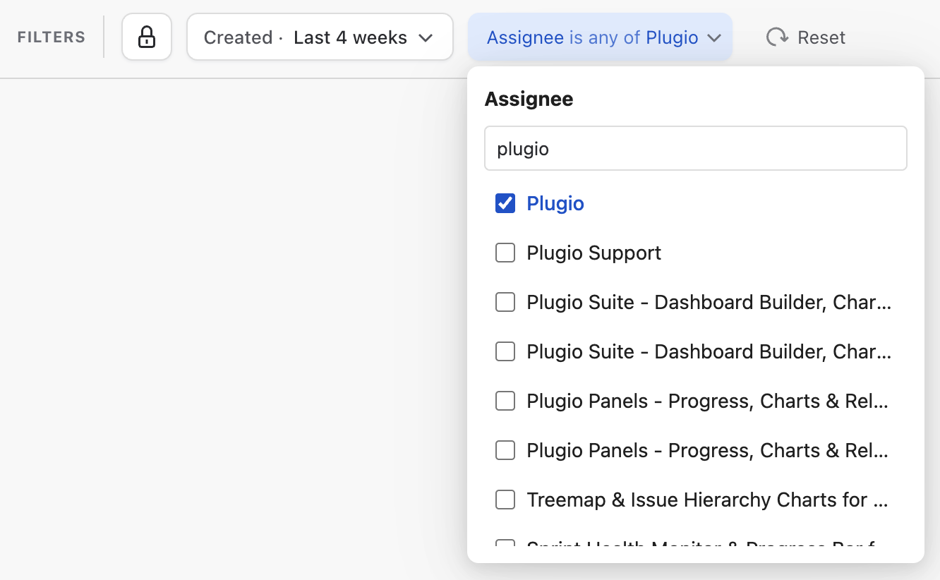
Every field filter in Suite has a visibility mode. Fixed filters are applied silently and are part of the dashboard's definition. Editable filters appear on the viewer's filter bar with your value as the default — the viewer picks their own assignee or team, the whole board follows, and Reset restores your defaults. Nothing is saved back. The Parent (epic) filter is a picker over the epics actually present in the data, with live counts — make it editable and the dashboard becomes an epic switcher.
06Cycle time, age and time-to-deadline as metrics
Native: durations between two dates aren't a field, so they can't be averaged, charted or thresholded without a custom field maintained by automation.
Beside every stored numeric field, Suite's value editor offers three derived durations: Date difference (Created → Resolved by default — cycle time, lead time), Age (a date to today — Max of Age is your oldest open issue) and Time until (today to a date, negative when overdue — Min of Time until Due is the nearest deadline). They aggregate like any number and format as durations — 3d 10h, hours, days — with a dashboard-level choice of how many hours a displayed "day" contains.
07Formulas across metrics: completion %, SLA rate, points per person
Native: a gadget shows one number. A ratio of two numbers is a second gadget and mental arithmetic.
Number, Text and Pivot widgets accept formula rows alongside plain values —
{Done} / {Count} * 100. Operands can be hidden with the eye icon so they compute without
cluttering the tile, renaming a value rewrites every formula that references it, and a division by
zero renders as "—" rather than a wrong number. Completion percentages, SLA rates, points-per-person:
one tile.
08Dashboard text that updates with the data
Native: the Text gadget is static markup. Any number in it is stale the moment you save.
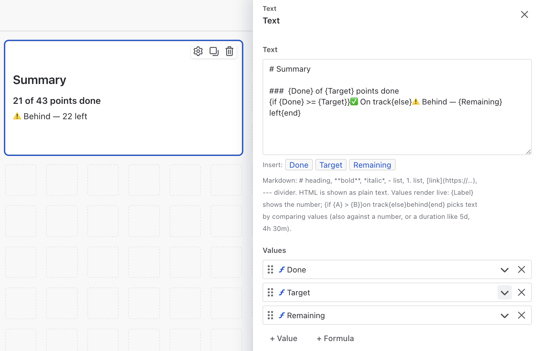
Suite's Text widget is markdown with live values woven in — reference any value or
formula as {Label} and it renders as the current number, following every dashboard
filter. It also supports conditional text:
{if {Done} >= {Target}}✅ On track{else}⚠️ Behind — {Remaining} left{end}, with nesting
and duration comparisons like 5d. A heading-only Text widget costs zero API calls, so
section titles on the canvas are free.
09A Jira pivot table with measures JQL can't express
Native: the Two-Dimensional Filter Statistics gadget counts issues by two fields. That's it — no sums, no averages, no nesting, no formulas.
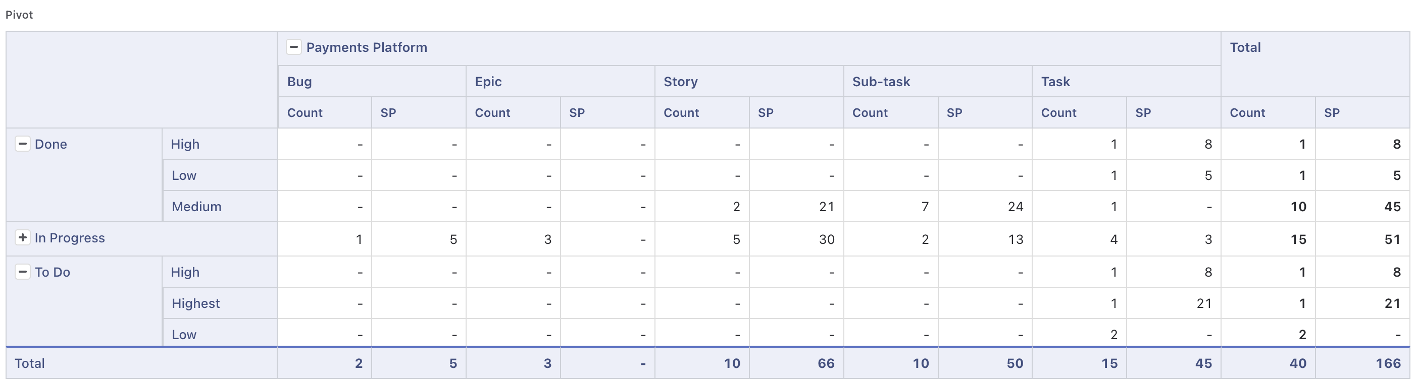
The Pivot Table nests rows and columns to any depth (date fields appear as bucketed variants — Resolved · Quarter, day-of-week, month-of-year), carries several measures with totals that are true totals (an Average total is the real average, not an average of averages), and accepts an if-condition comparing one field to another: count only issues where Resolved is after Due date, or Time Spent > Original Estimate. Plain JQL can't compare two fields on the same issue; this can, and a formula row turns it into a late-delivery rate per team.
10Epic → story → sub-task tree with story point rollups
Native: the epic progress bar counts child items. Story points don't roll up; sub-task estimates don't roll up at all.
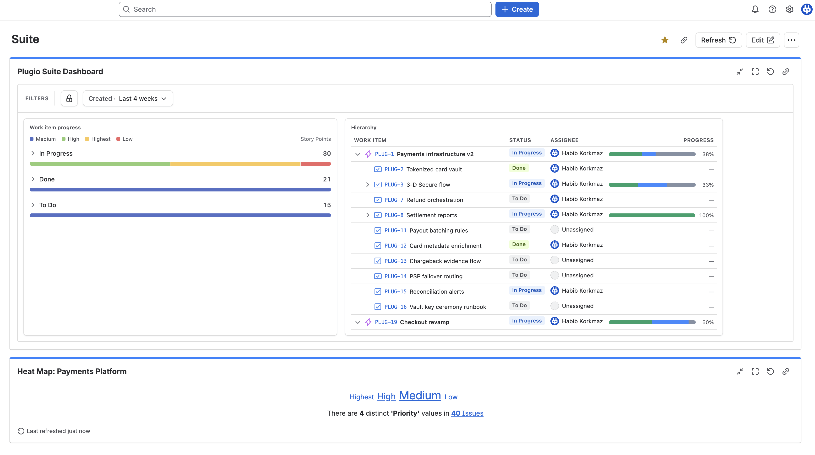
The Hierarchy widget renders epic → story → sub-task as rows you can expand, with value columns rolled up over each subtree — issue count, sum of story points, a derived duration — shown as a status-split bar with % done, dots, a fraction, or a plain number. A Roll up from setting decides whether sub-tasks are real work (count at the deepest level) or a checklist (visible but out of every number). An epic that appears always brings its whole tree, so a branch is never cut in half by the time window.
11A Jira treemap: where the work is, and how old it is
Native: no treemap, no heat colouring; the closest thing is a pie per field.
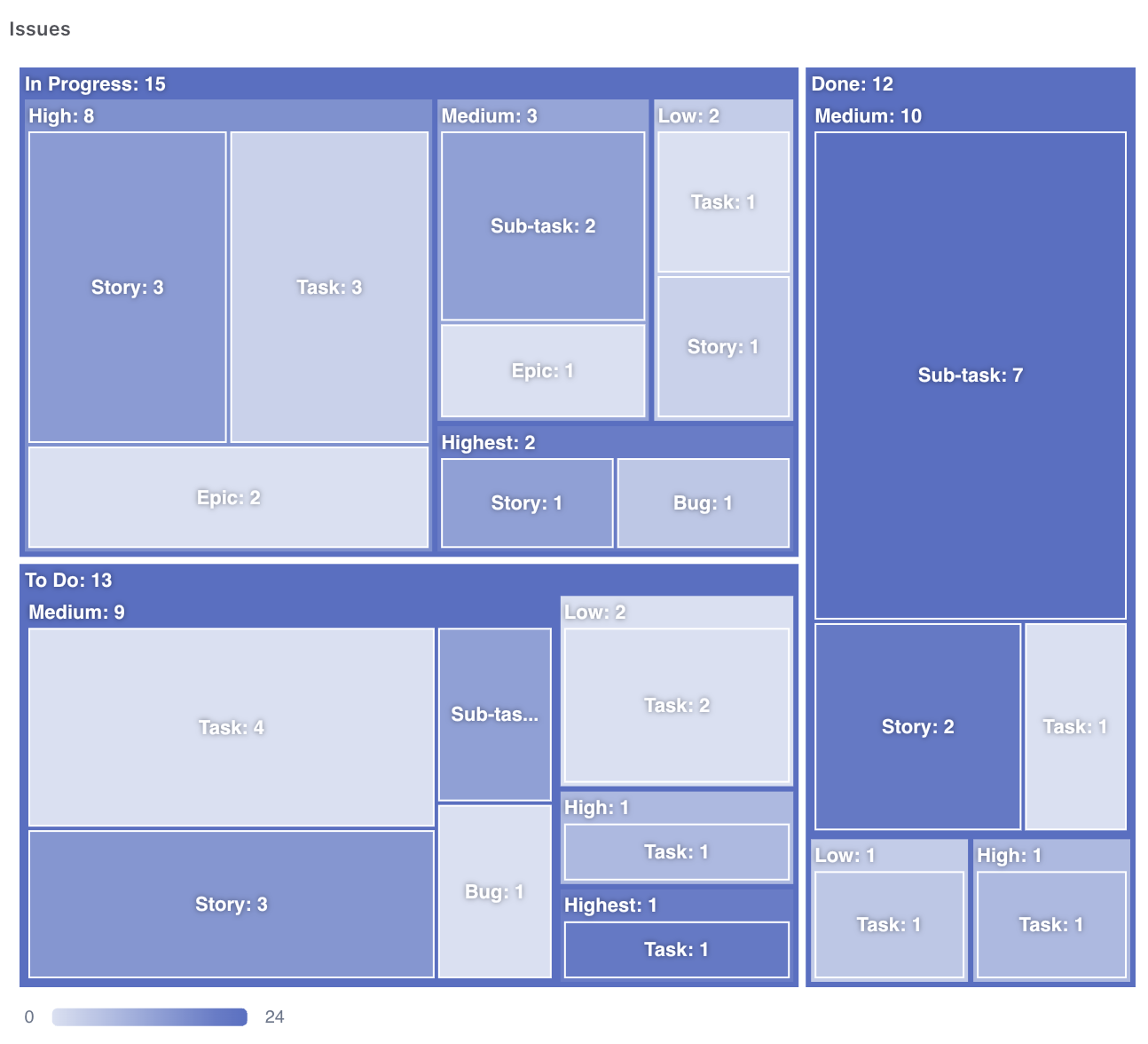
The Treemap nests any number of categorical levels — Project → Epic → Status — sized by one metric and optionally coloured by a second: tiles darken with average issue age, or sum of remaining estimate, on a globally normalised heat ramp so colours compare across branches. Drill-down mode shows one or two levels per view with a breadcrumb back up. It answers a question a pie can't: not just where the work is, but where the old work is.
12…and still on the native Jira dashboard, as a gadget
Native: a full-page app is one more place to look. Teams already open their Jira dashboard every morning.
Suite ships a companion gadget, Plugio Suite Dashboard, that renders a saved Suite dashboard inside a native Jira dashboard — read-only, with the editable filters and the period or sprint picker fully live. Author in the full-page builder; the gadget updates on save. It also embeds cleanly in Confluence via a Smart Link, so a Suite dashboard can sit inside a project page.
Two things worth knowing before you install
- Permissions are the viewer's, not the author's. Every query runs as the person looking at the dashboard, so sharing a board never shares data they couldn't already open — and two people can legitimately see different numbers. Nothing leaves your Jira site.
- Scope is required and capped. A dashboard won't fetch until it has a bounding scope, and the base fetch reads up to 2,000 issues; beyond that, affected widgets show a warning rather than a confident partial number. Narrow the scope, tighten the window.
Try it on your own projects. Plugio Suite is on the Atlassian Marketplace, and the documentation walks through every widget and setting.
Want the same rollups on the issue itself rather than on a dashboard? That's Plugio Panels.